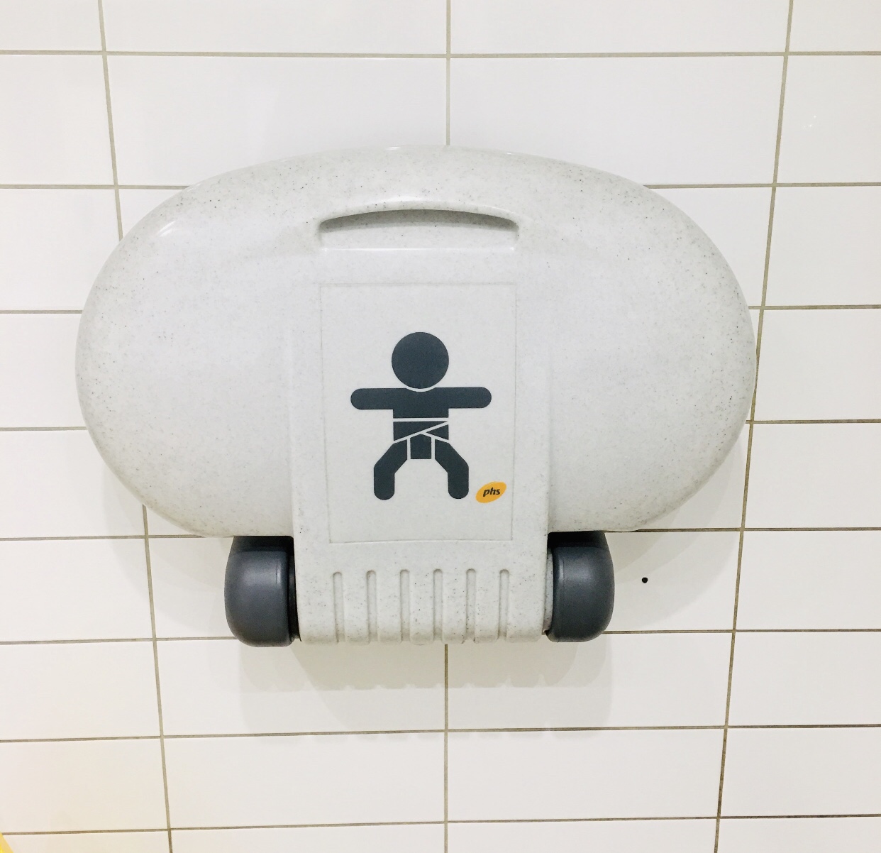
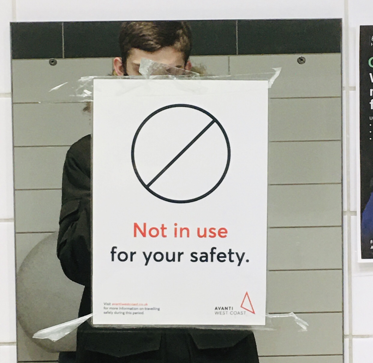
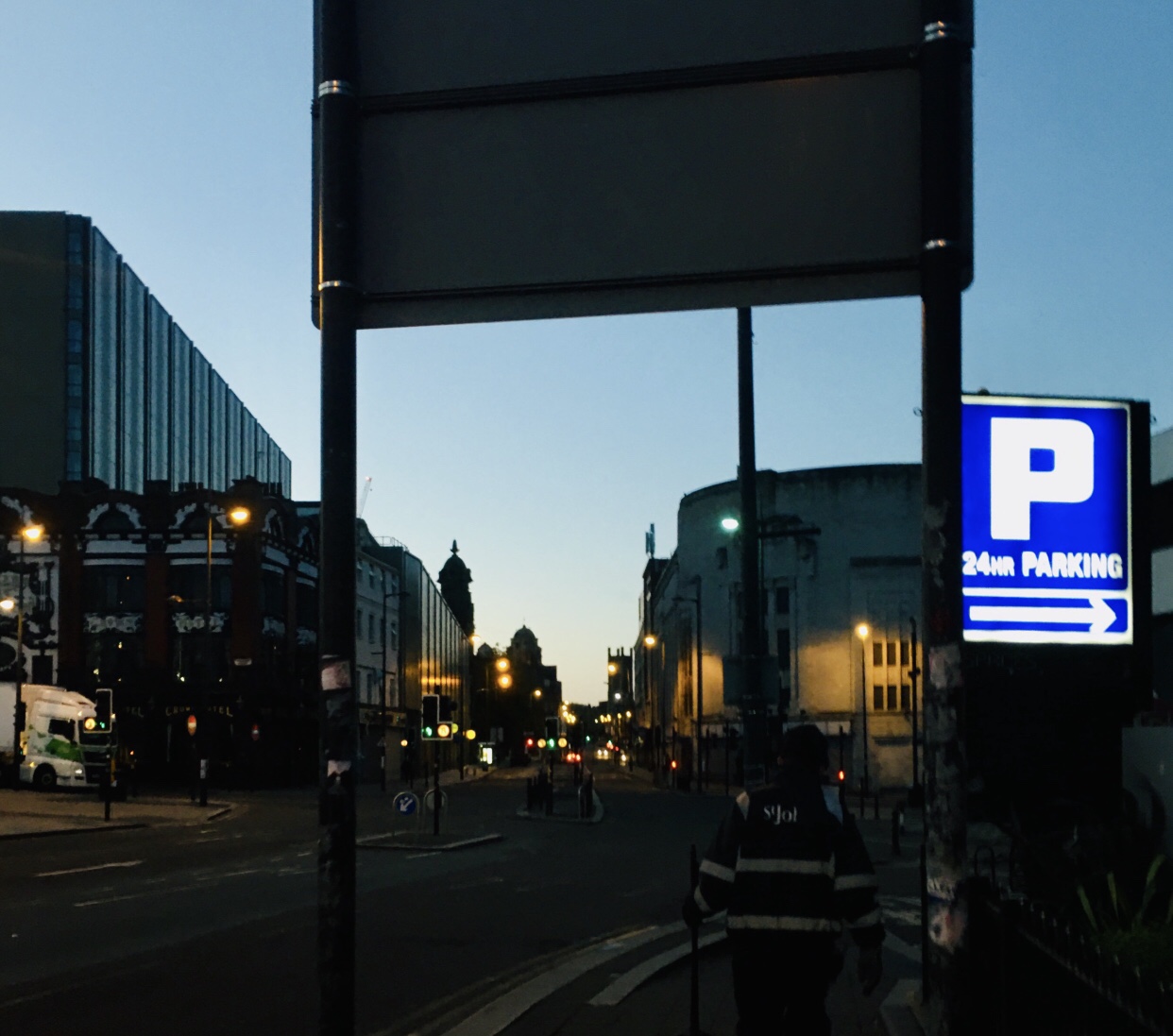
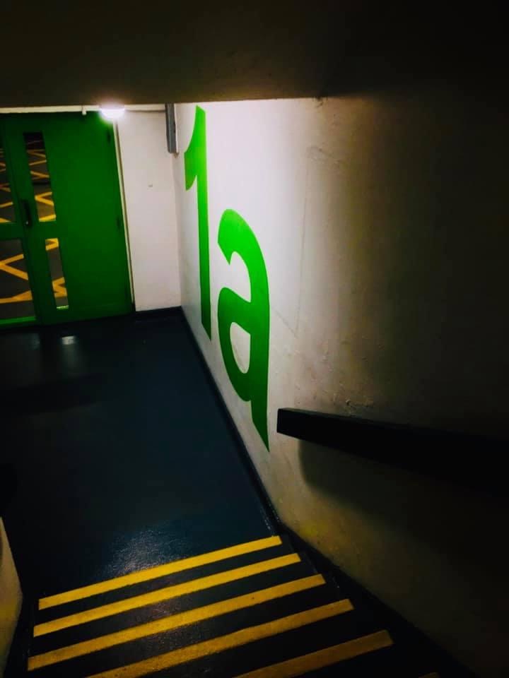
‘PH1000 – Text found within the Photographic Space’
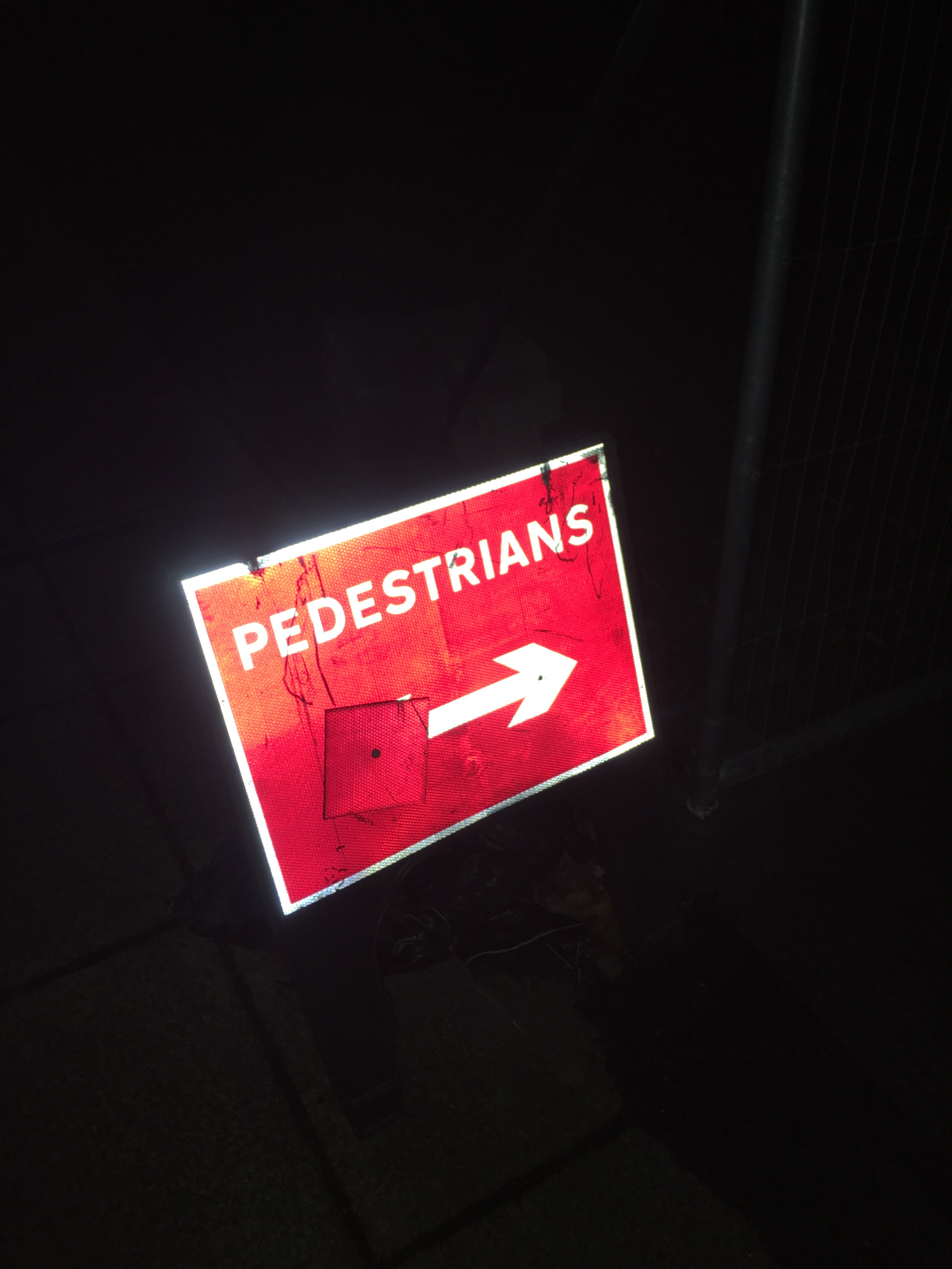
My aim of this photo shoot was to search in the picture for a wider range of different types of text, I have also selected a variety of street signs, posters with key details about them, particularly what is happening with the current circumstances. I also wanted to capture a selection of the text scale and how the bold colours on the buildings stand out.
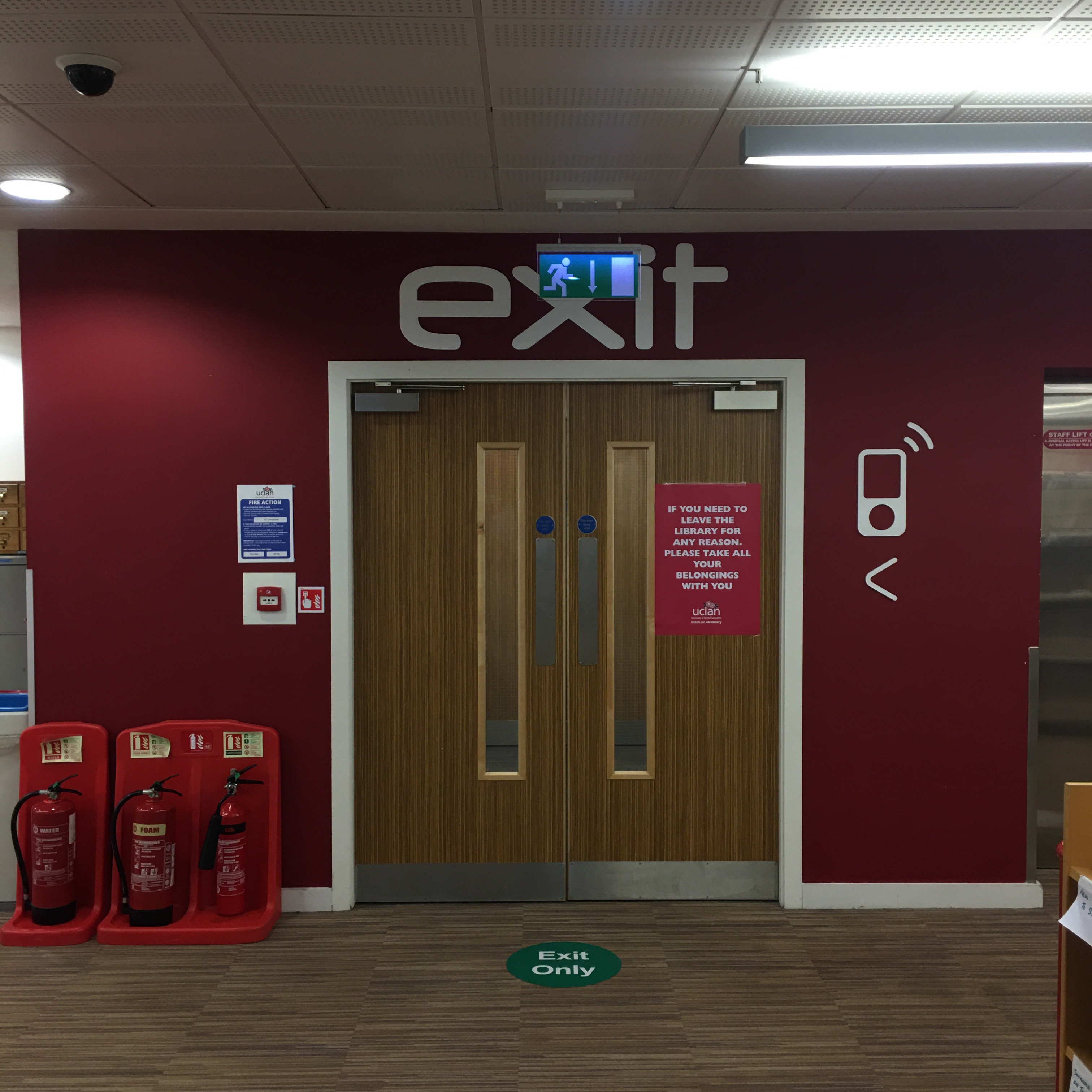

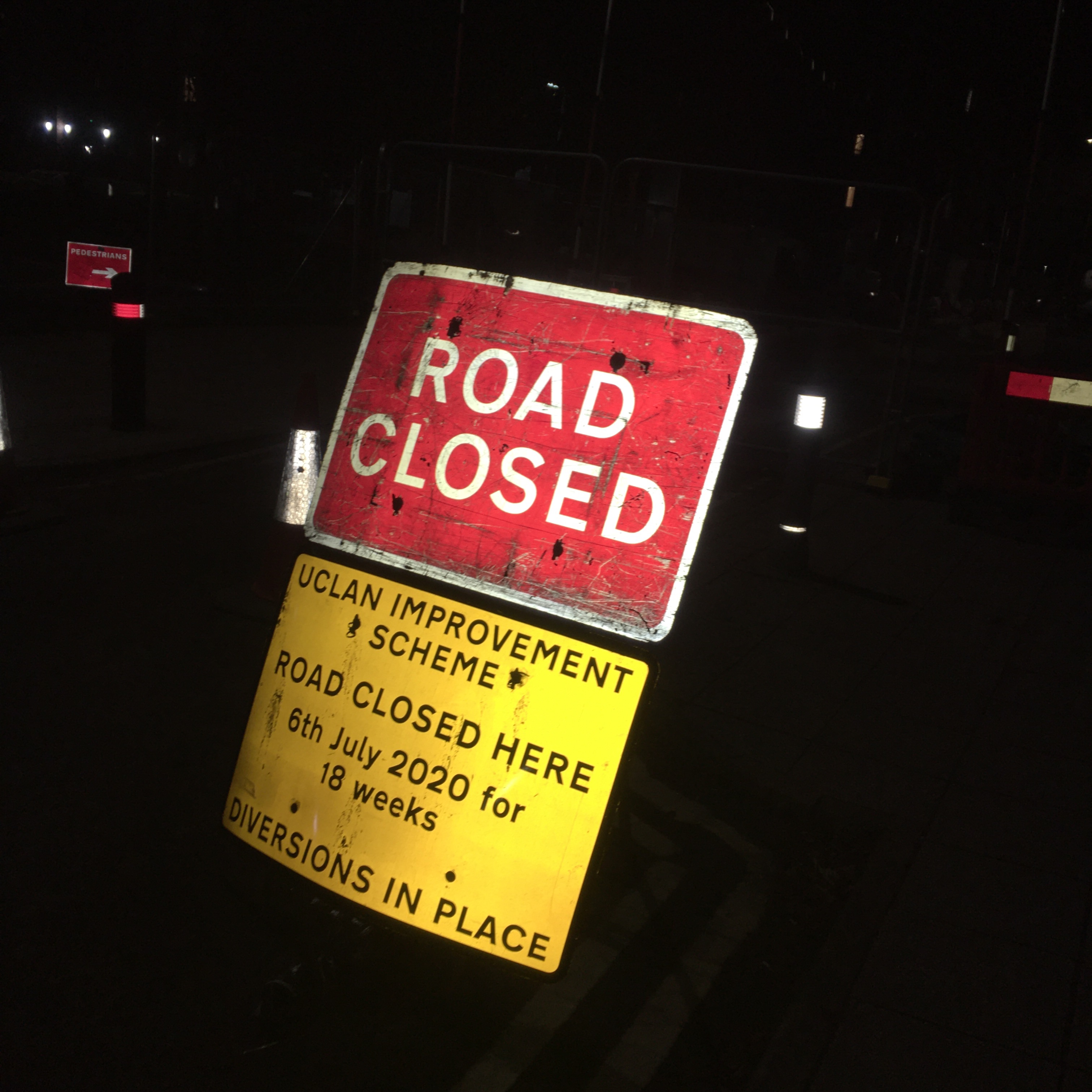
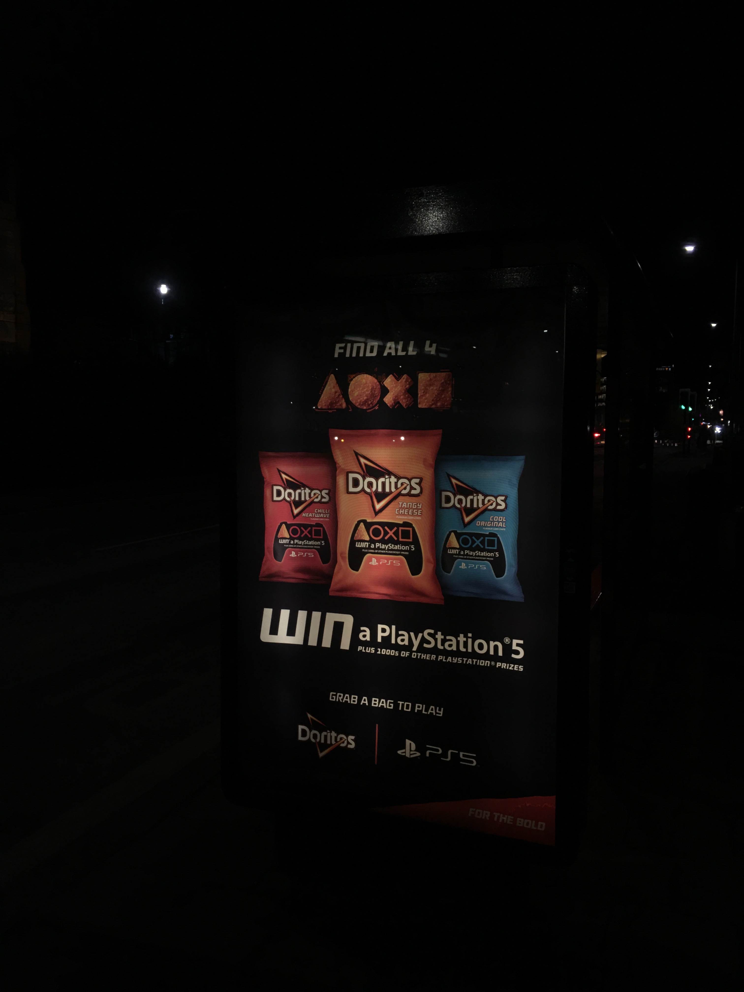
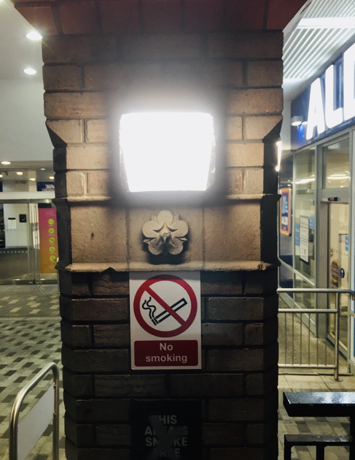
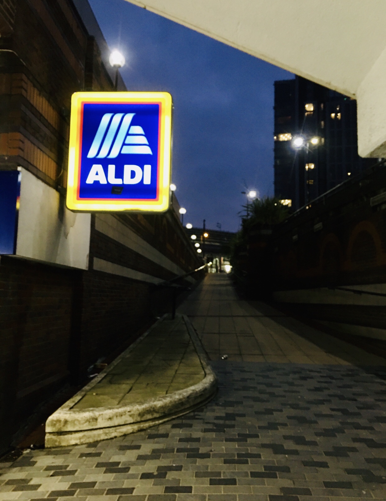

Once I took my images during the reflective process, I began to think about how successful the poster and signs are as the signs of houses, shops are in light up text. Most businesses have bold Red Neon Lights mainly. That, compared to the size and text displayed on posters, catches my attention.

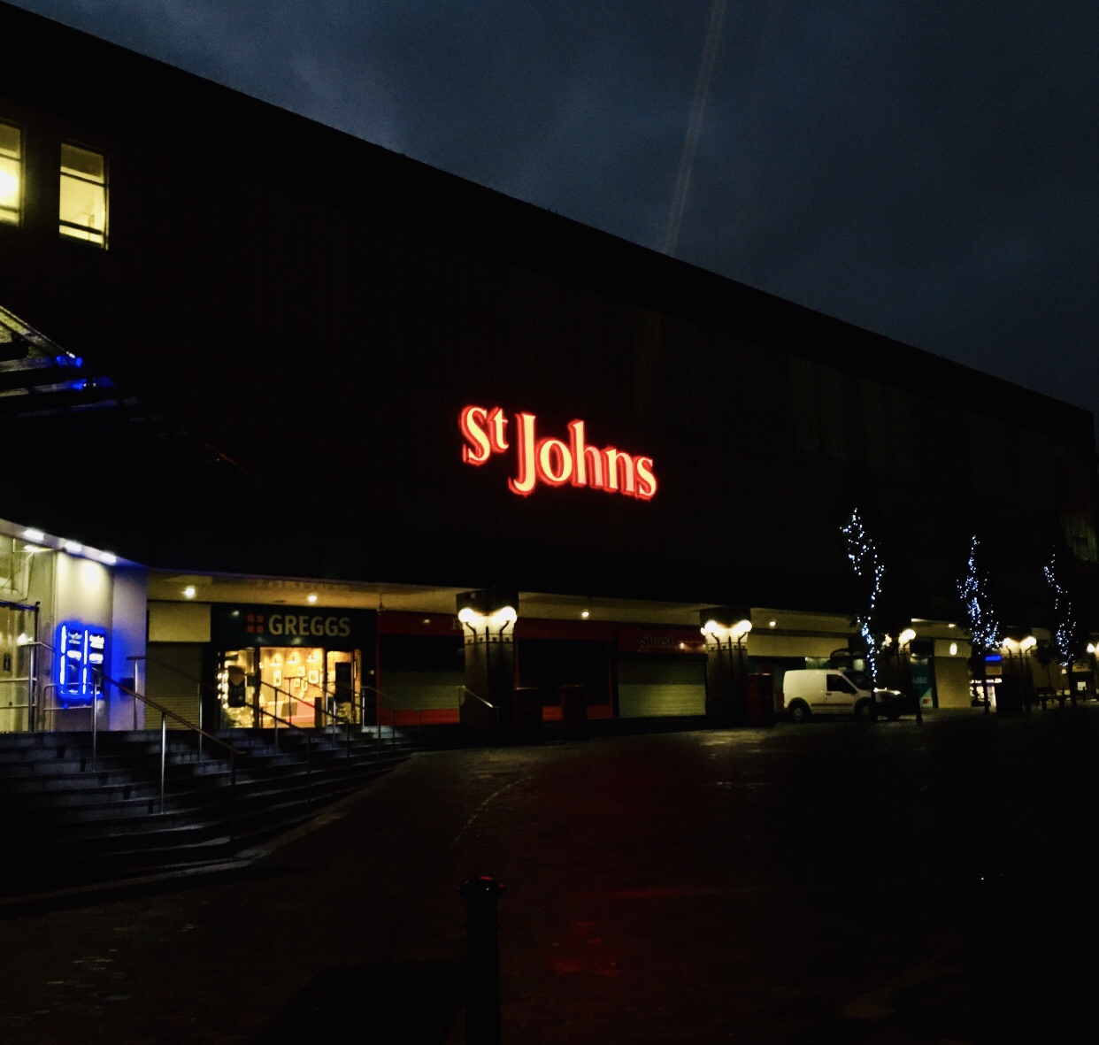
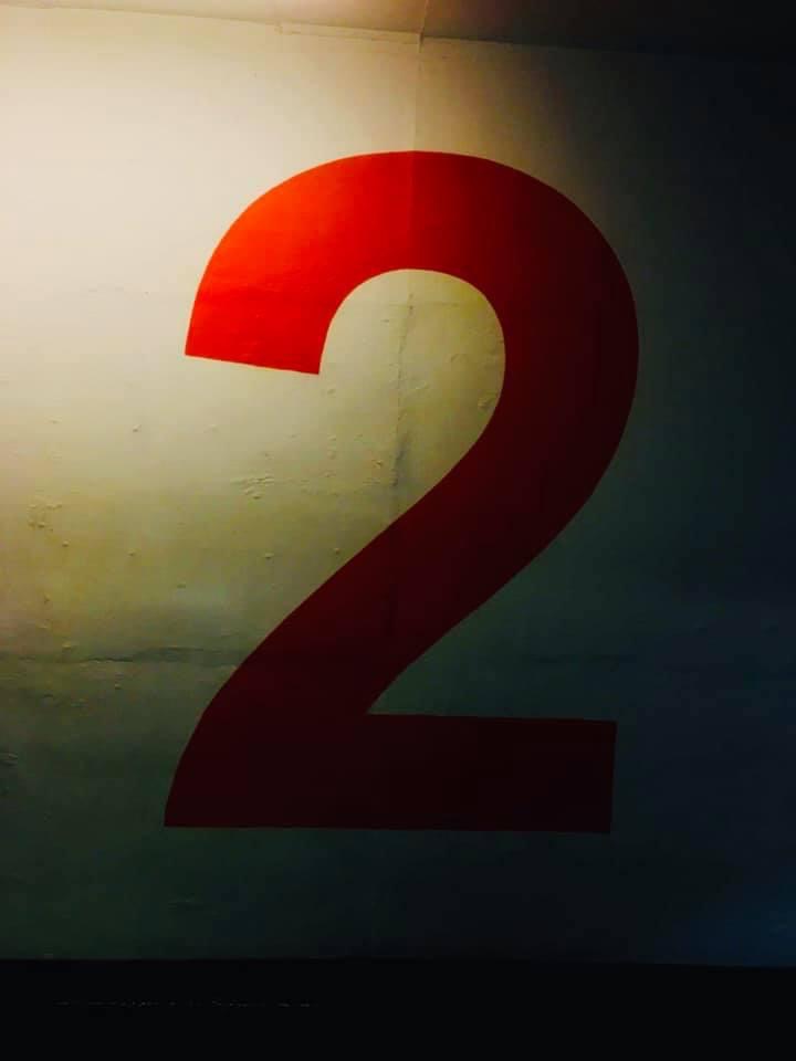
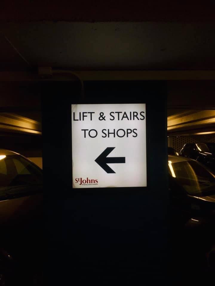
The good effect of the text and picture was to see the number and the letter as it was so dark when it was photographed. The negative consequence of the picture was that I wasn’t able to get too much floor in the image frame. Perhaps I should have selected another place to photograph as the St . Johns car park, Liverpool was too dark and busy to catch text in the picture as there were tonnes of people going up and down the stairs so I had to keep getting out of the way.
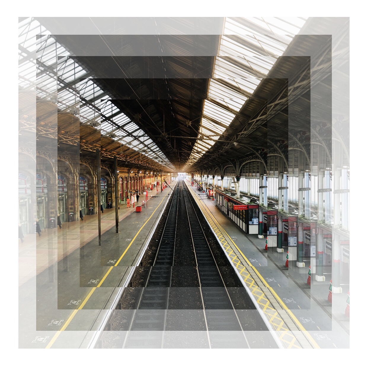
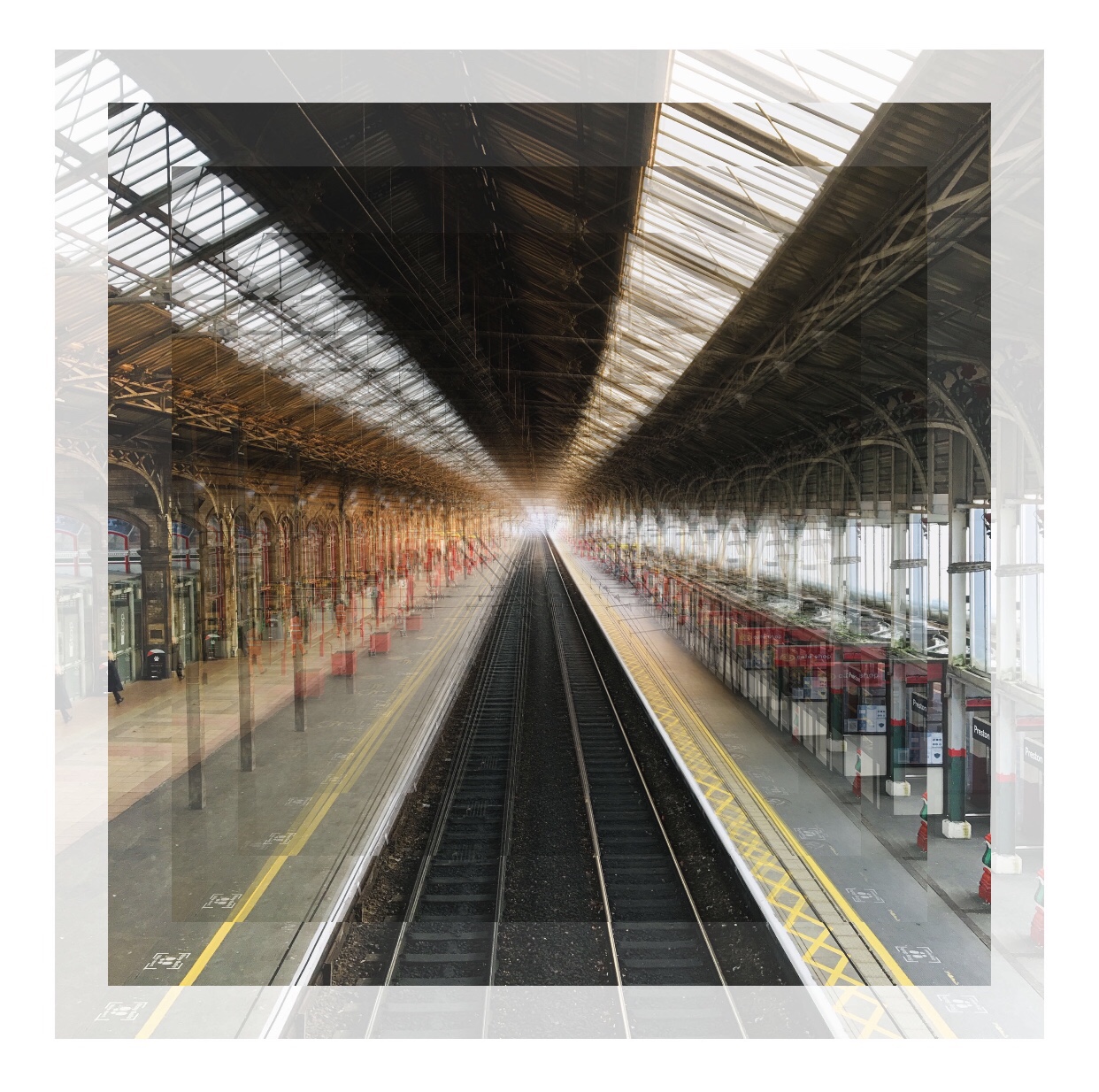
‘PH1000 – Typology’ (Image Add Text)
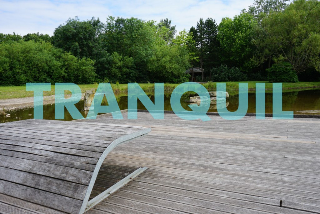
I tried a wide variety of colours, positioning and formatting during the image add text editing process, for me this assignment meant it allowed me to understand the use of text, fonts and scale, the only negative effect of this that could have been enhanced is including more of the seating area in the picture frame. For this image, the word TRANQUIL I have chosen makes the image very solid, special and very meaningful as it is free from disturbance and very calm in the image.
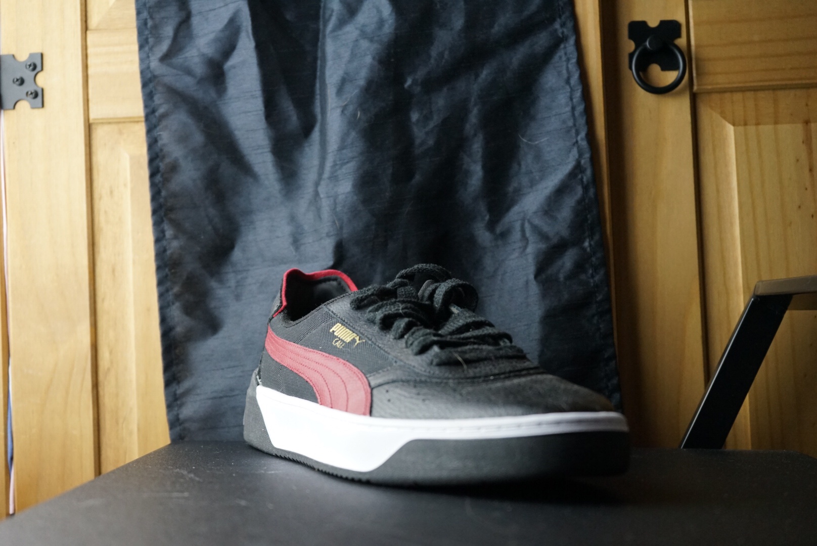
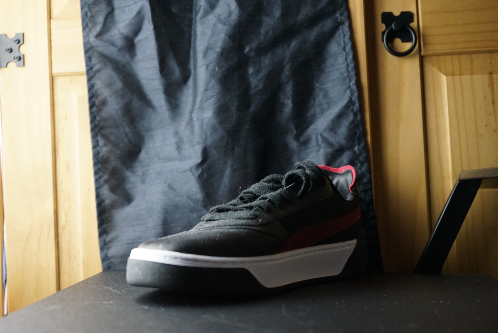
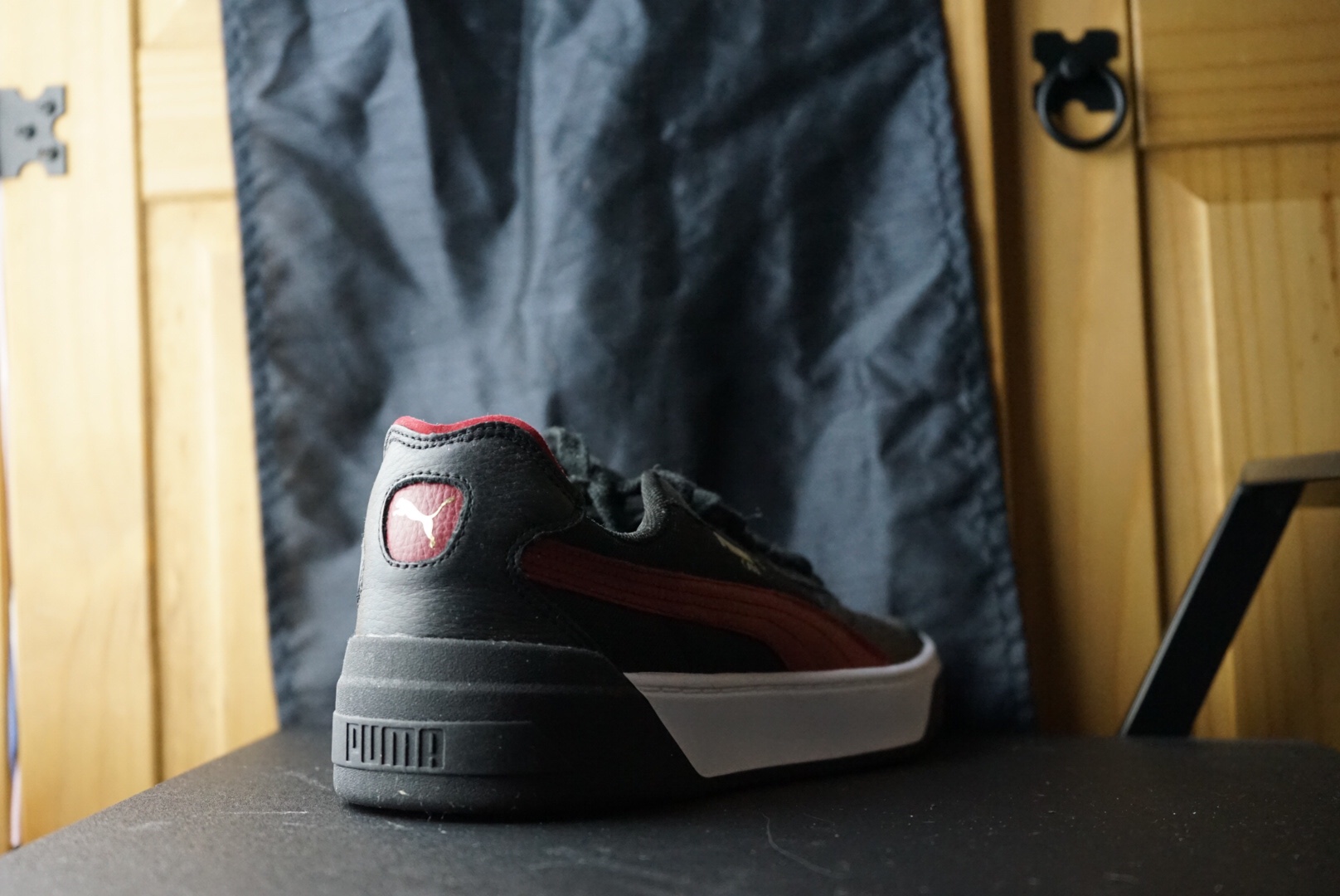
PH1000 Assignment 1, Task B / part one: DIPTYCH…
Diptych One 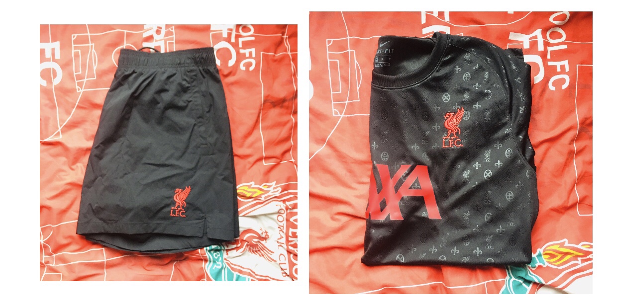
Diptych Two
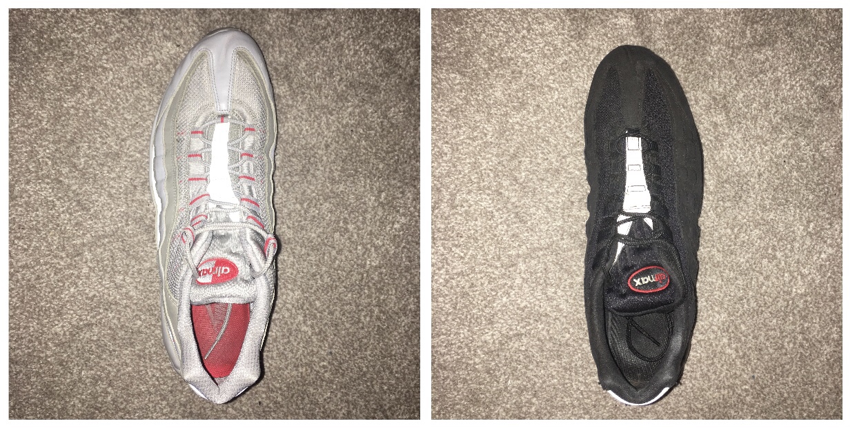
I wanted to explore similar things that can be paired together so I chose Nike trainers that are the same style and form, grey/red and black/red, so I just wanted to see if they would look different next to each other. As these Liverpool FC things are part of a series, the shorts and T-shirt calibration, so I decided to position the objects over an LFC surface to see how the black and red colours interact with the surface in the background.
The reason I chose this image as my final diptych is because my goal of editing process was to be able to have both images representing a full and empty bottle, what I find really interesting about this diptych is that the light, tones and details make the images very interesting to look at and the background of the image is very effective for me as there is a variety of colours and shadows. What didn’t go to plan about this diptych is that the image of the empty bottle I photographed is too dark and it makes the whole image look so different as the goal throughout the process wasn’t the same with both backgrounds.
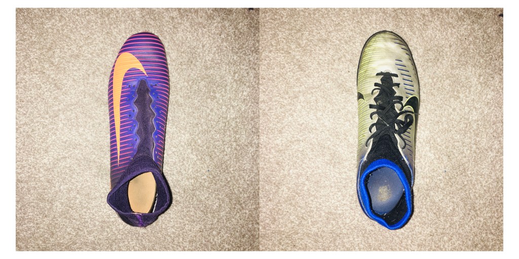
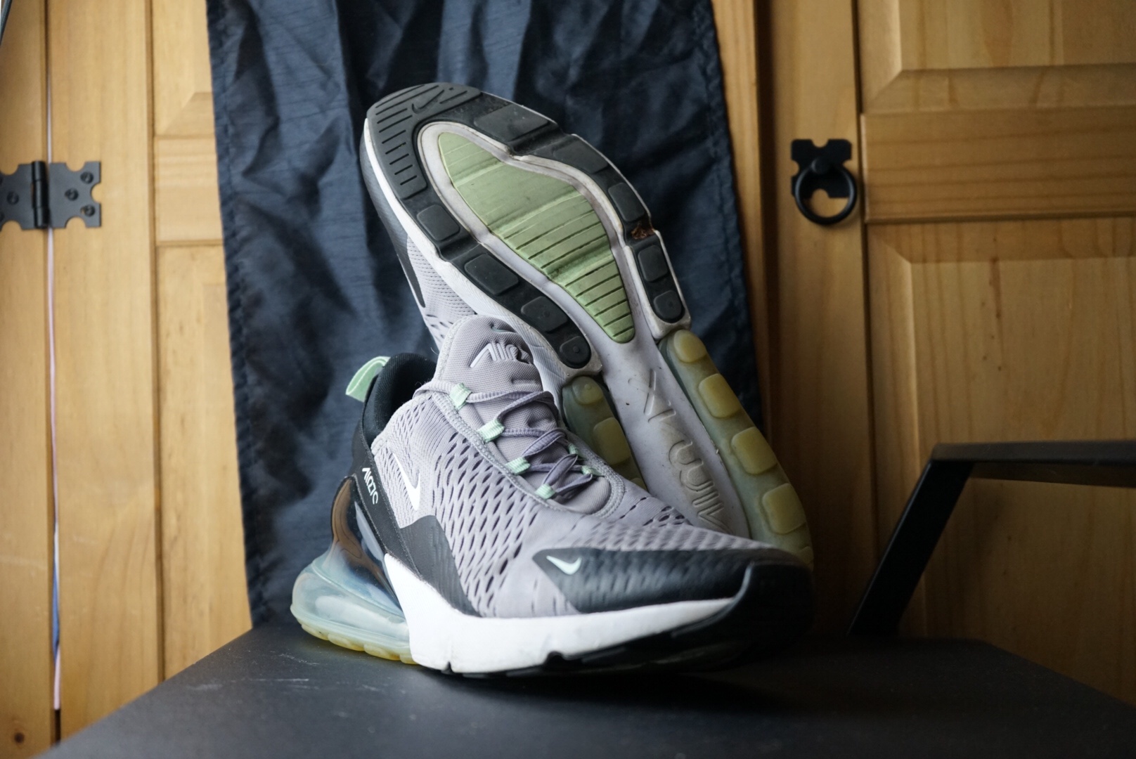
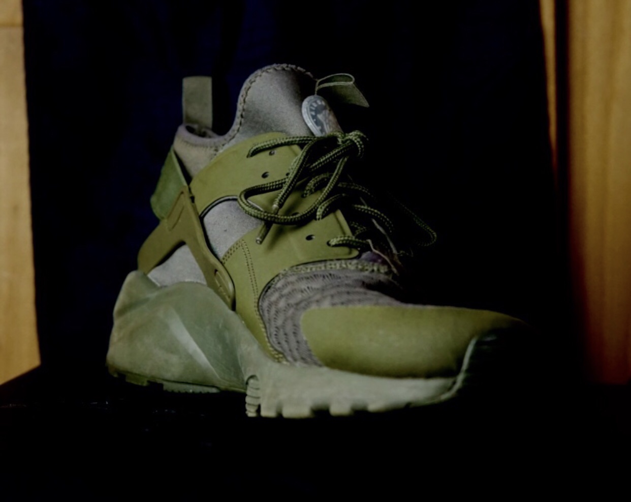
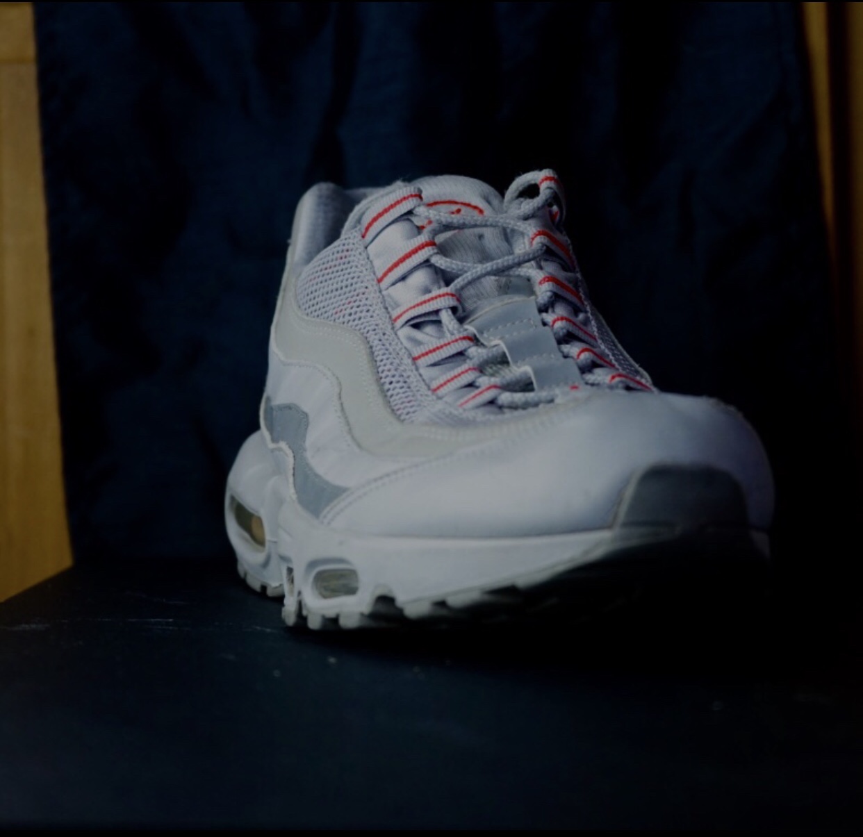
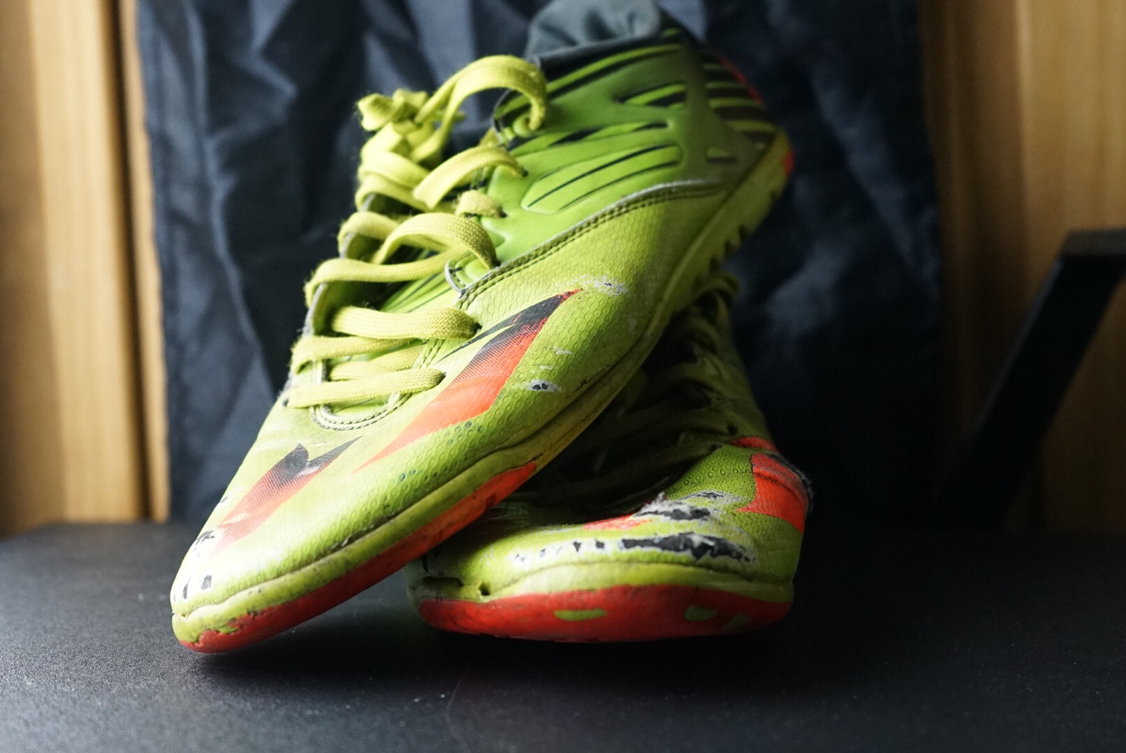
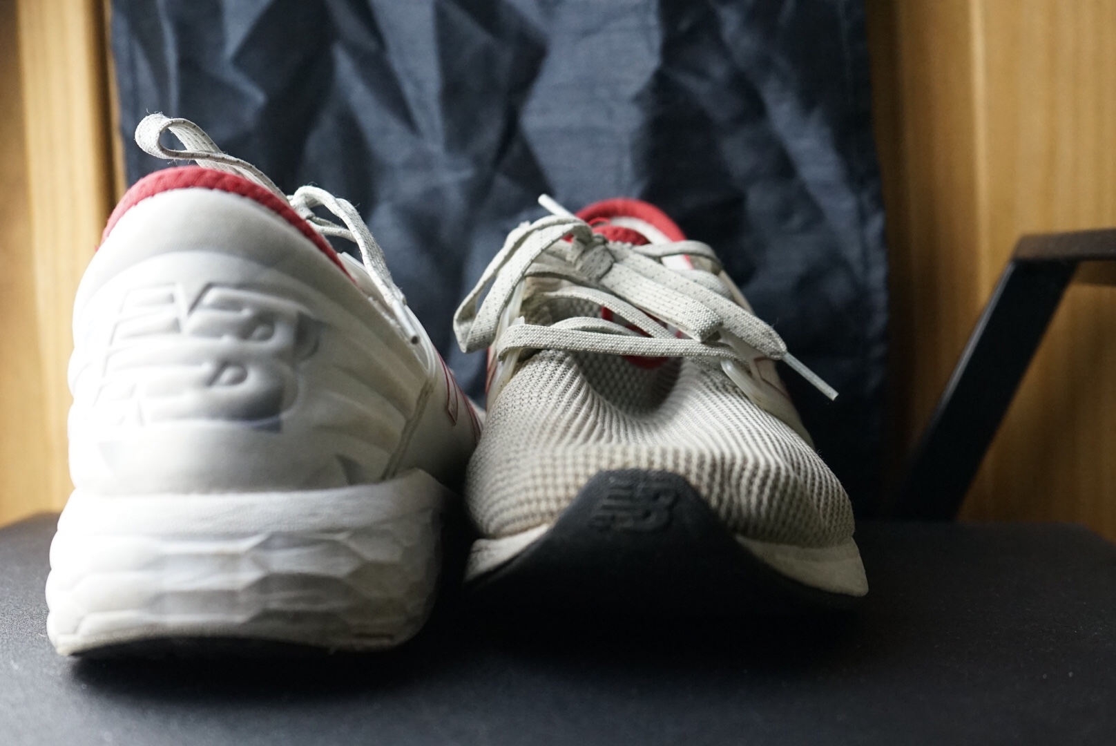
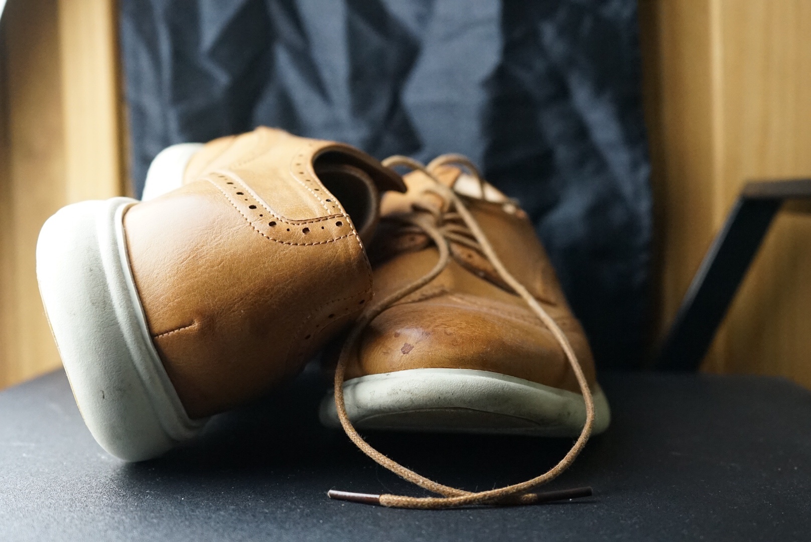
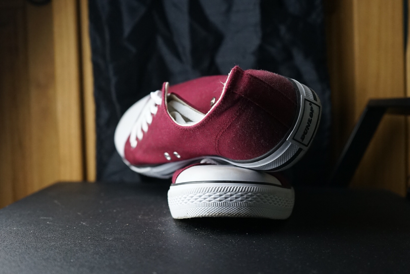
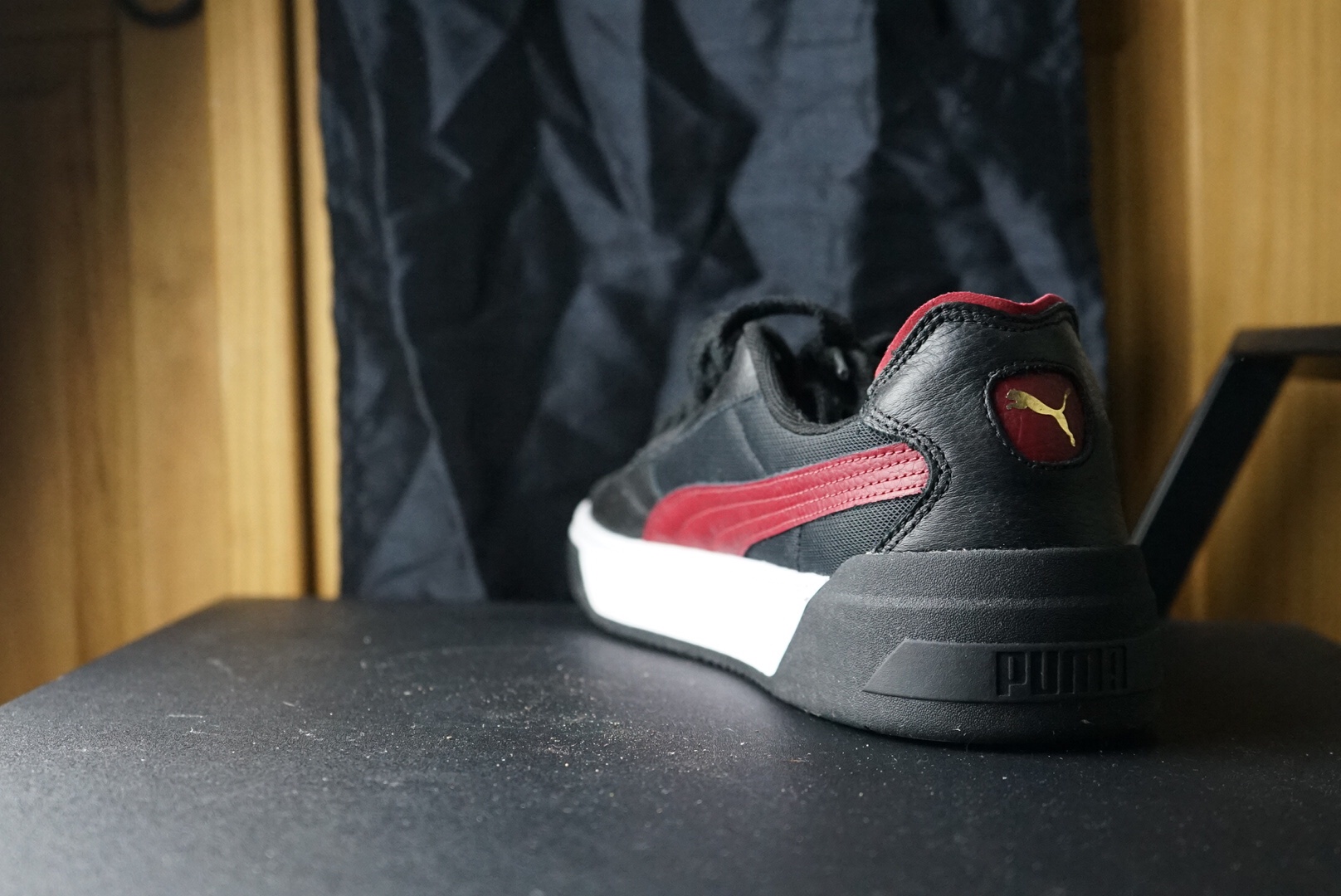
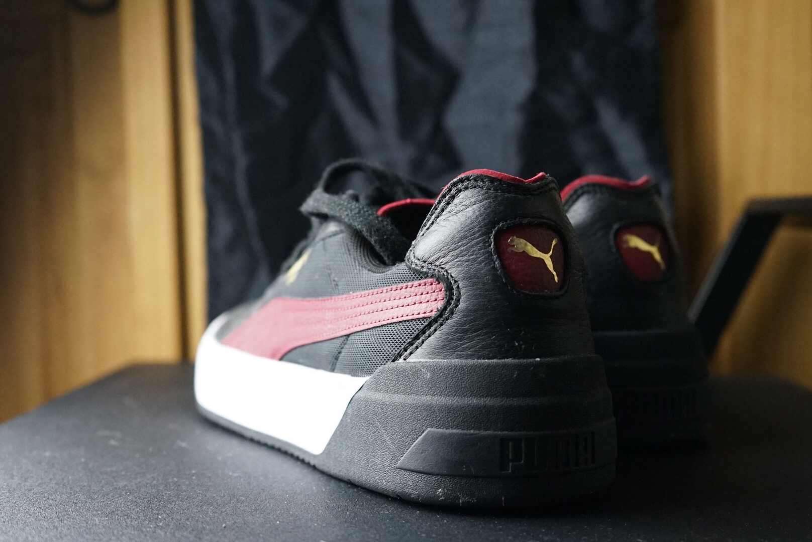
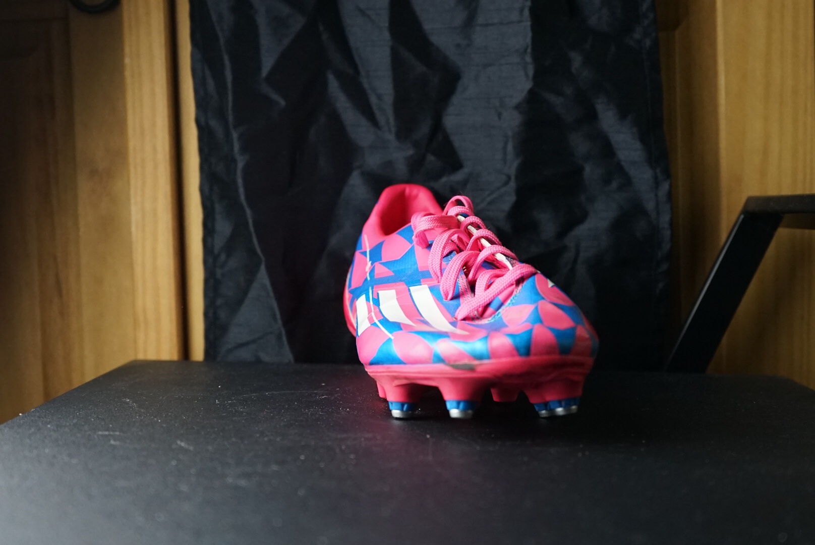
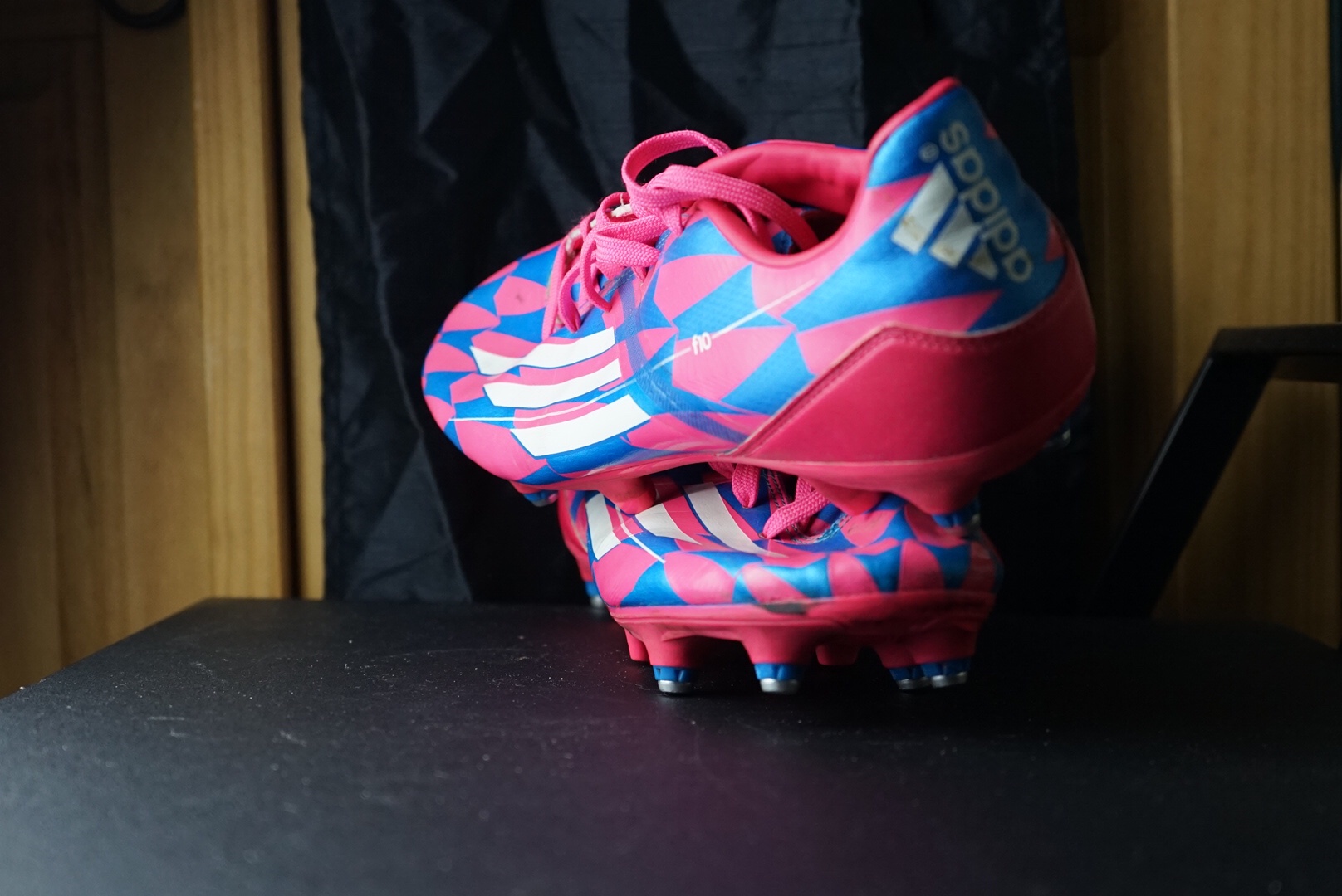
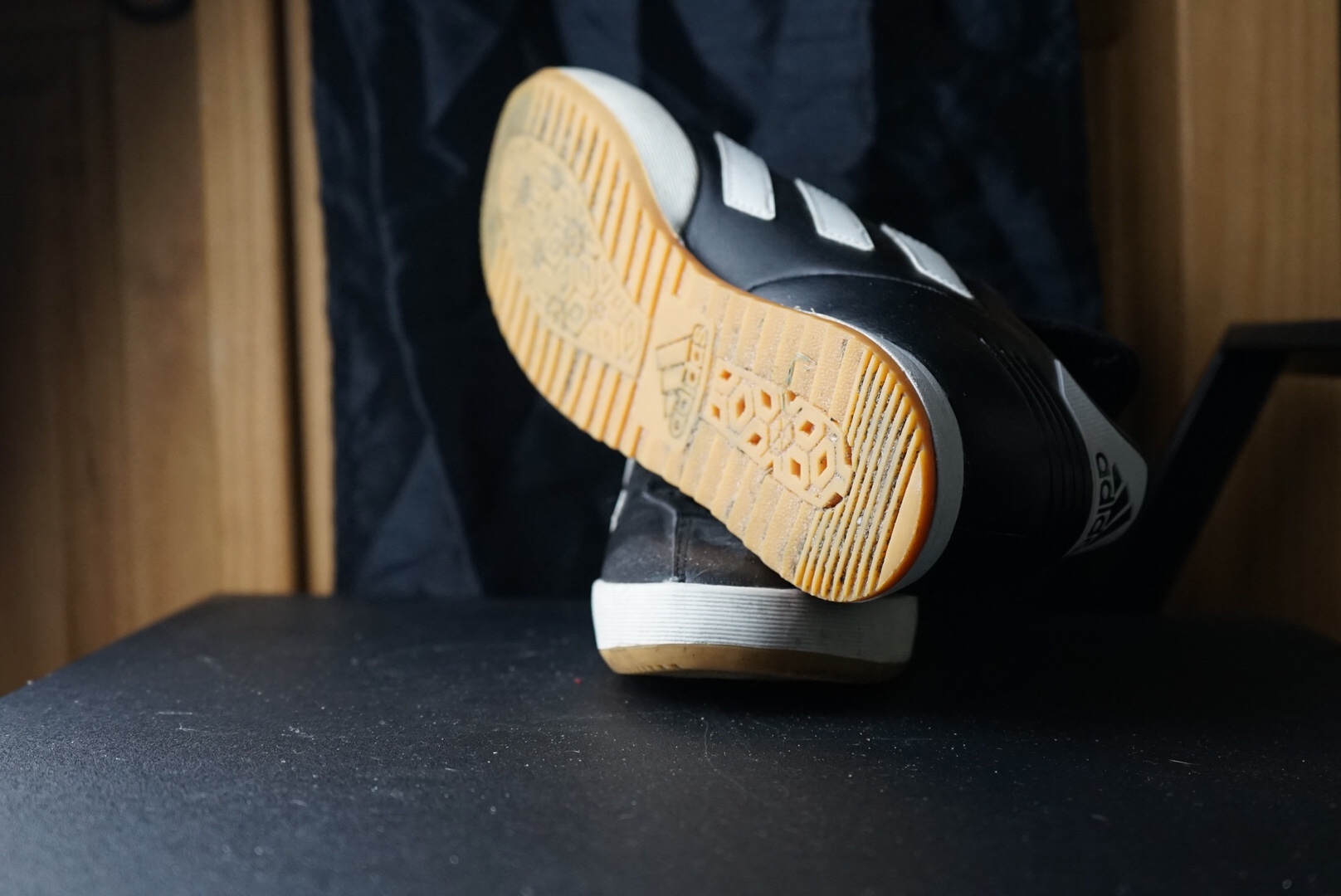
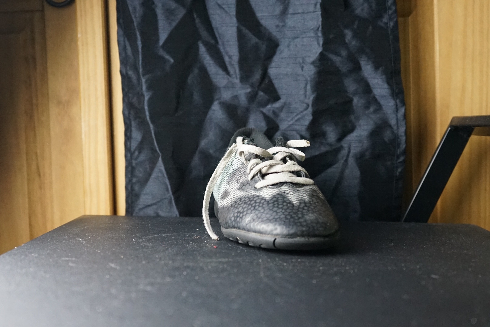
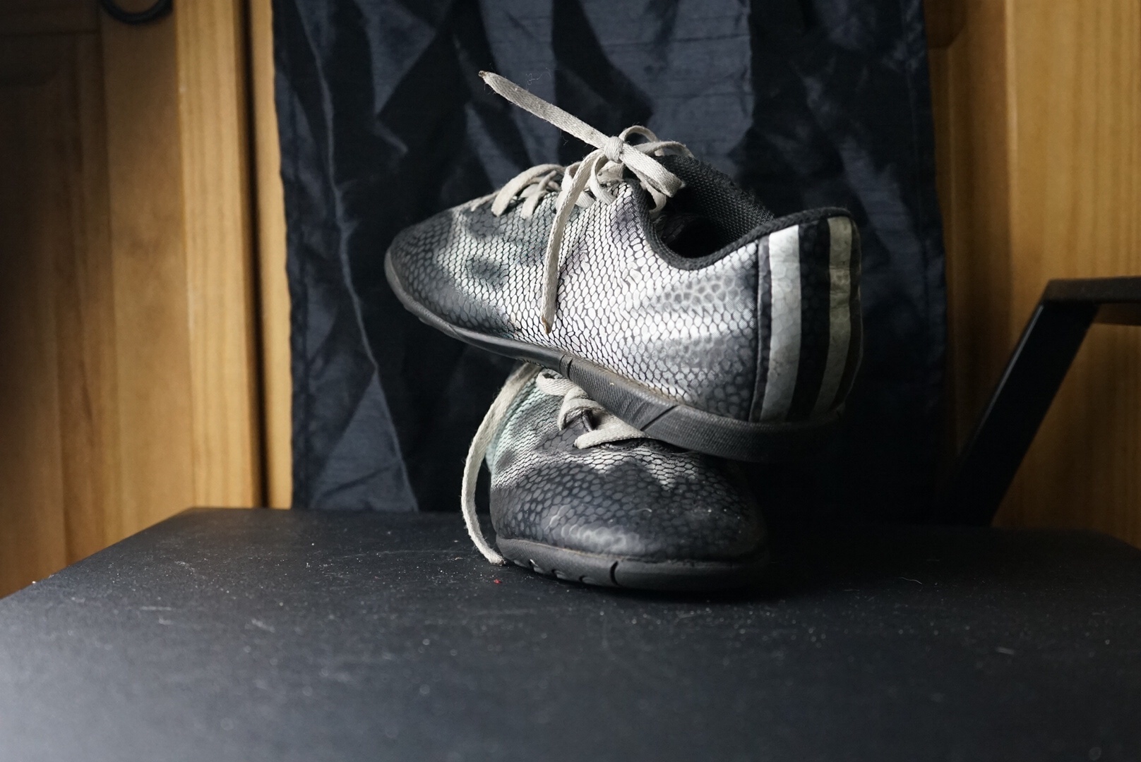
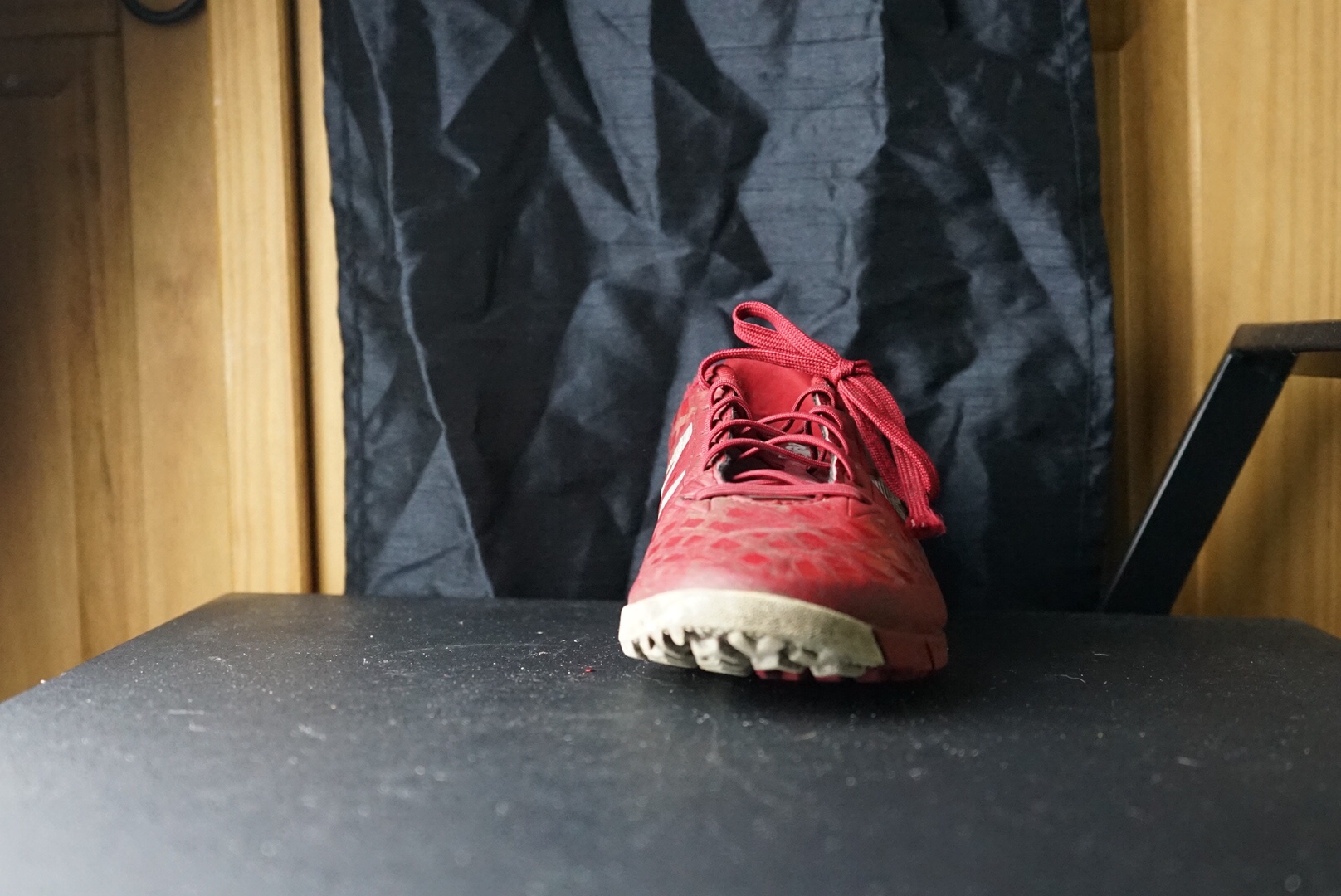
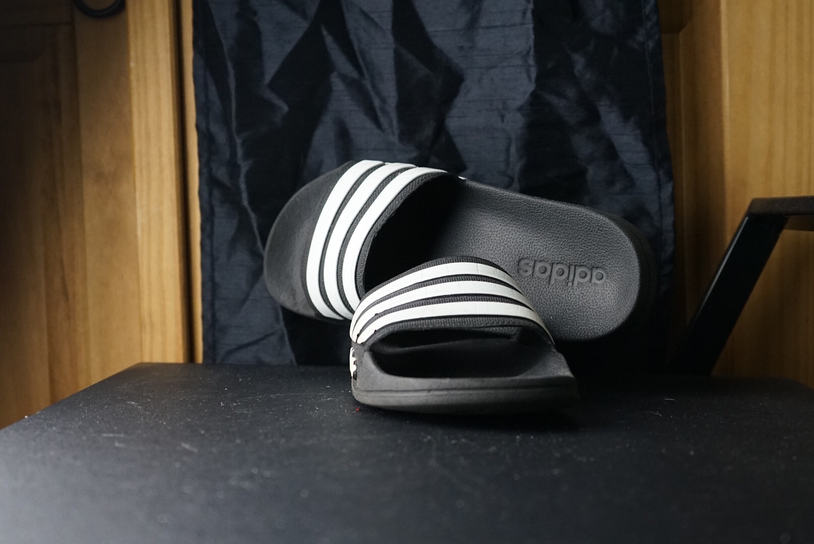
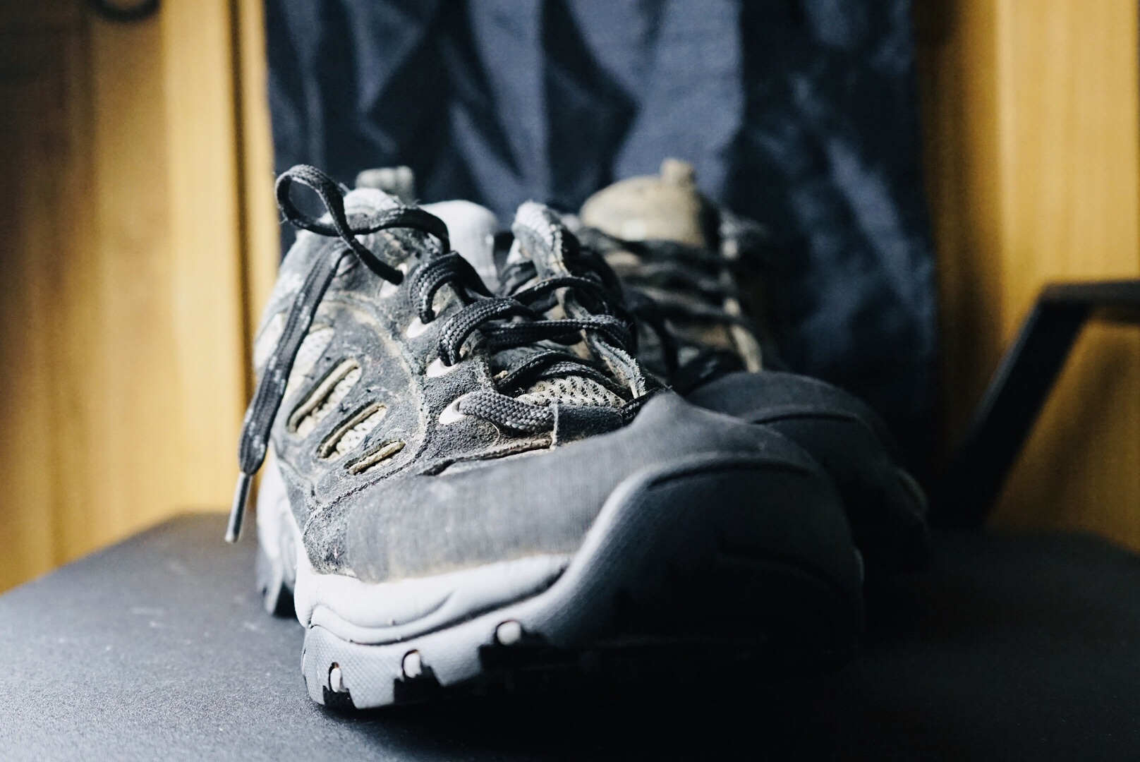
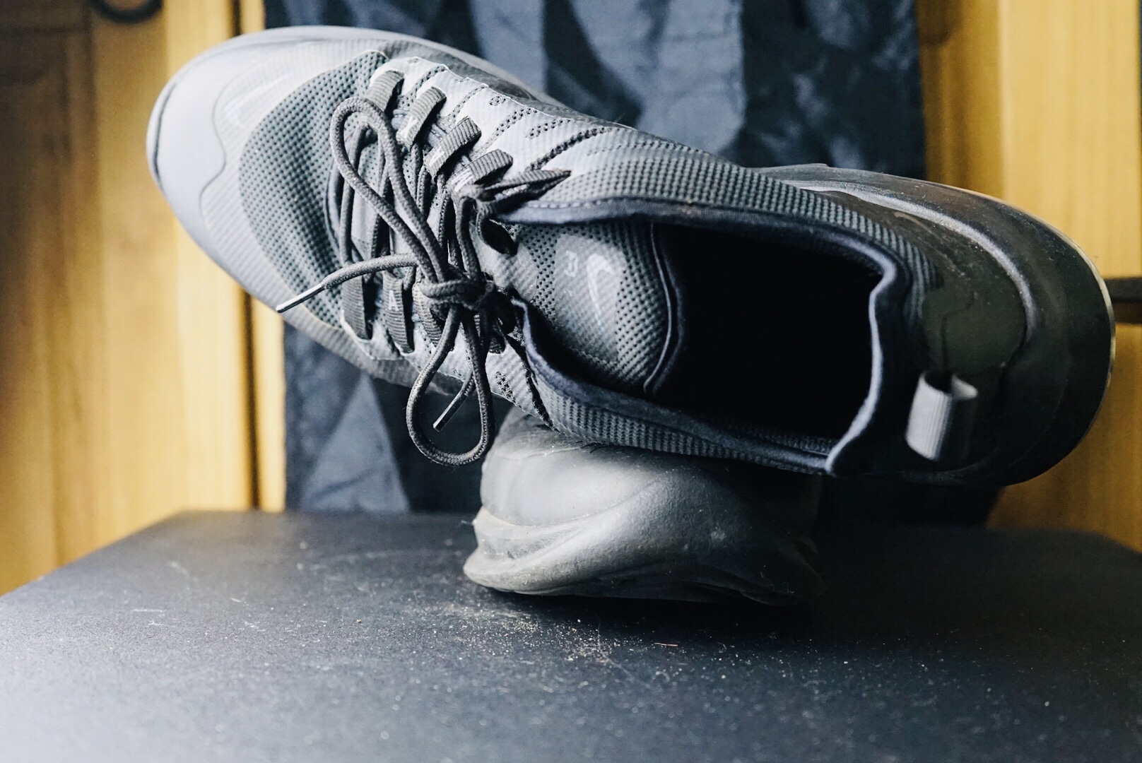
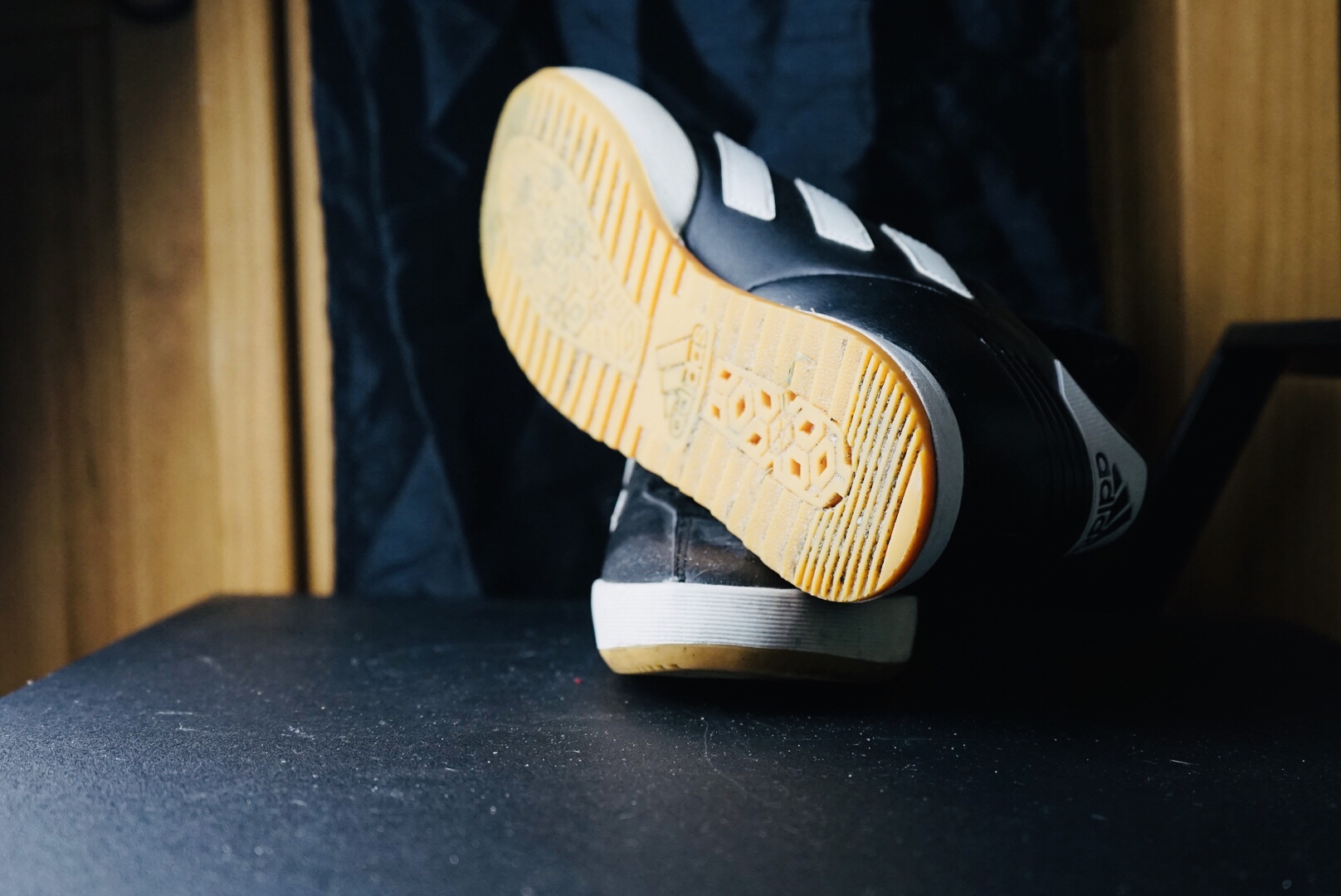
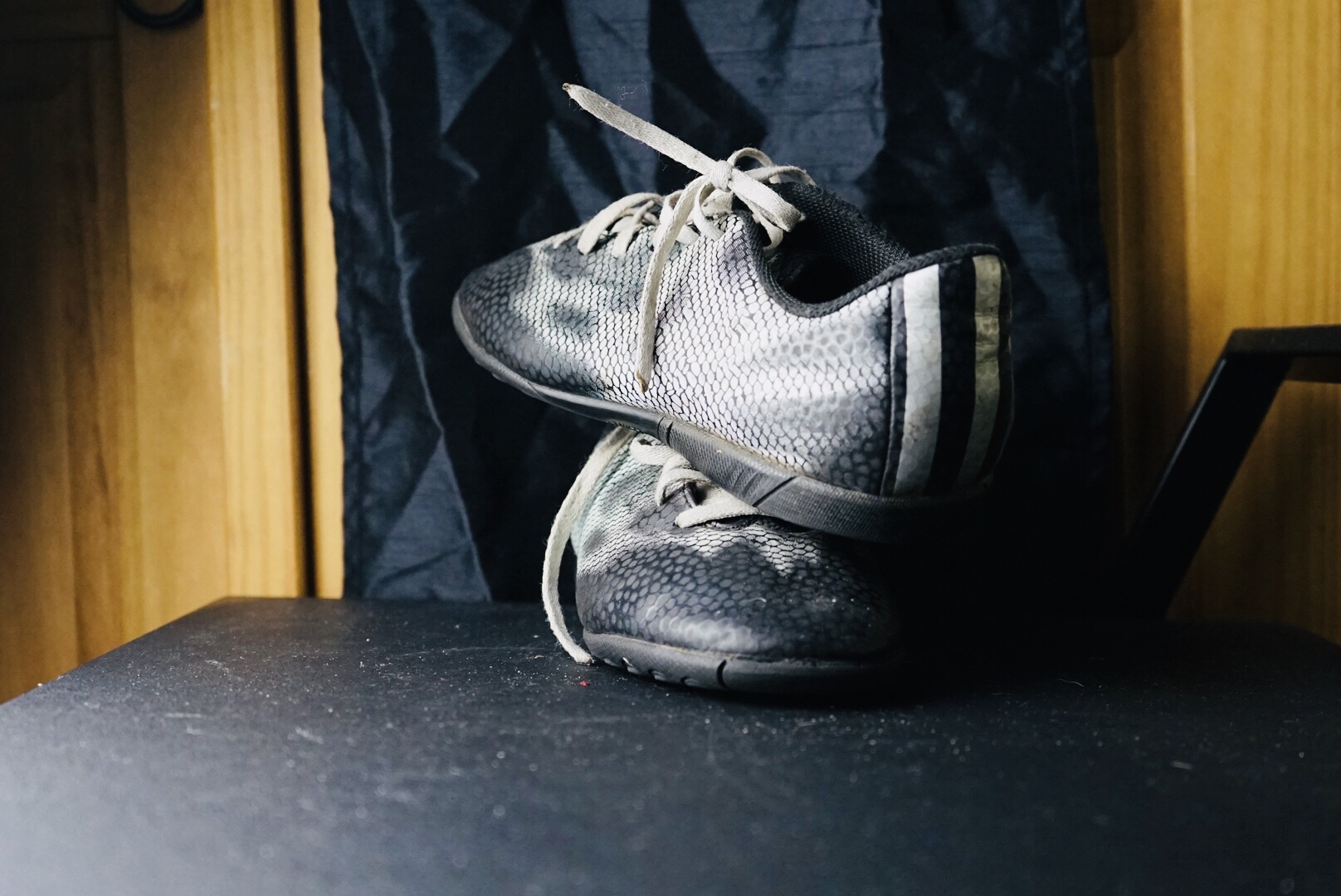
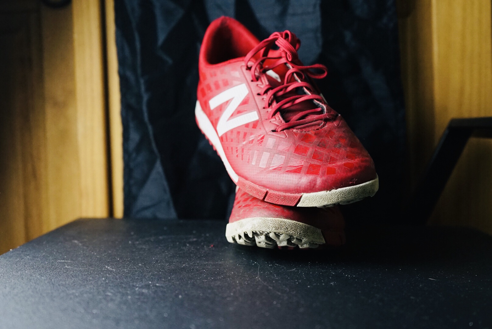
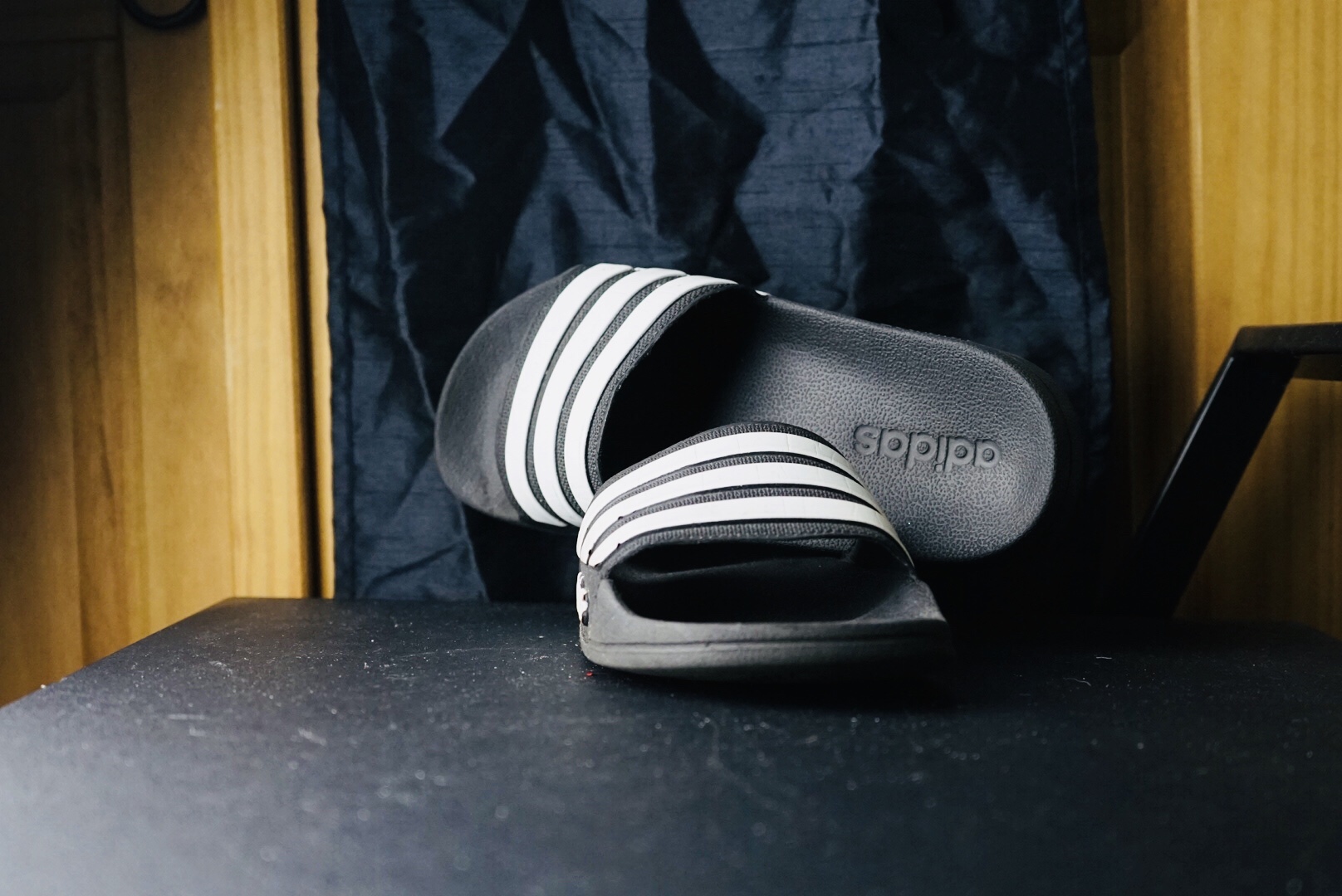
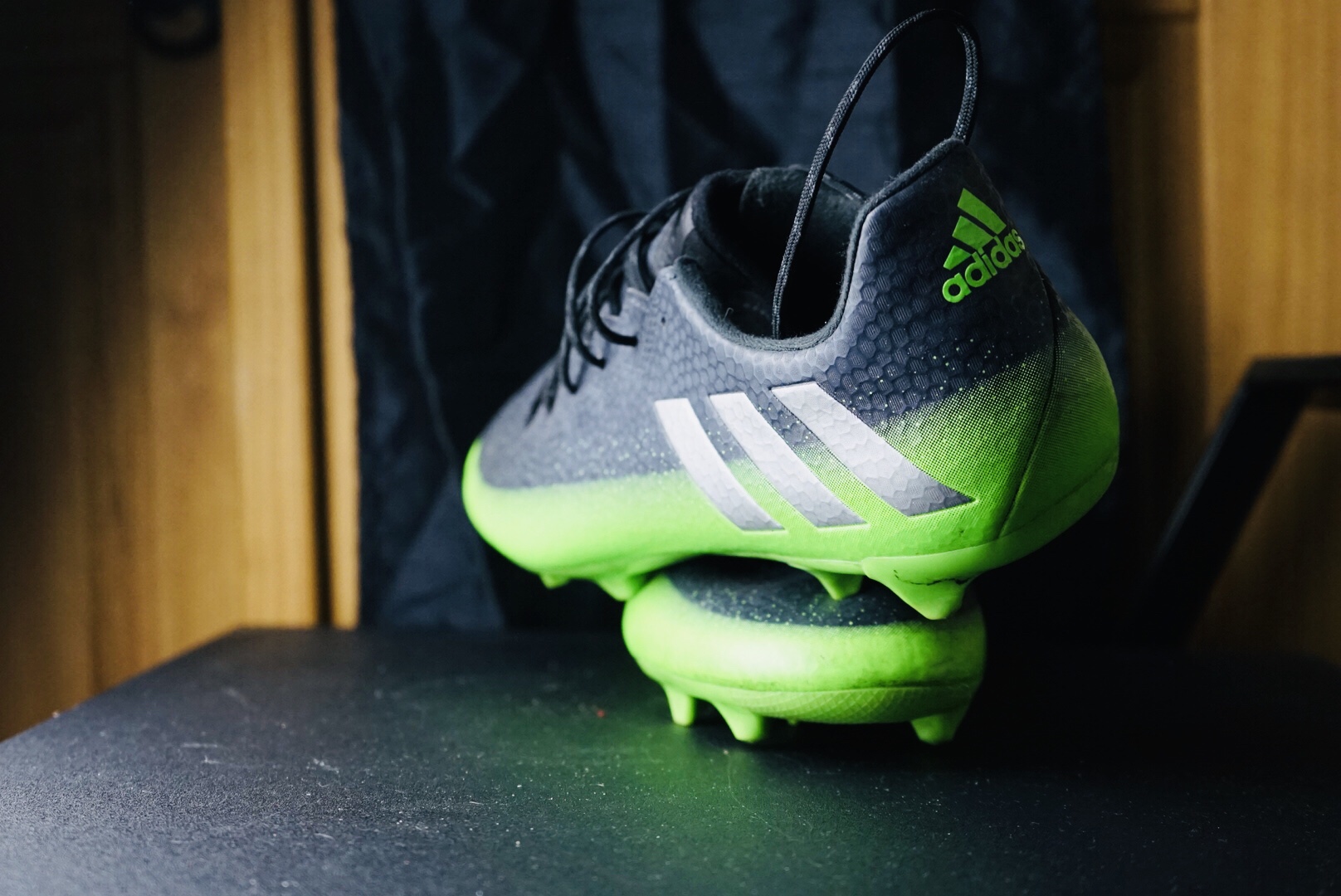
PH1000 Assignment 1, Task B / Part Two; TYPOLOGY: Footwear Shoot…
My goal of the shot was to catch the light reflection on the surface of the trainer, boot, and shoes. During the shoot, I wanted to explore the location of the boots, so I started to point them in a variety of directions. From angles to the front, back and side.
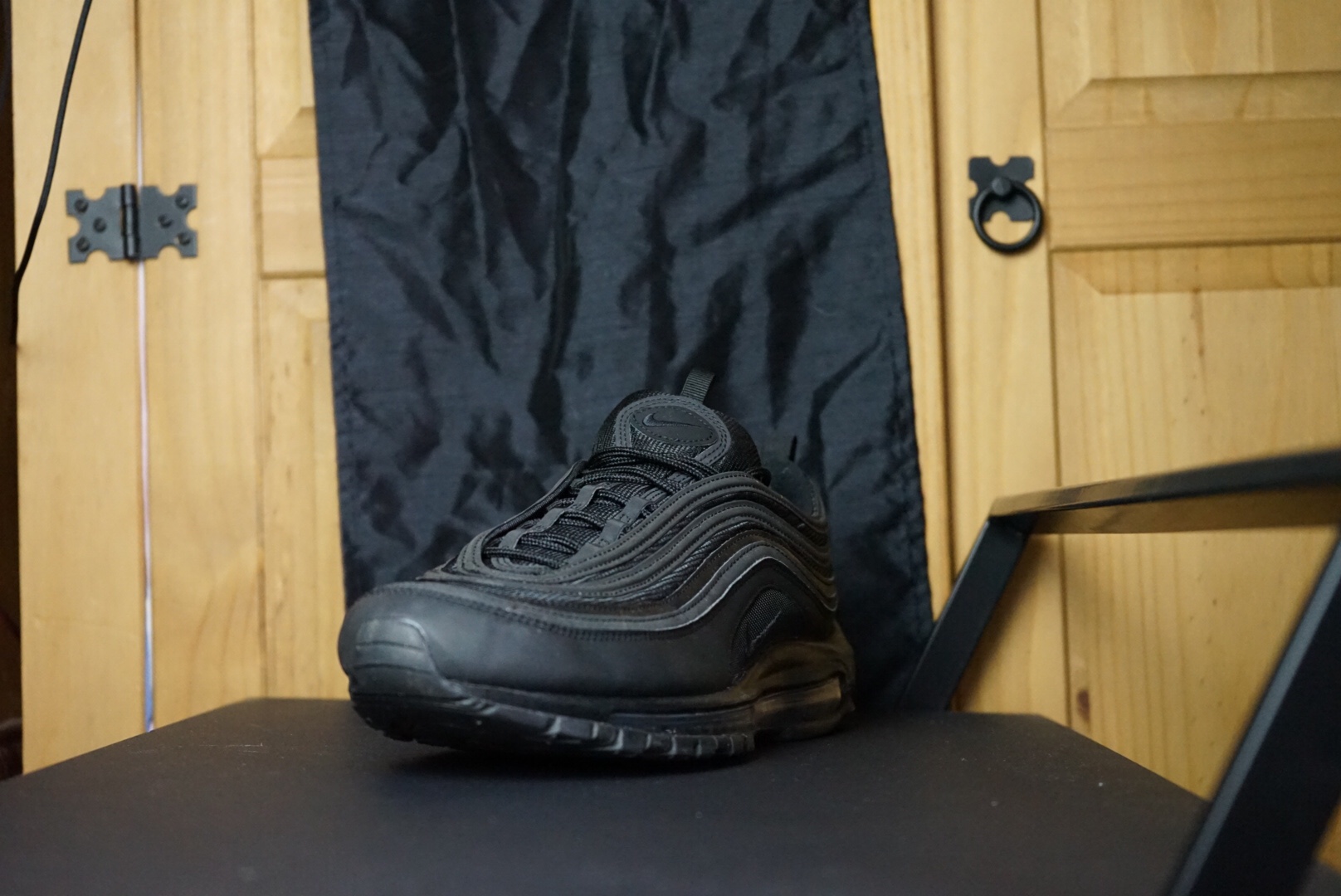
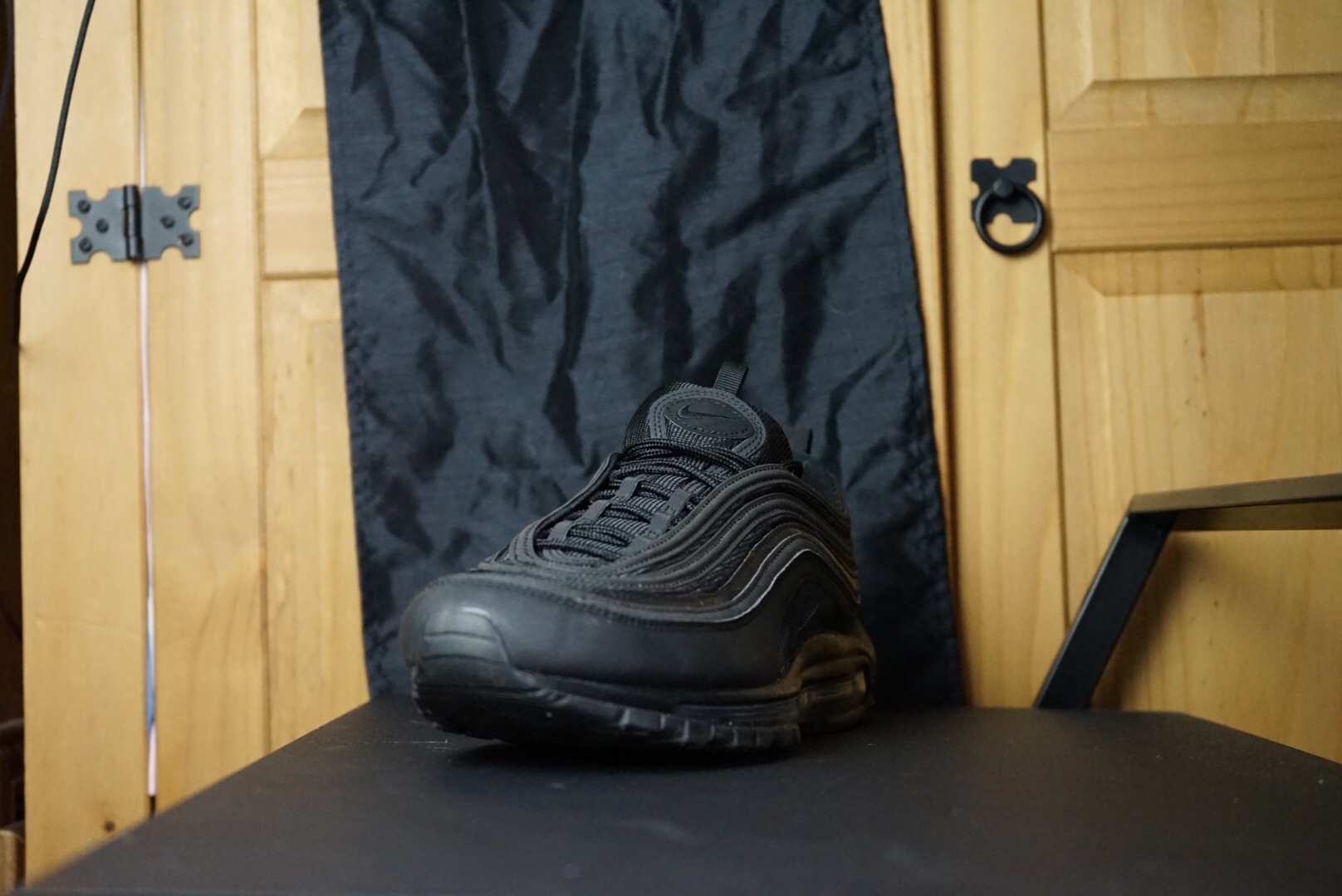
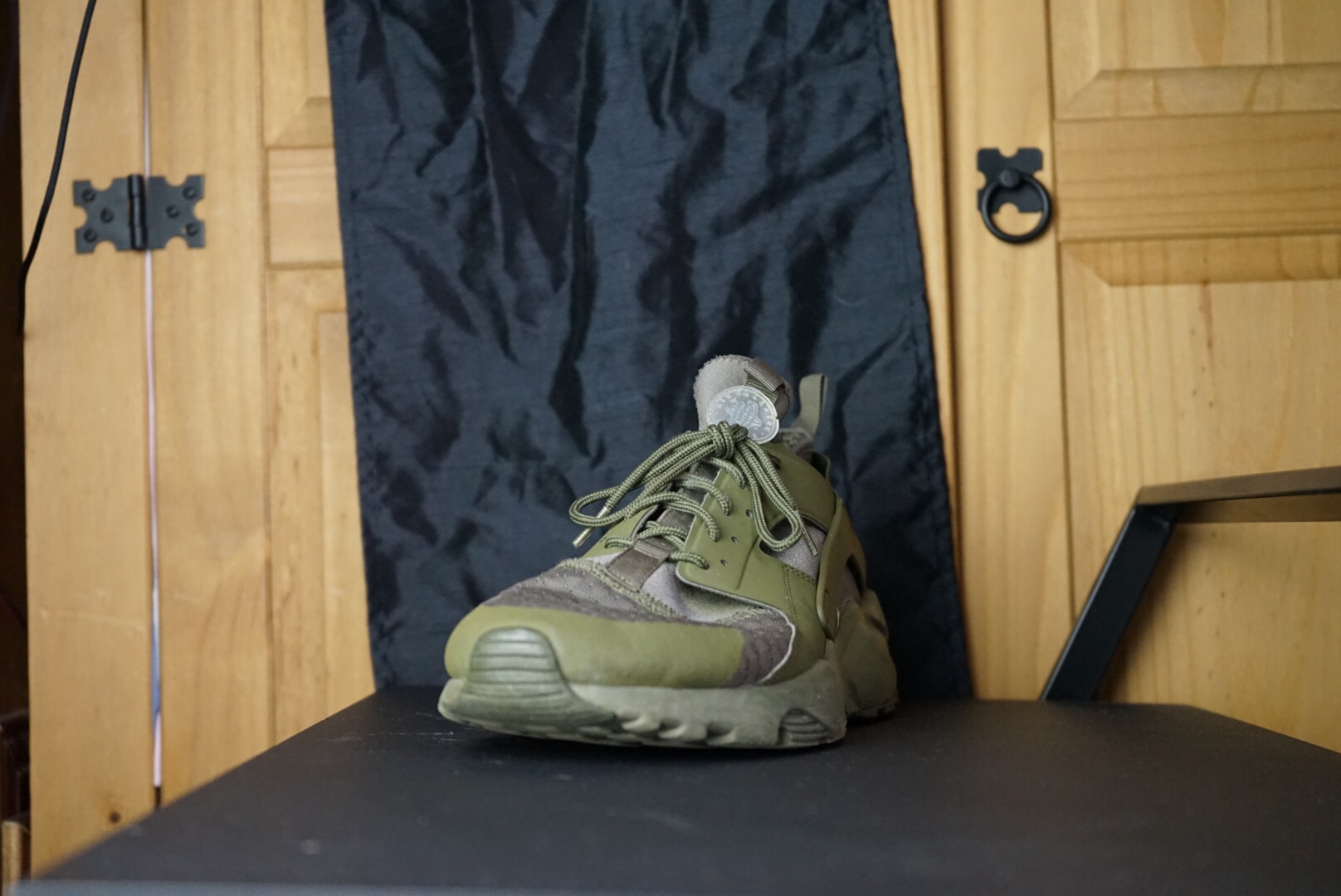
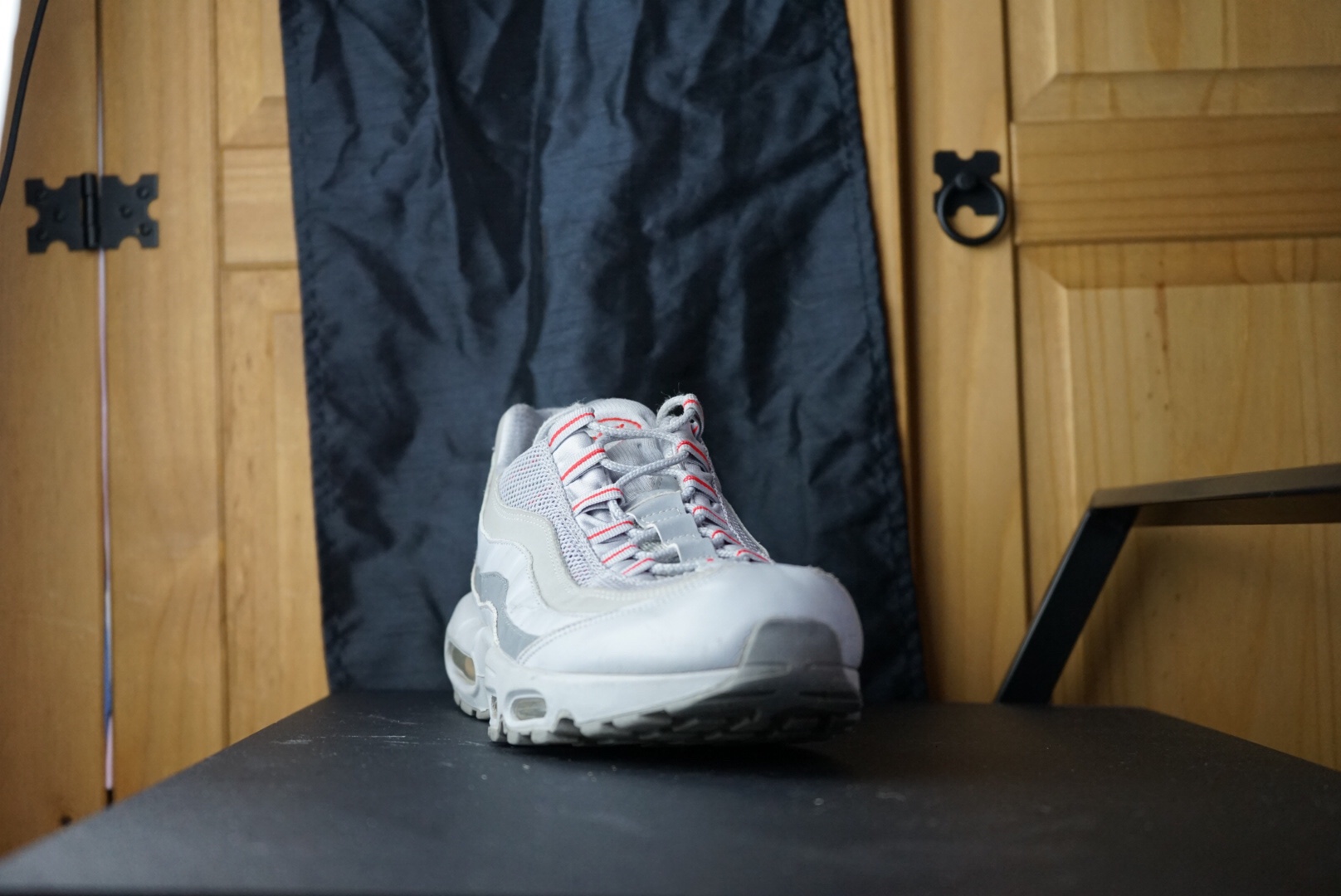
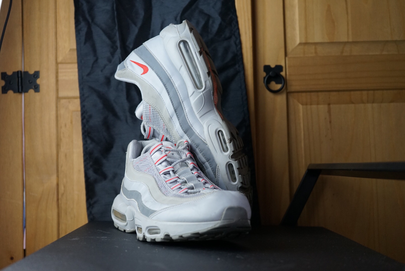
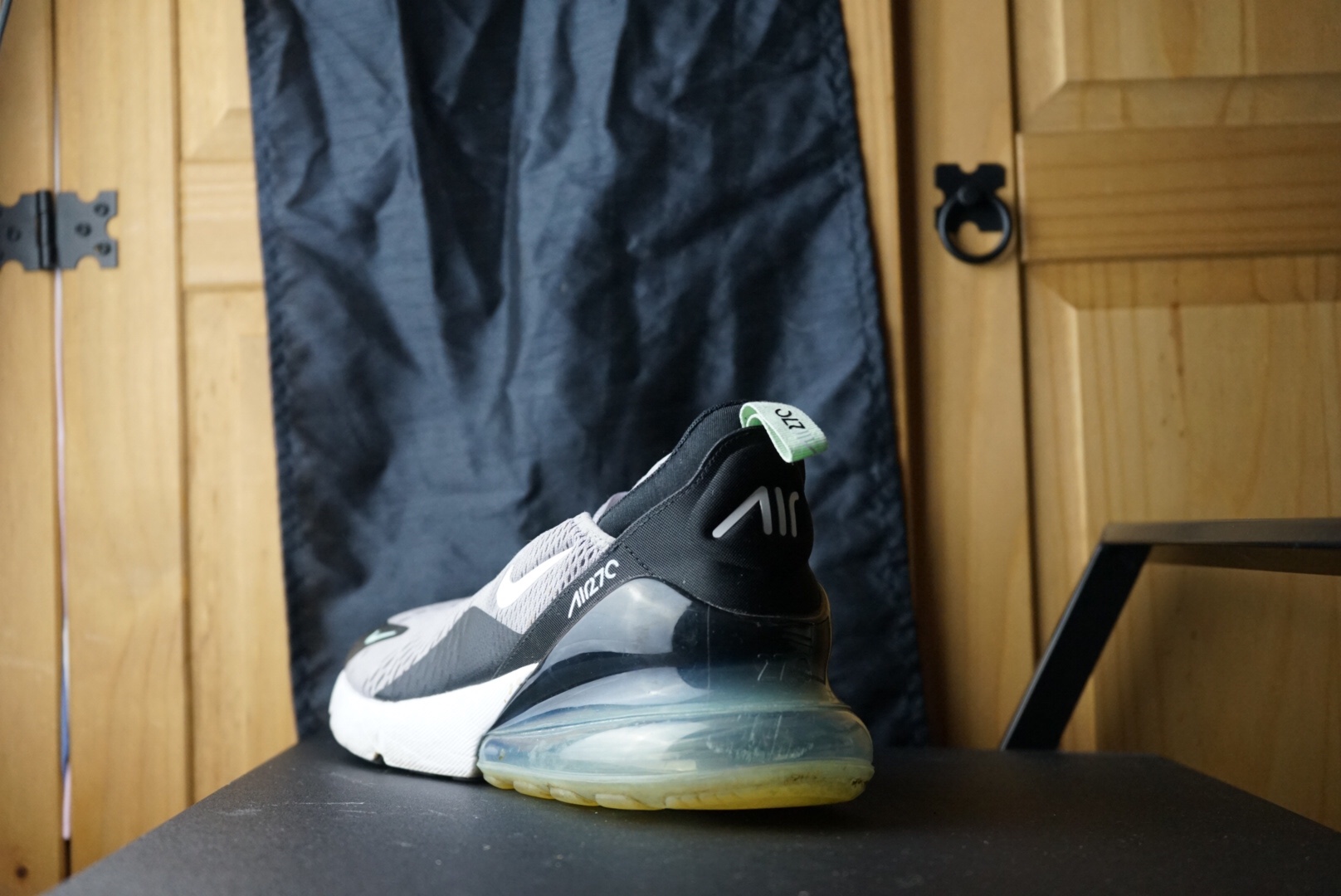
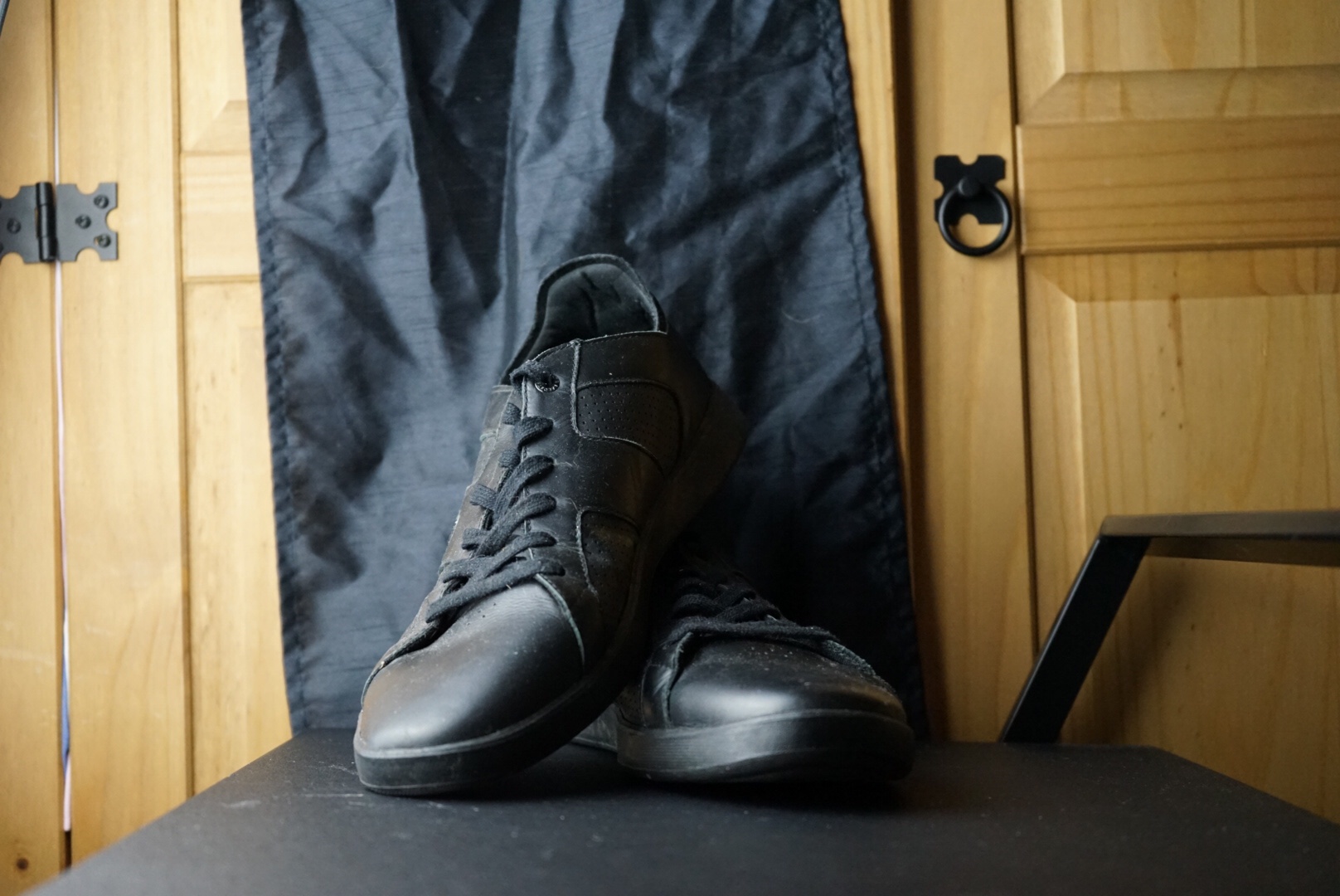
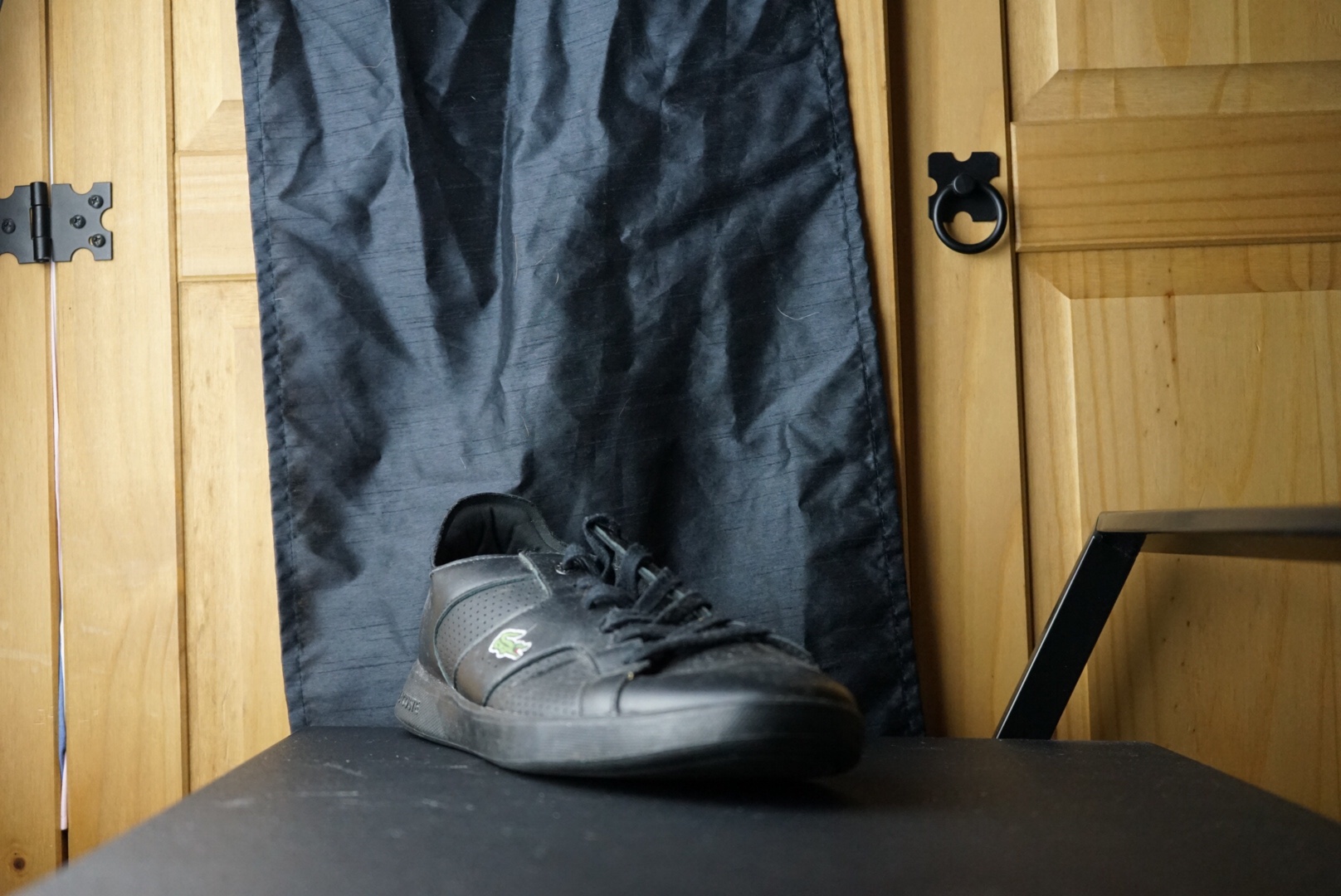
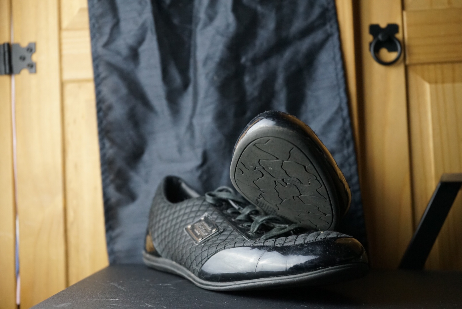
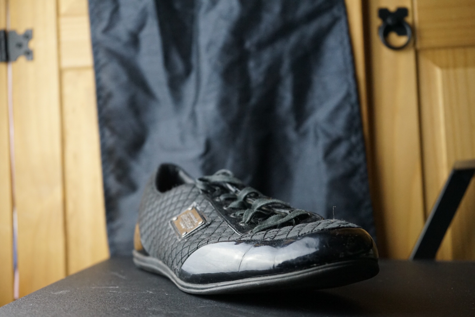
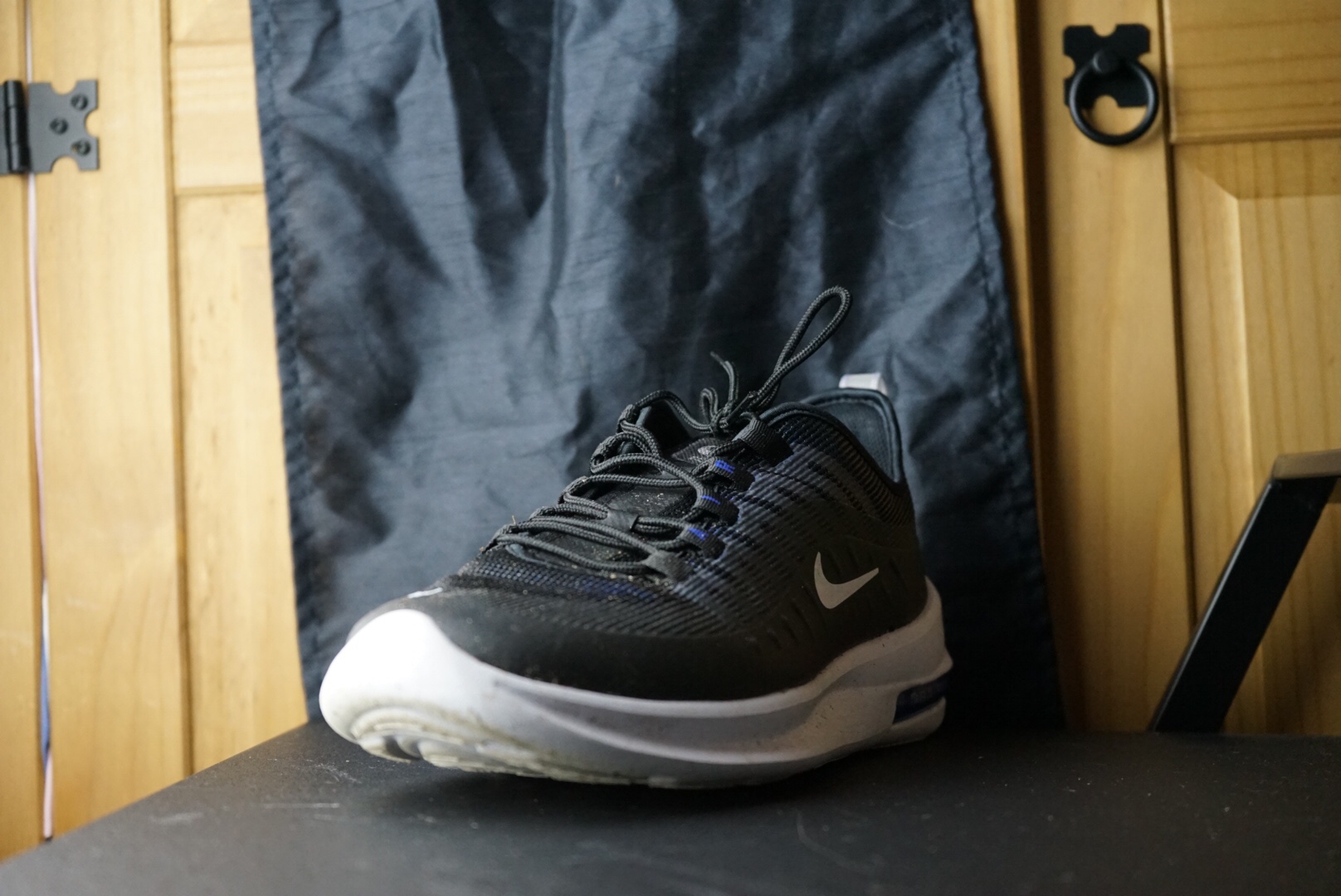
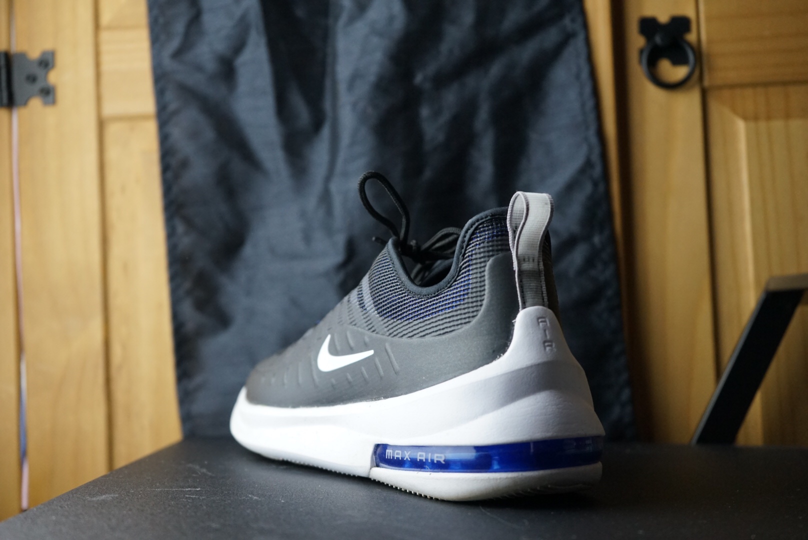
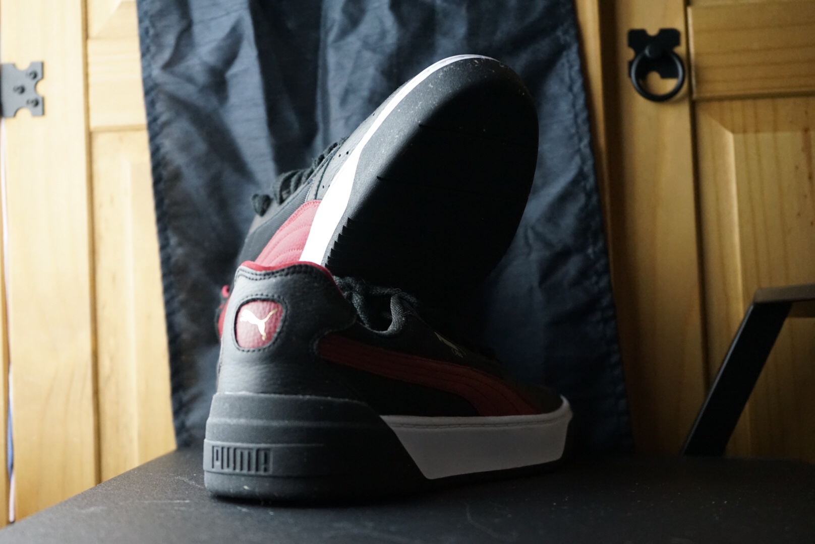
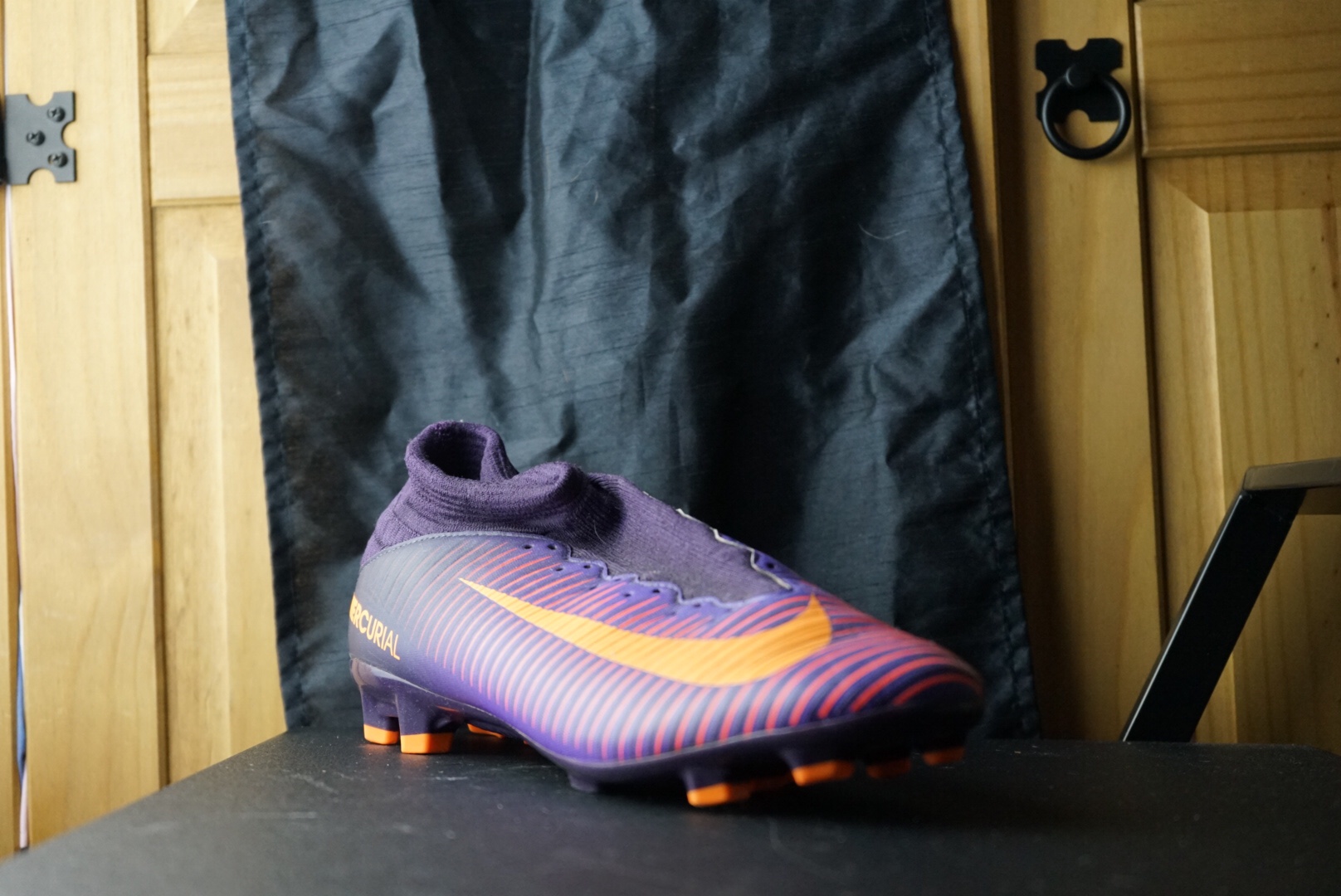
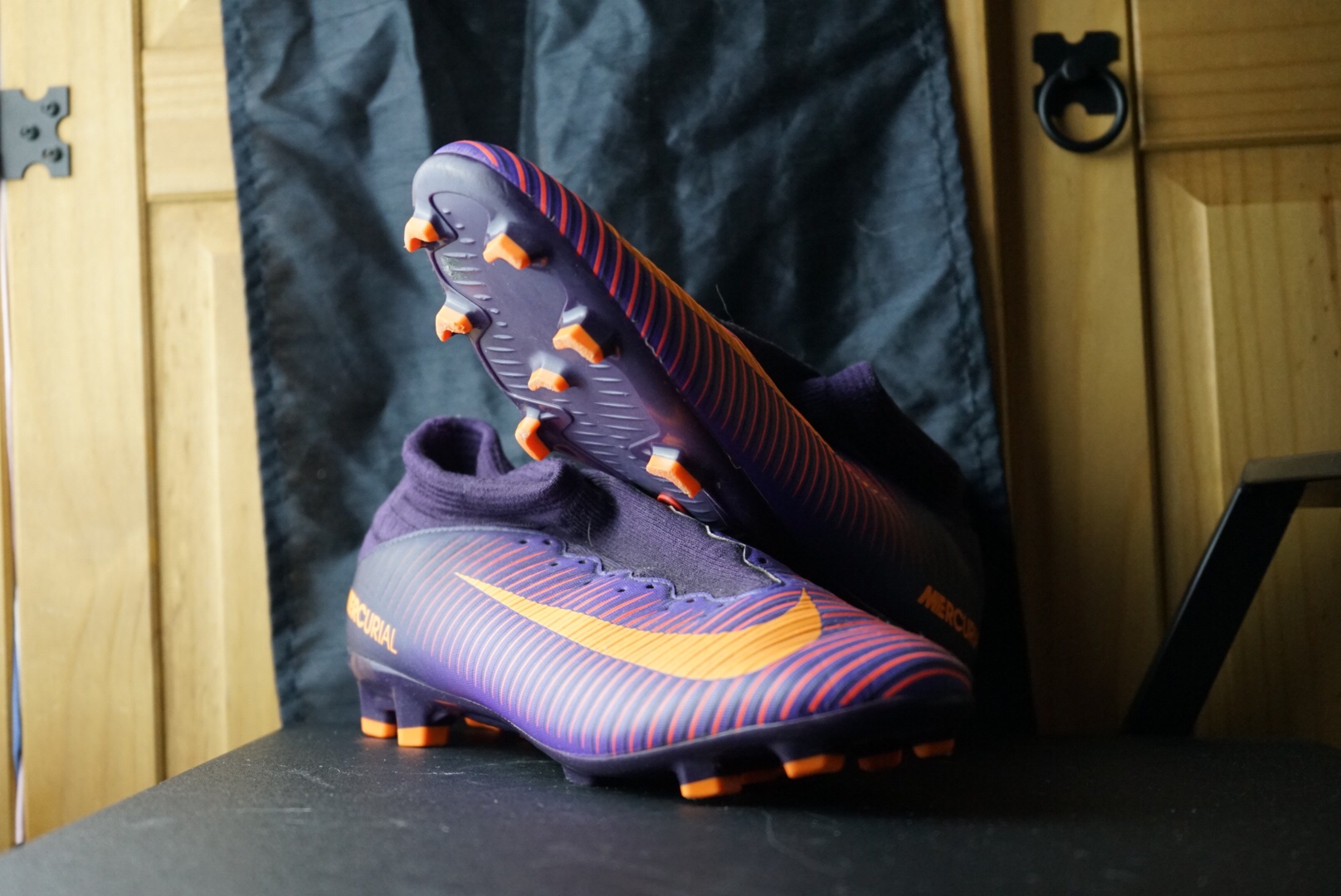
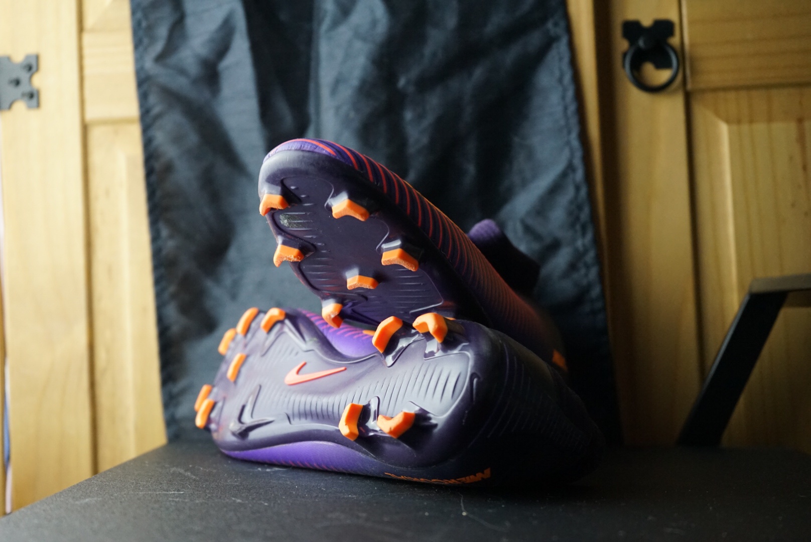
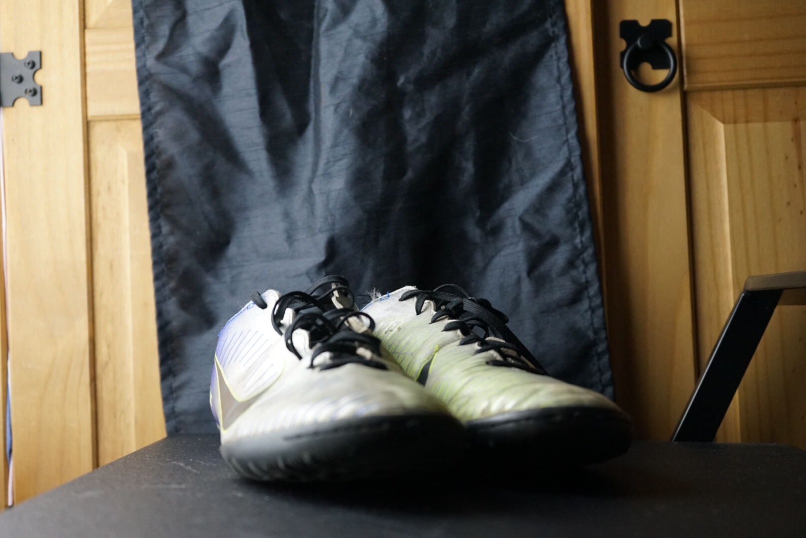
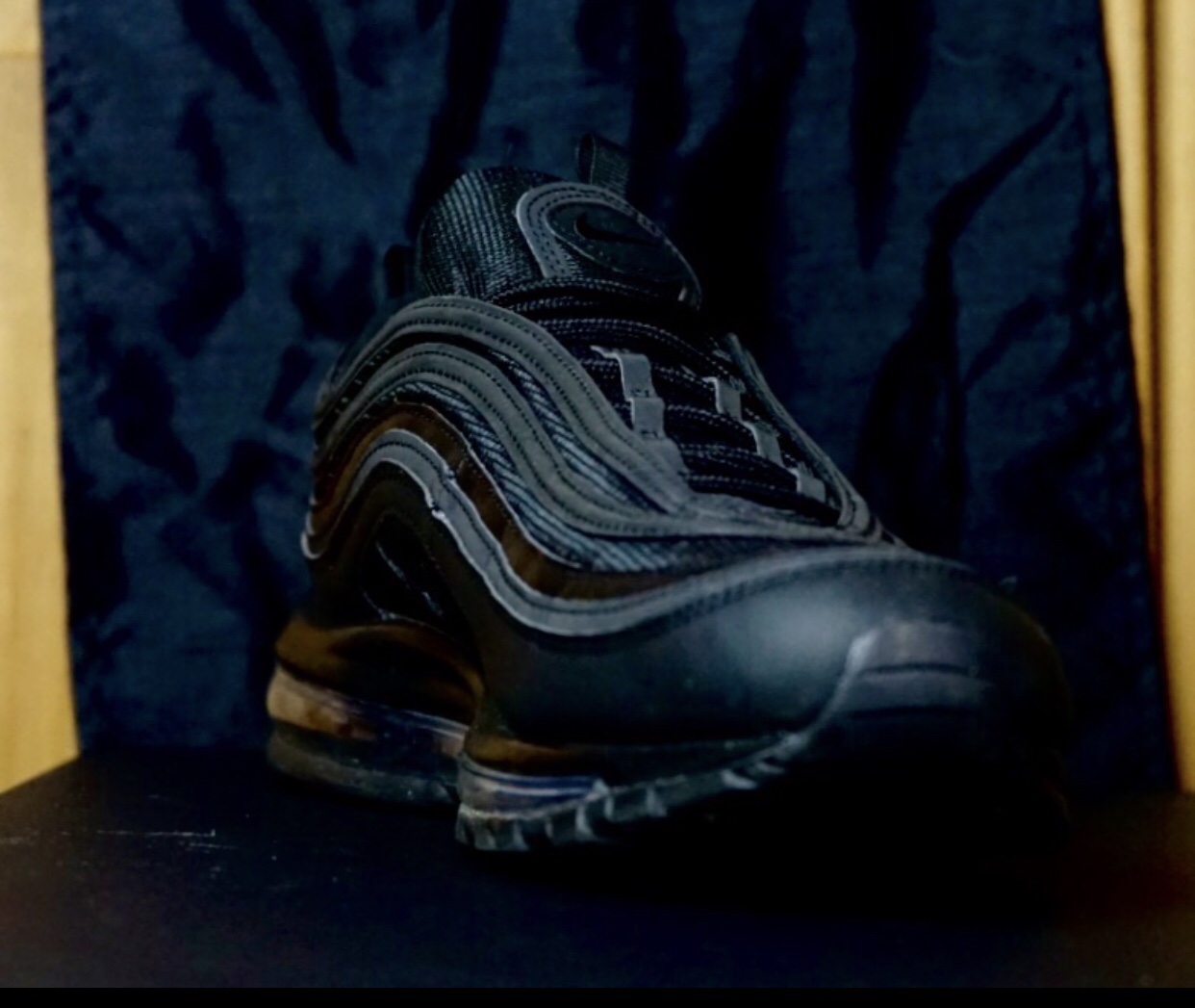
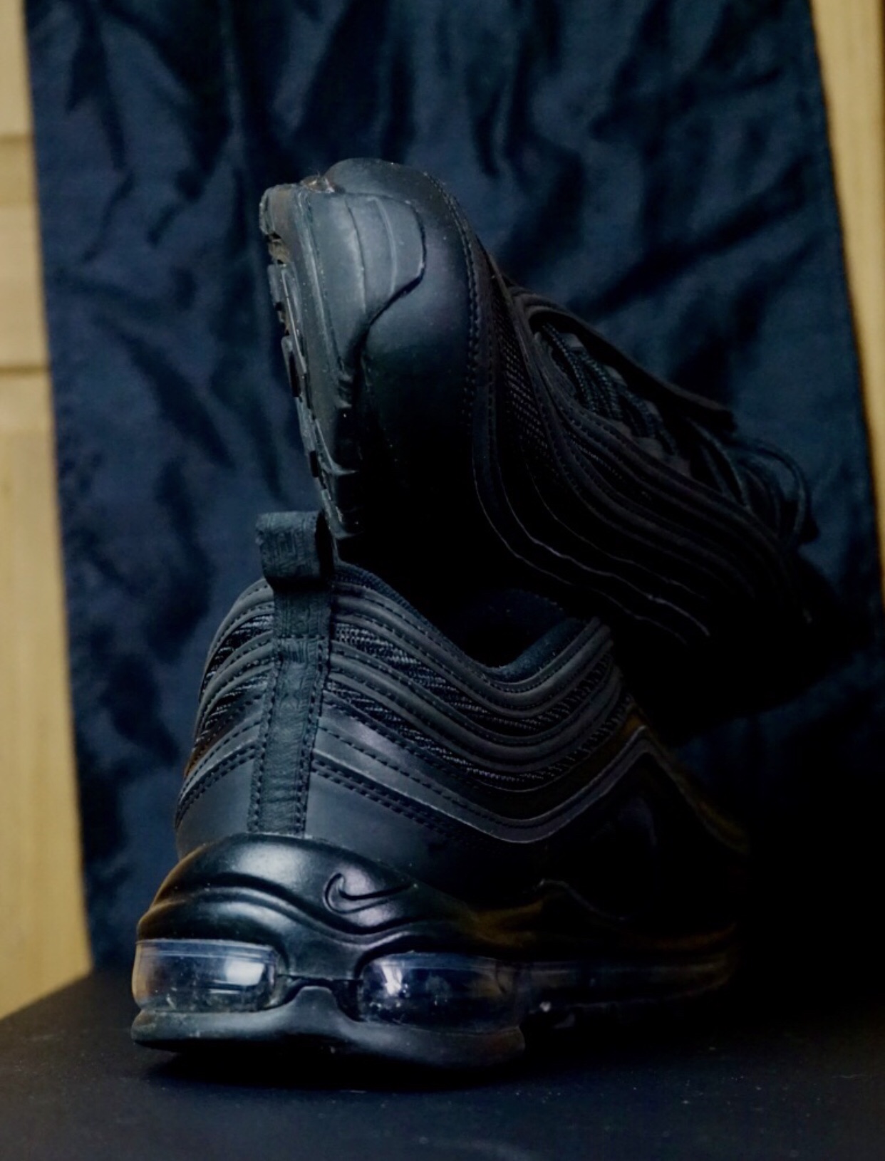
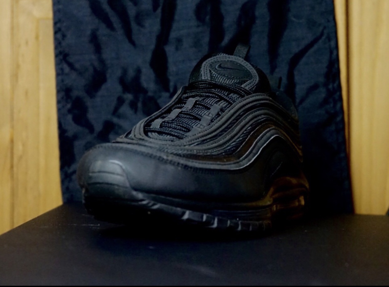
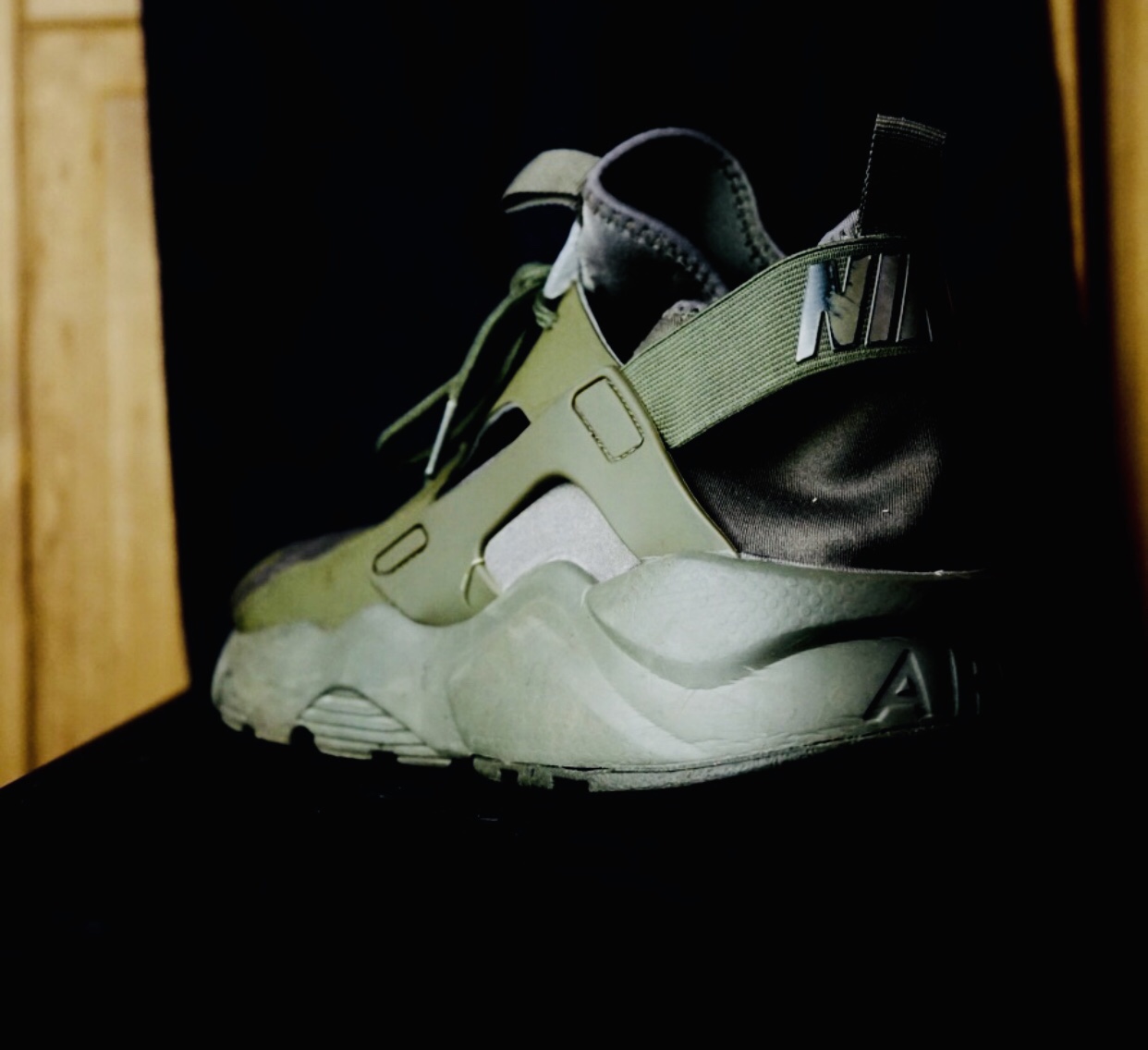
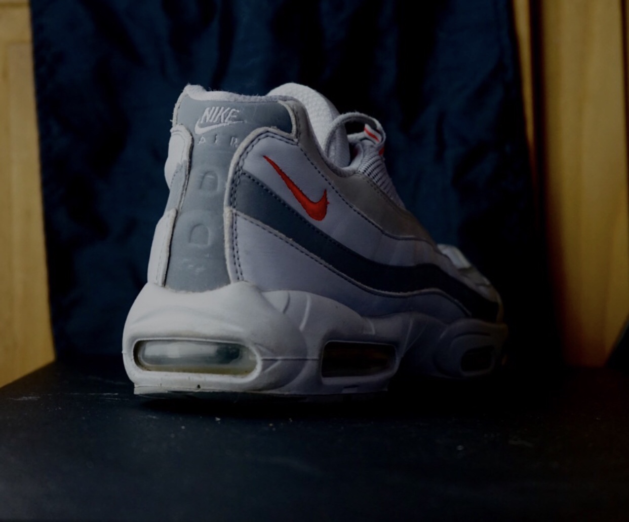
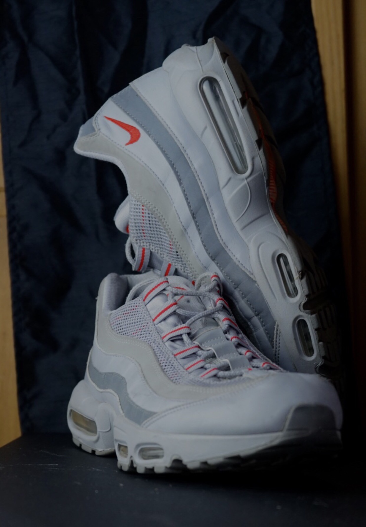

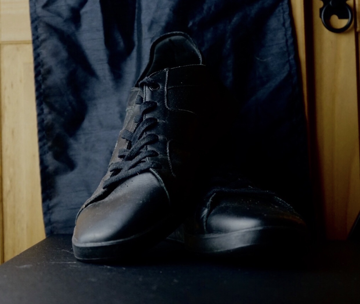
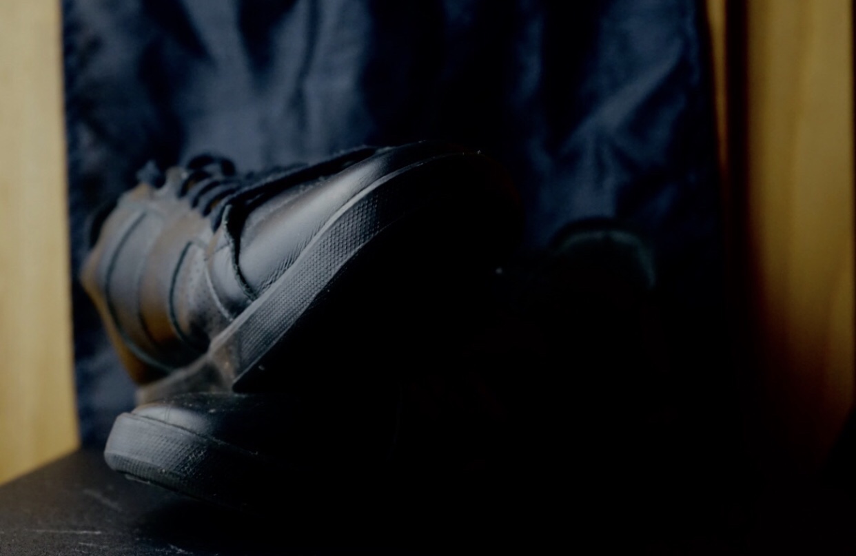
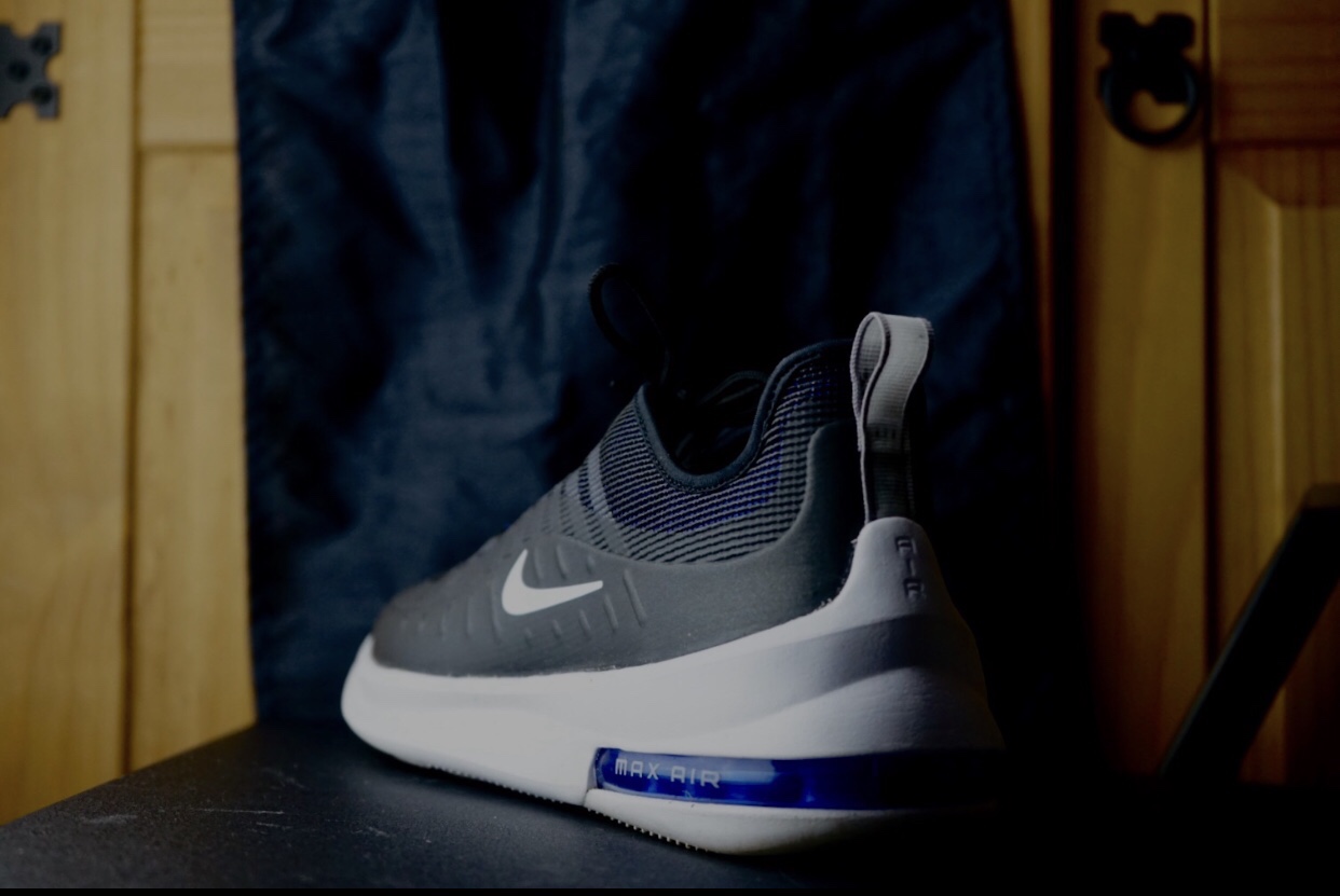
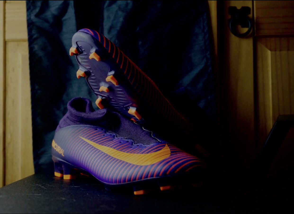
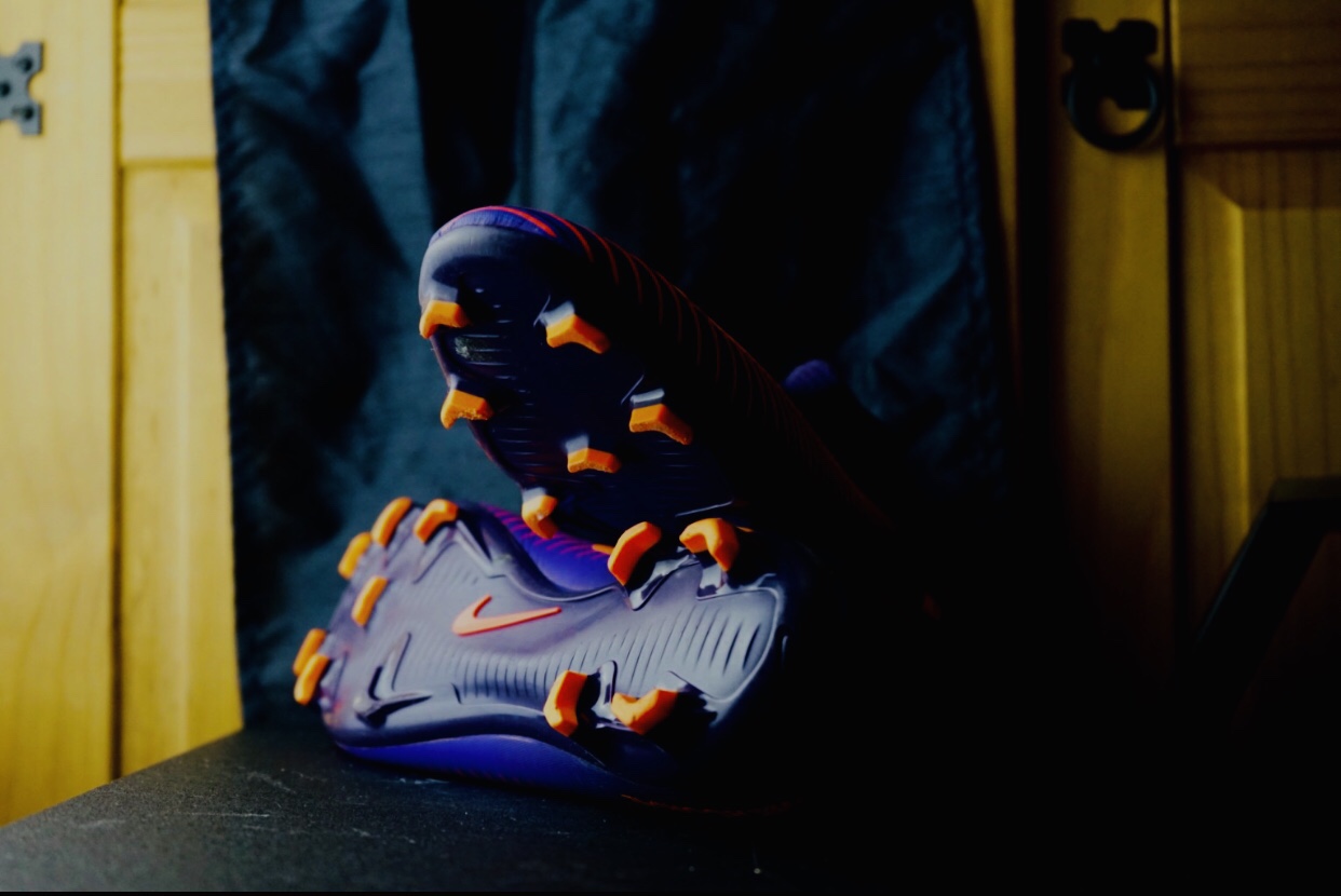
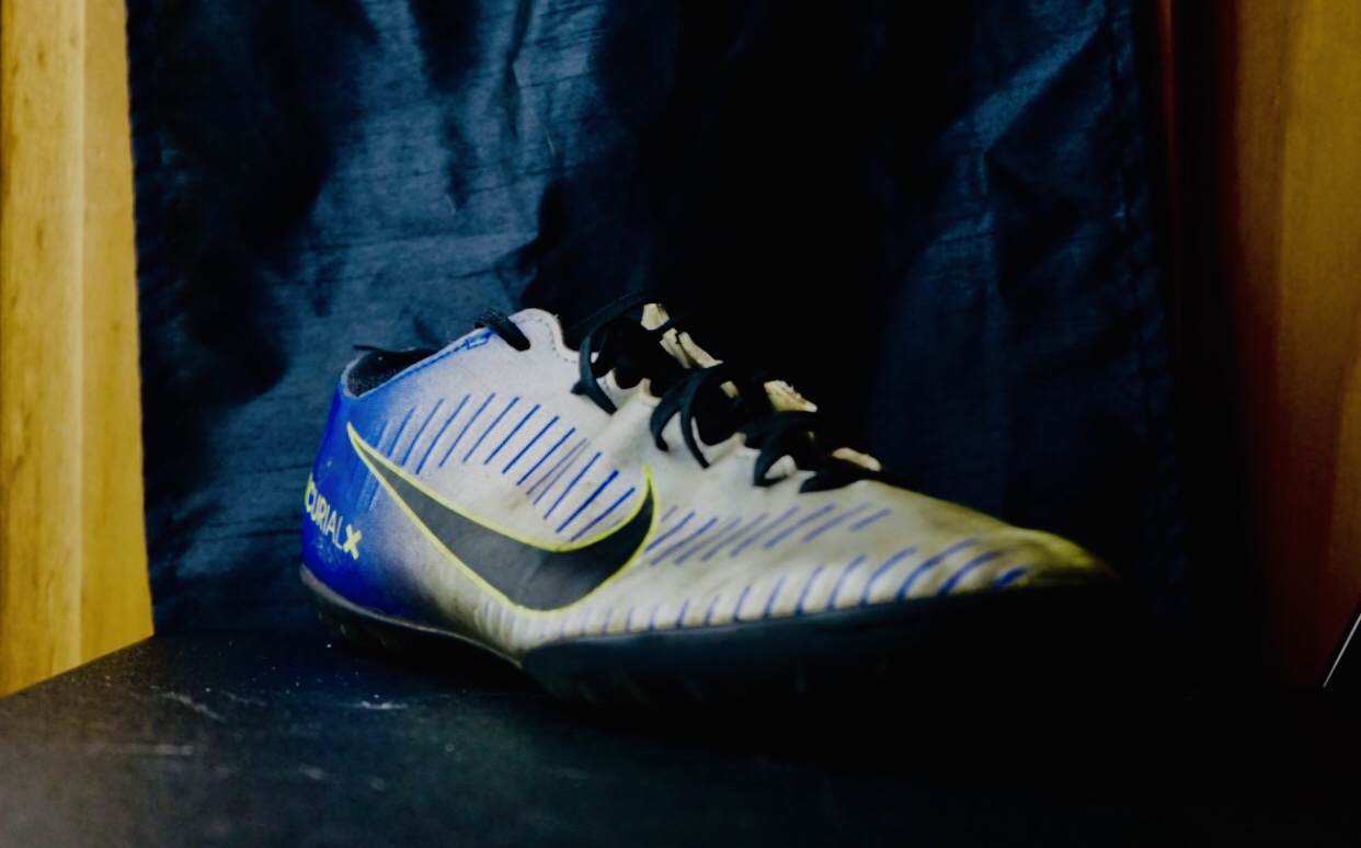
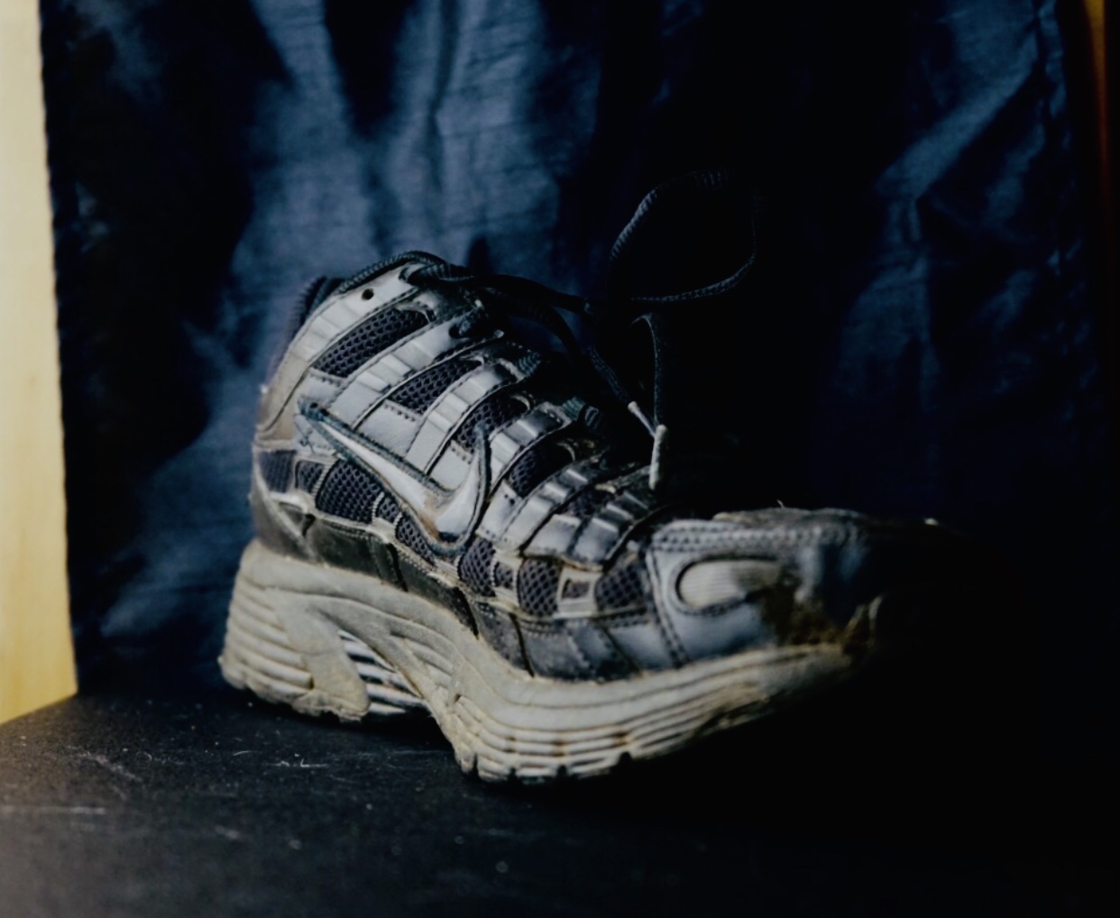
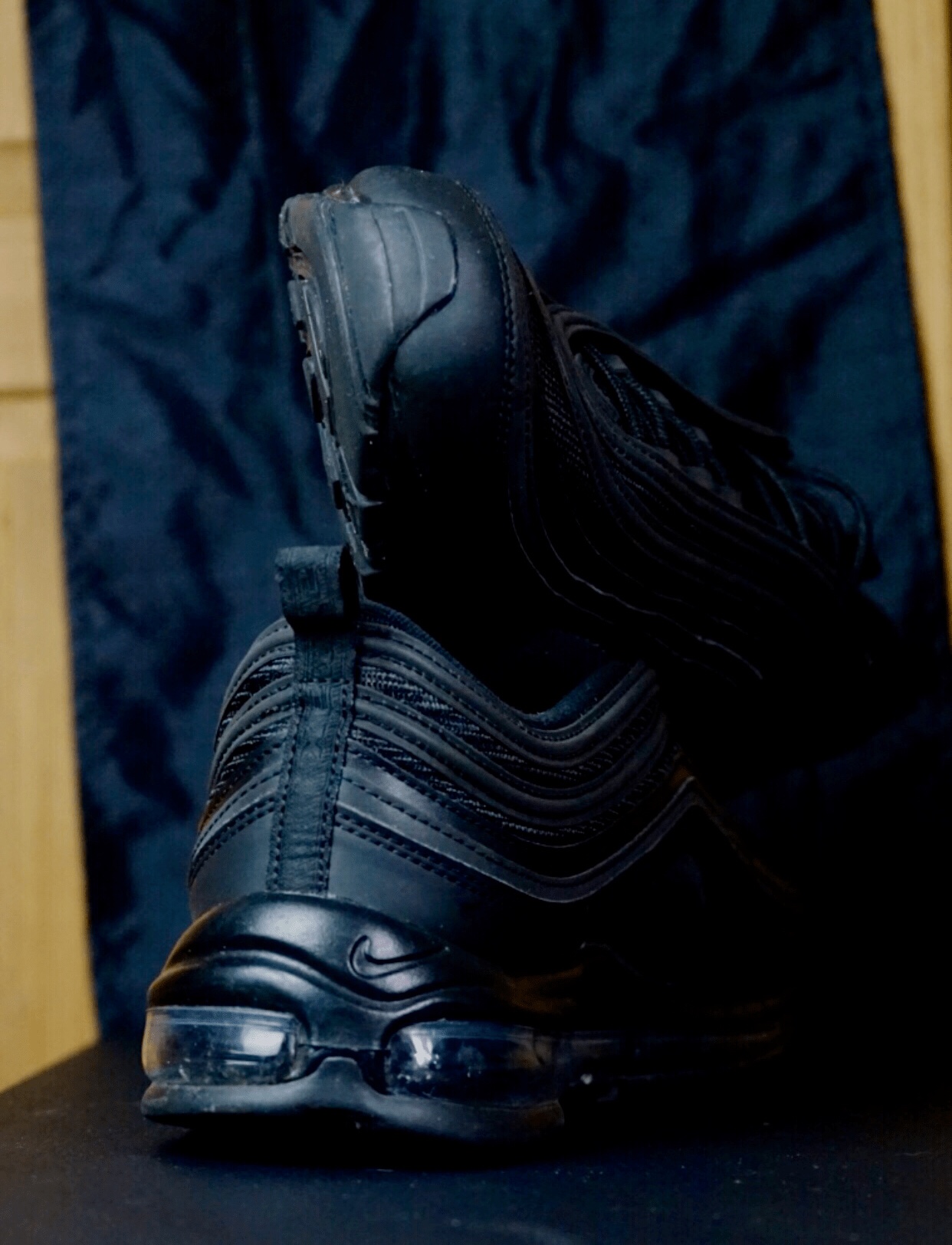
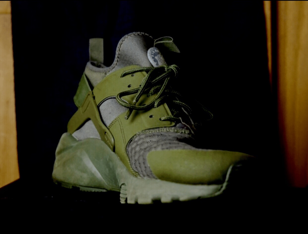
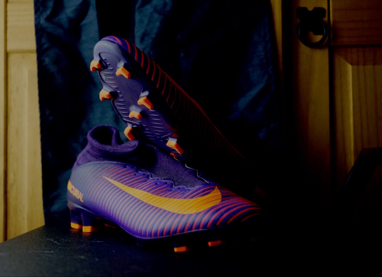
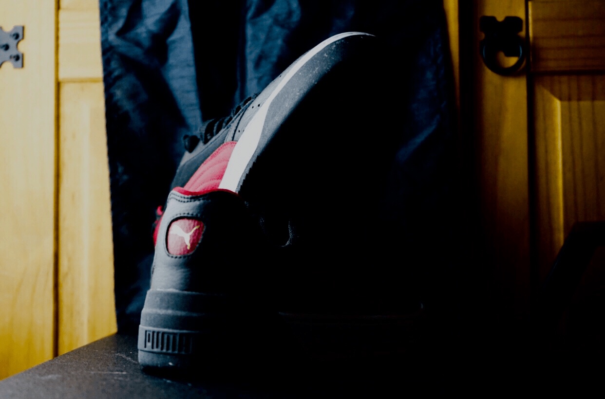
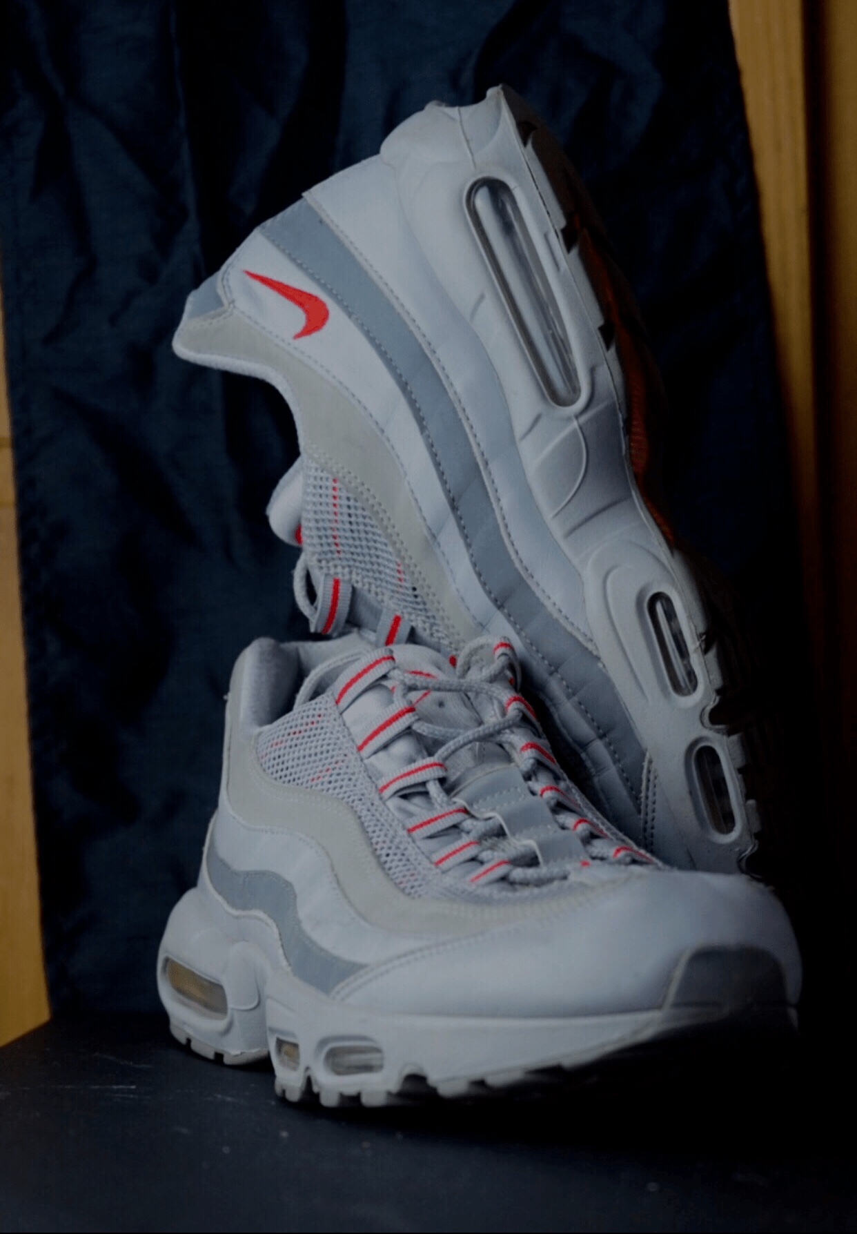
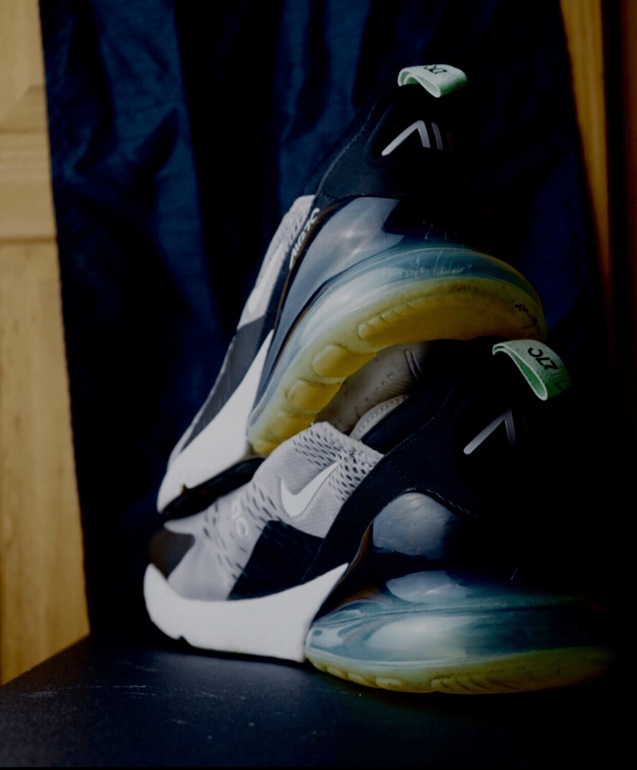


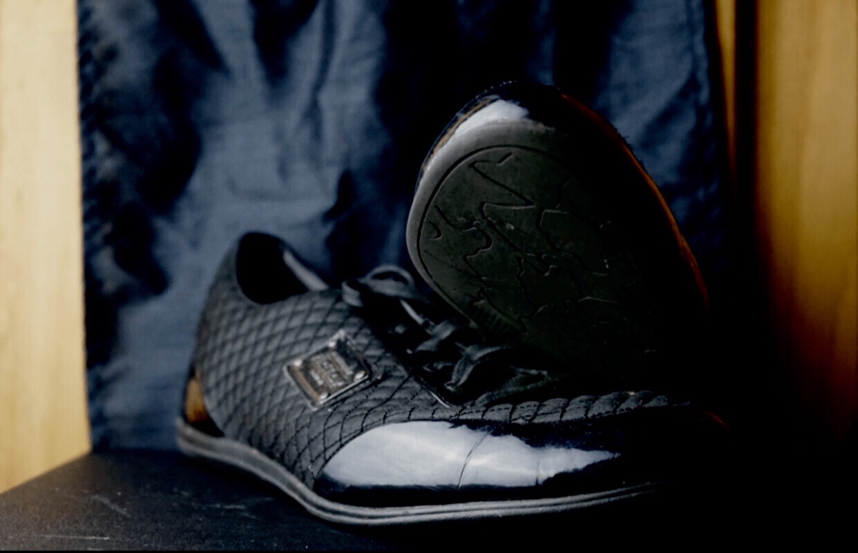
I picked 9 pictures here these pictures I captured are off mine and my brothers’ footwear which are off sneakers, shoes, and football boots. If you can see more specifics of the tones, form and colours of the boots, the lighter colour footwear is more distinctive.
As I think my goal was to catch the light that represents the trainer, the colours, tones and shadows on the product I have captured are really interesting to me. I chose these as my final typology footwear photographs. These pictures shows what I have been trying to focus on.
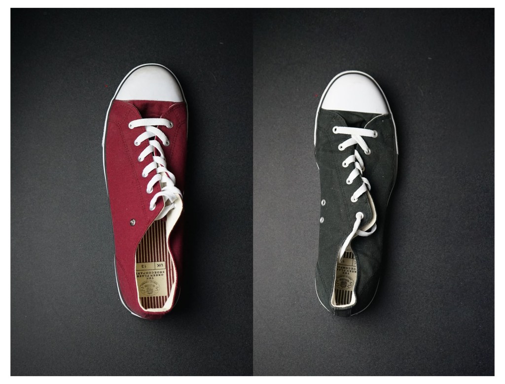
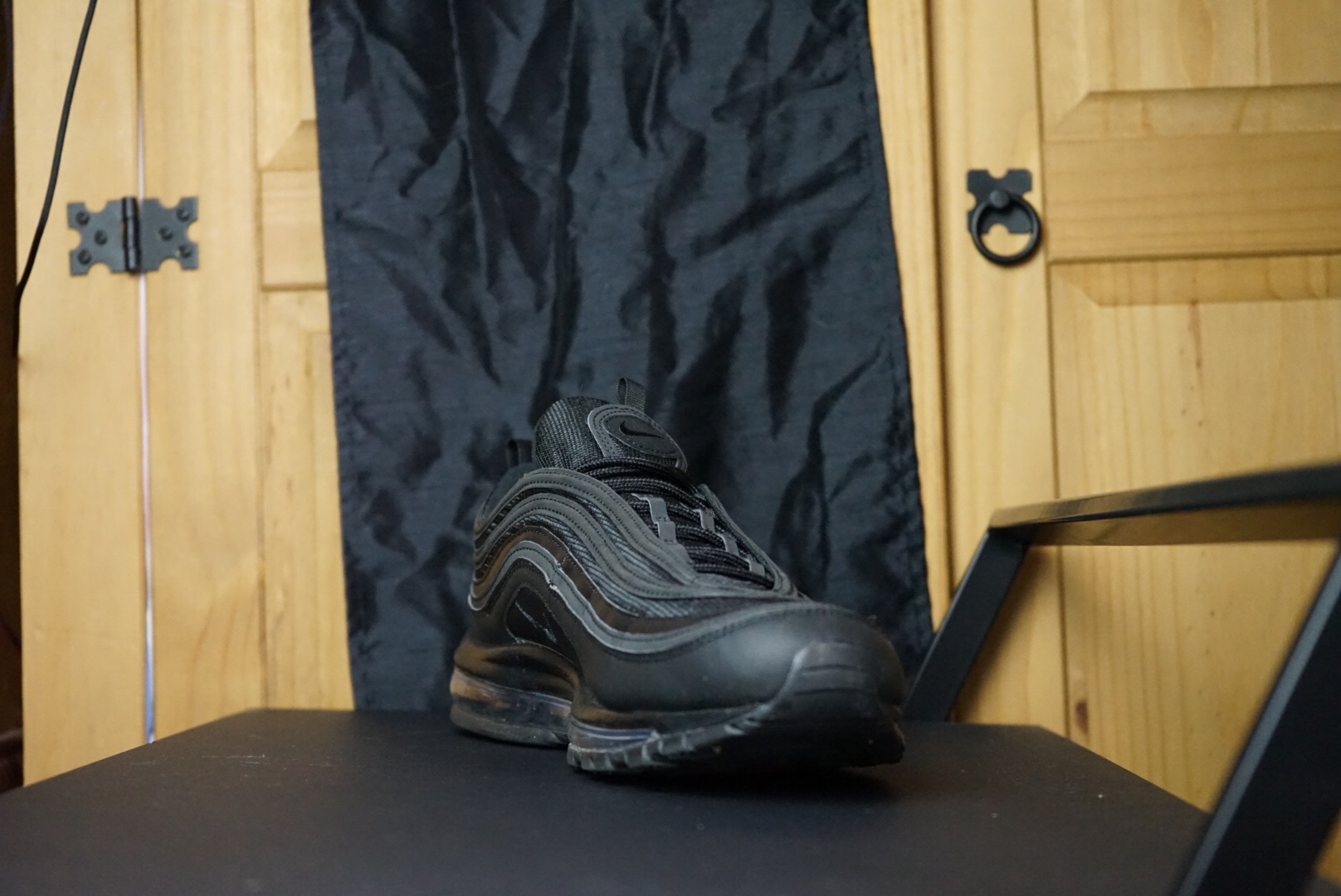
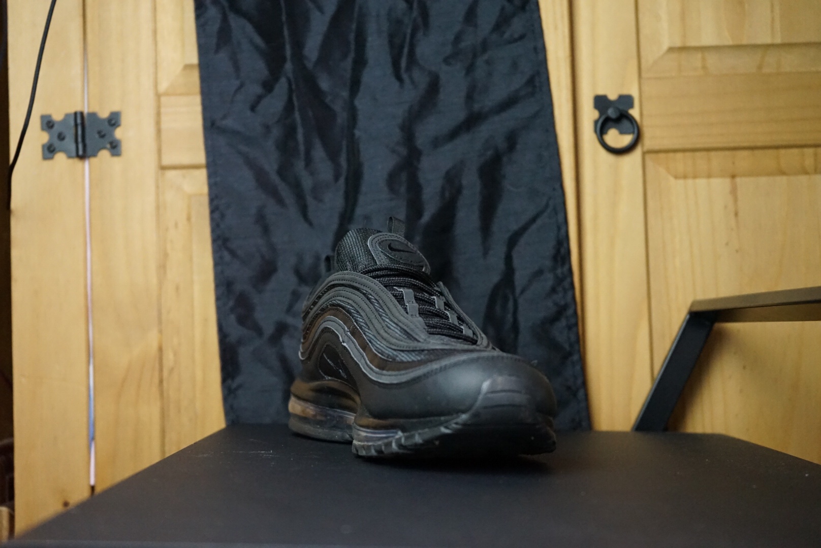
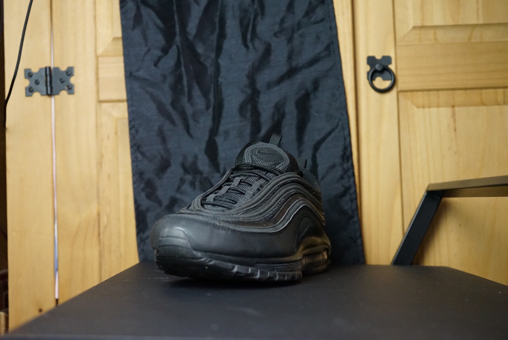
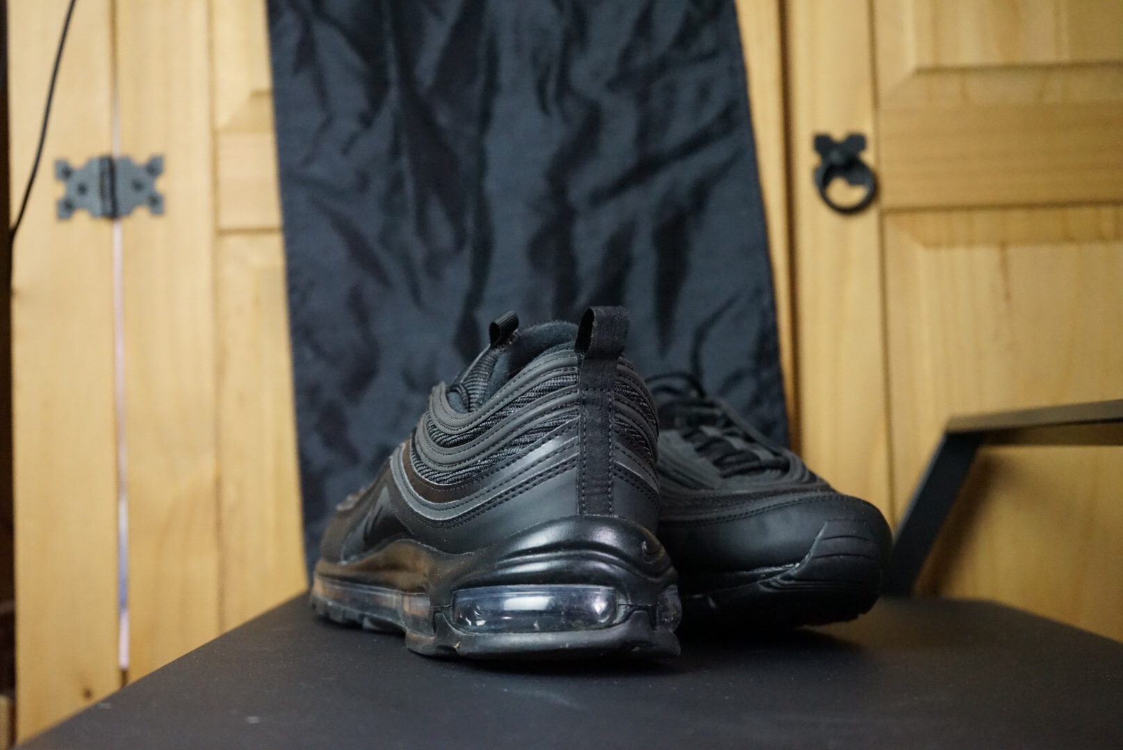
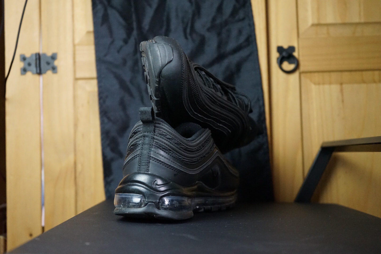
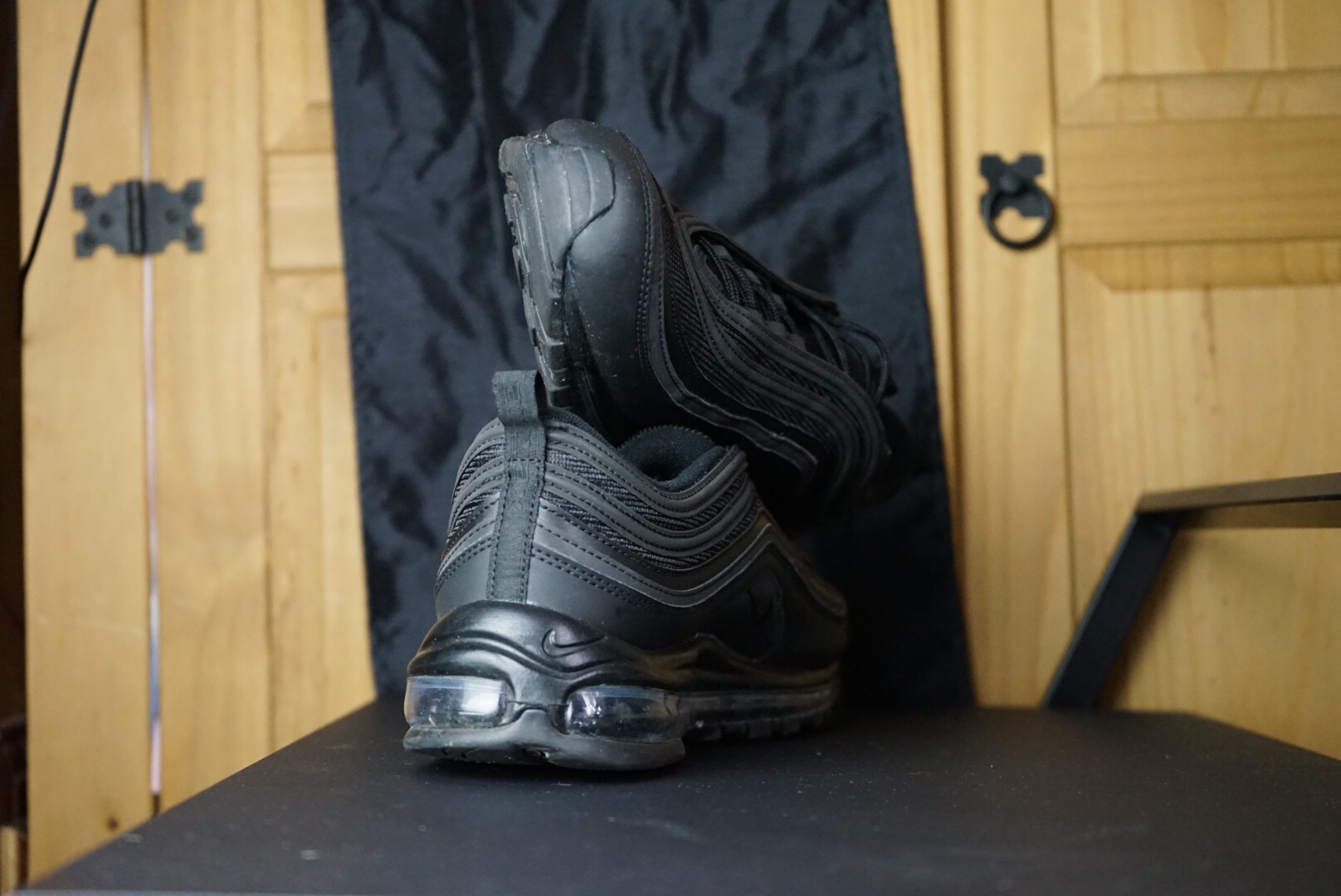
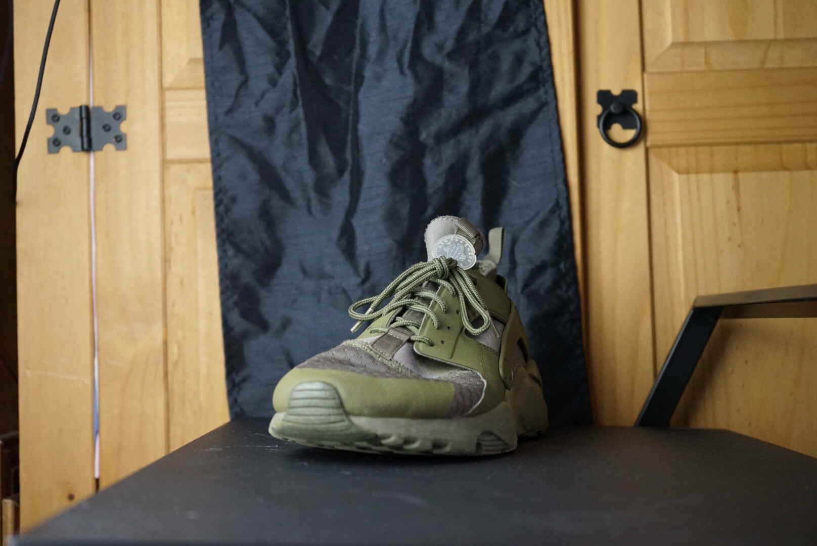
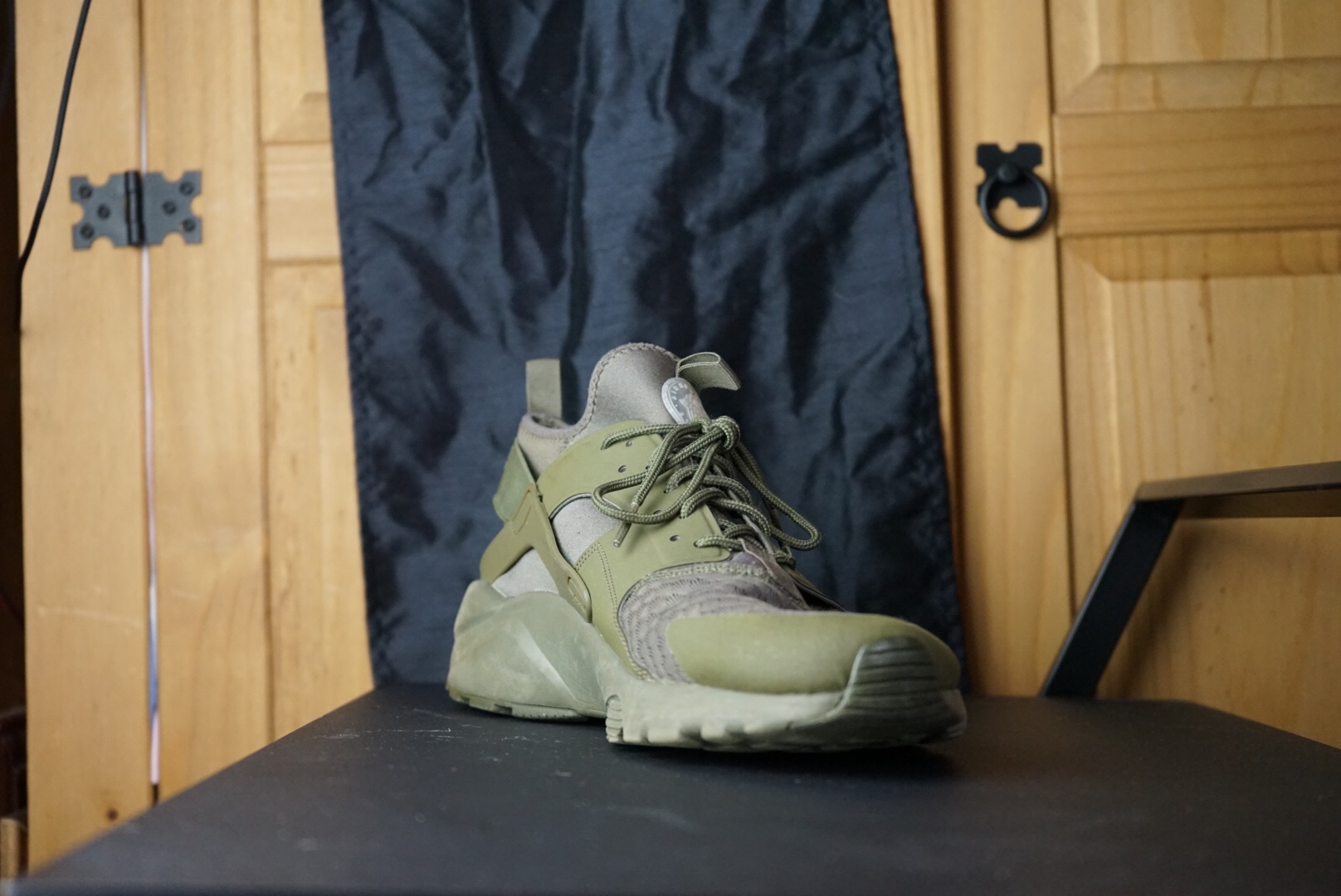
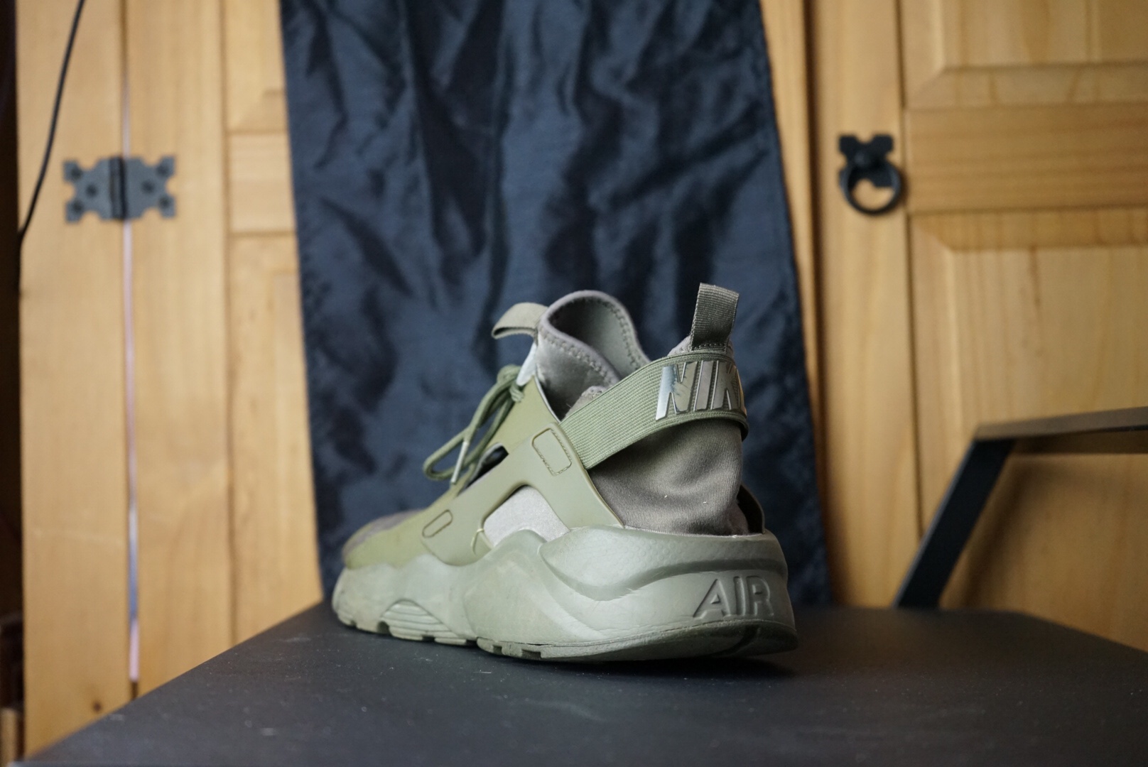
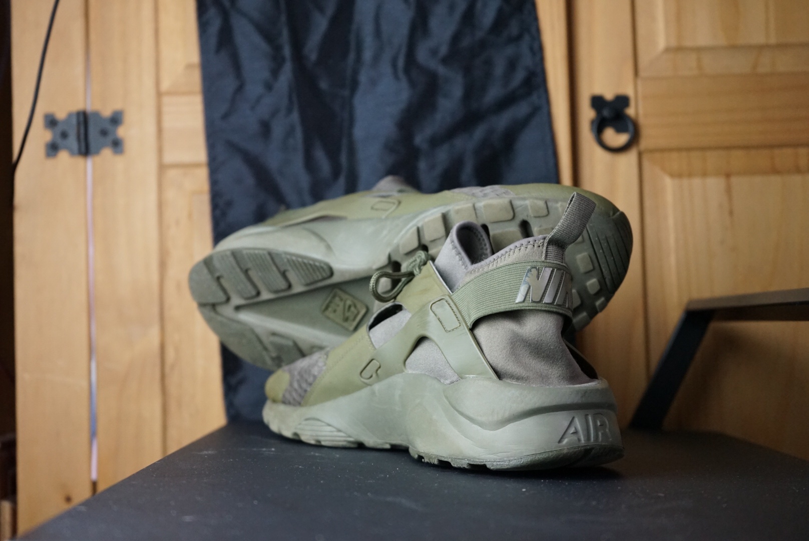
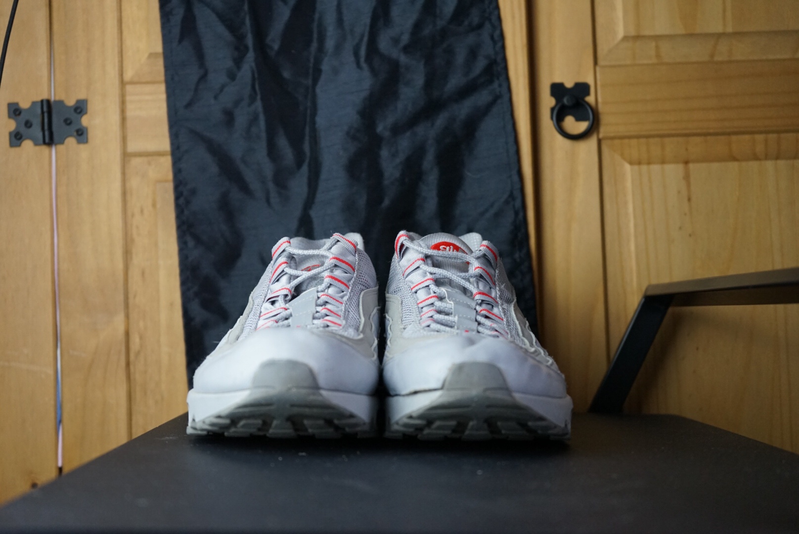
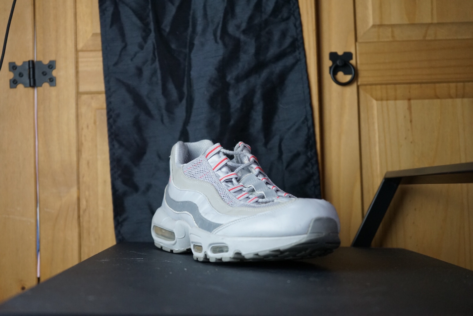
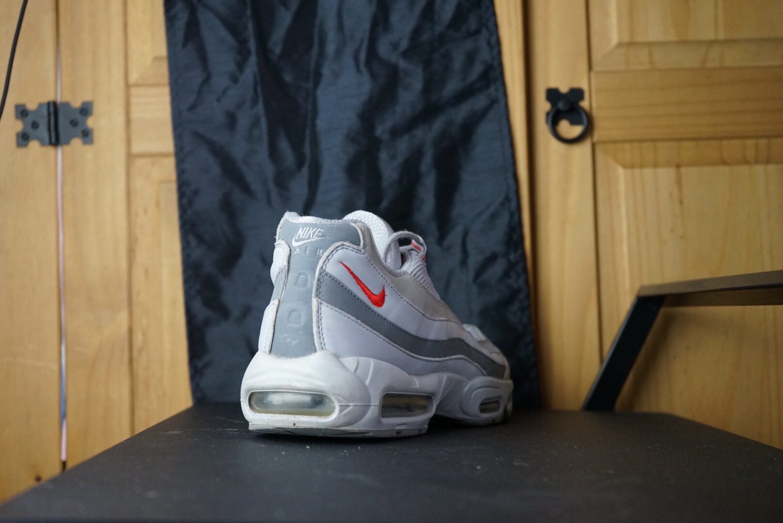
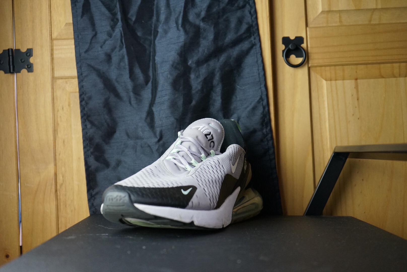
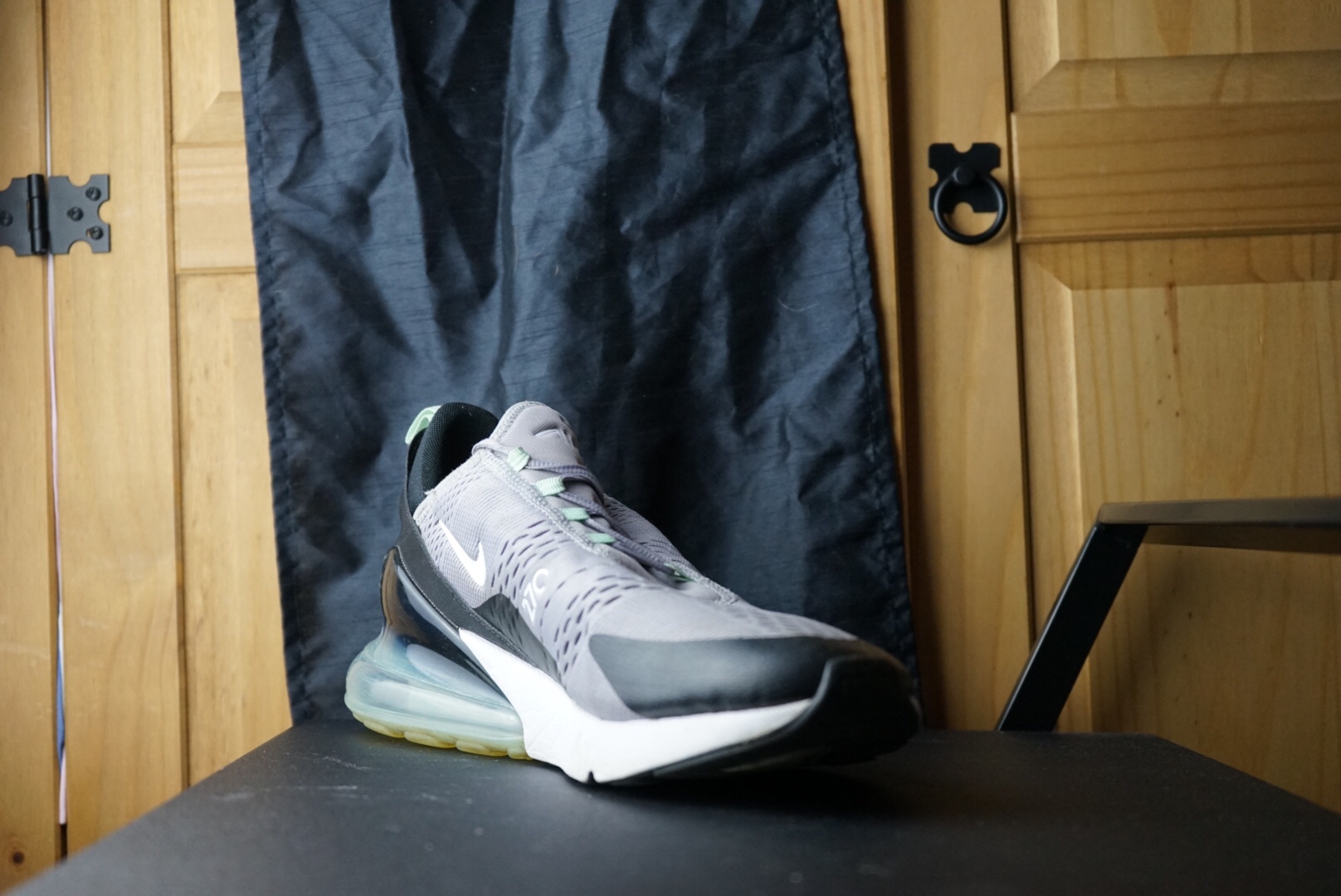
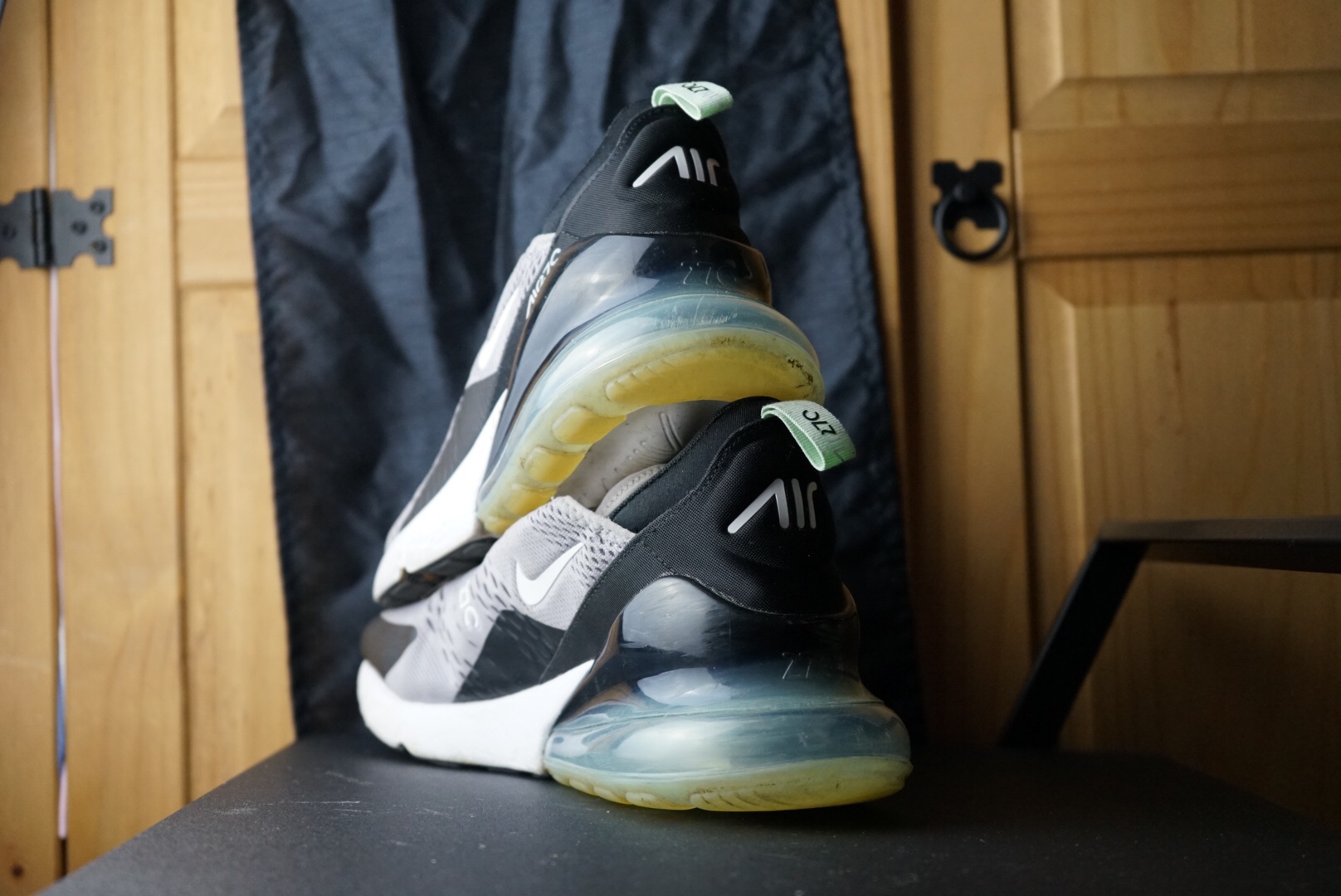
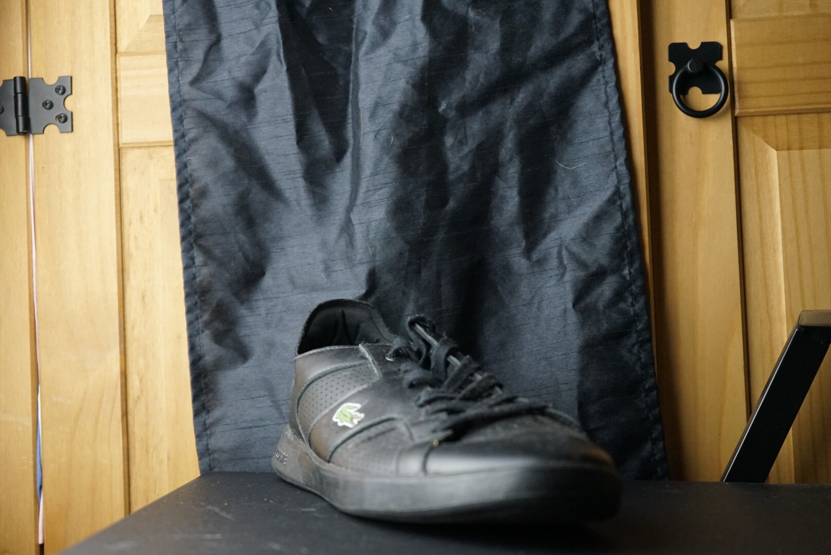
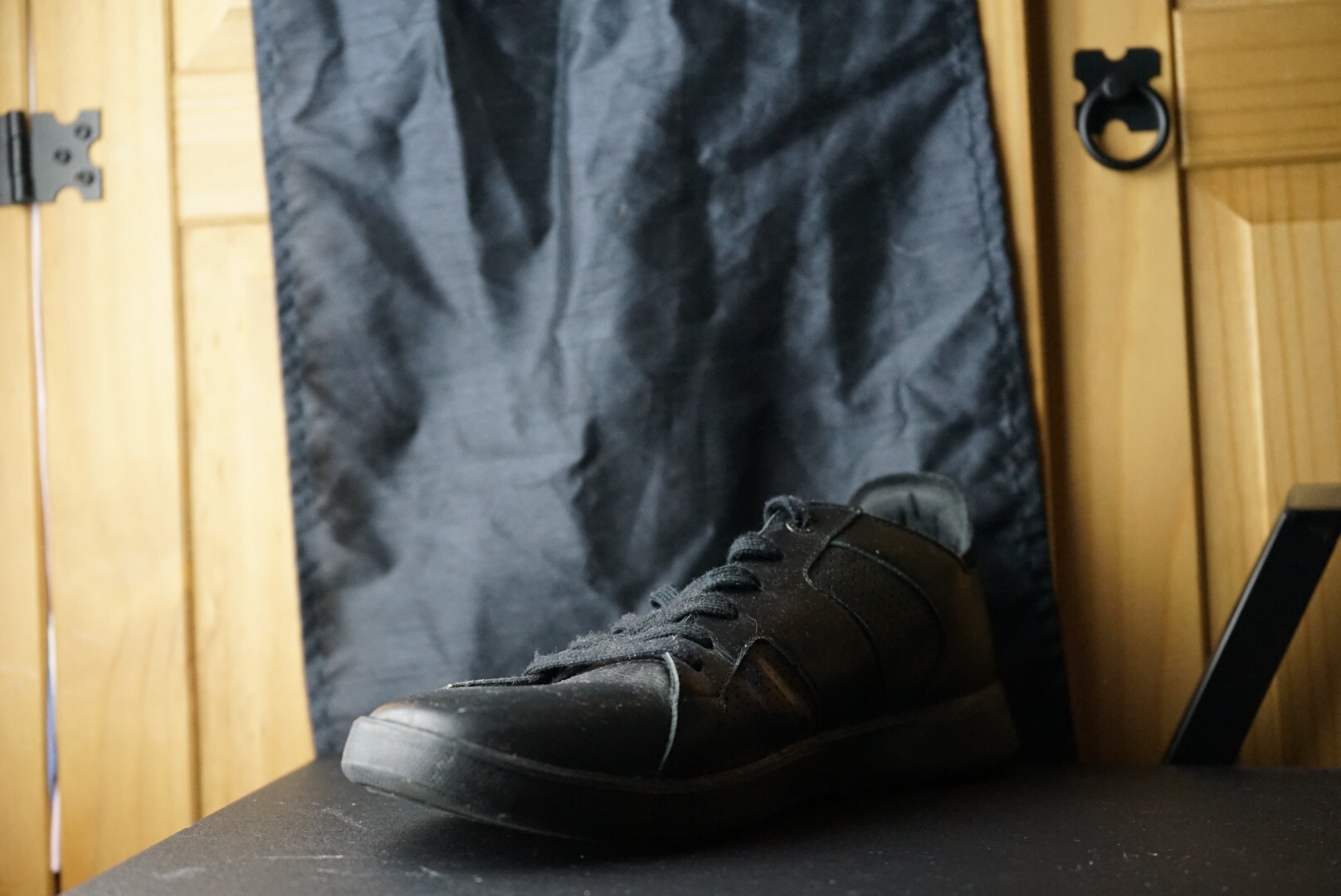
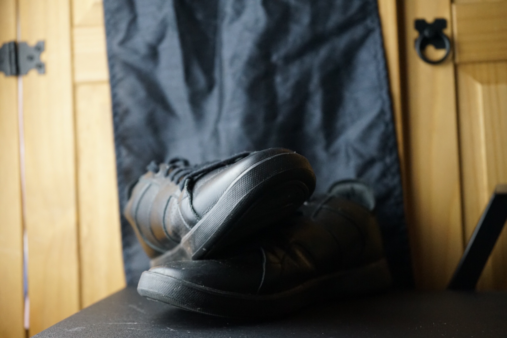
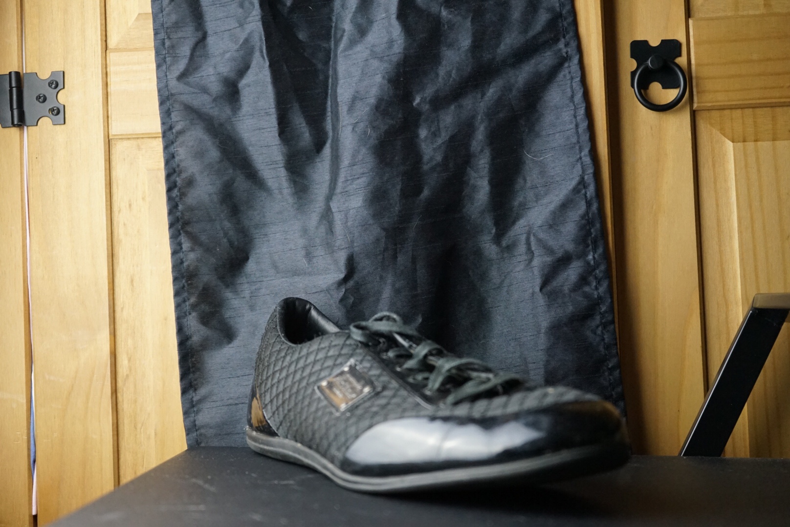
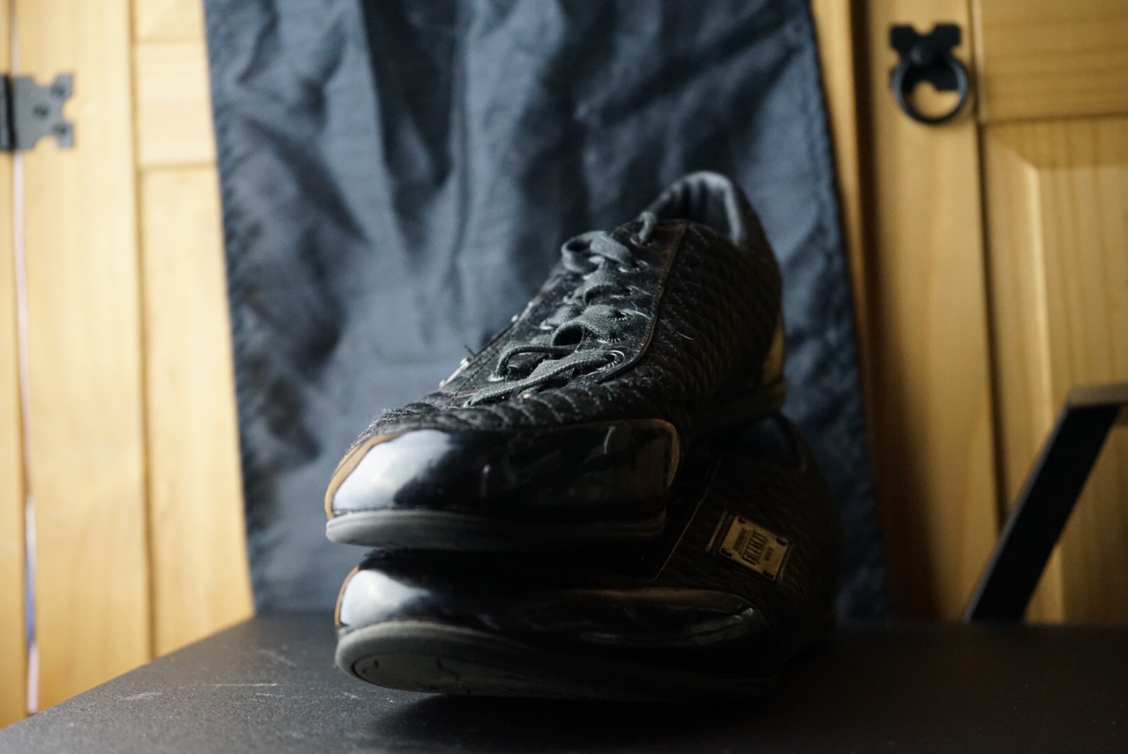
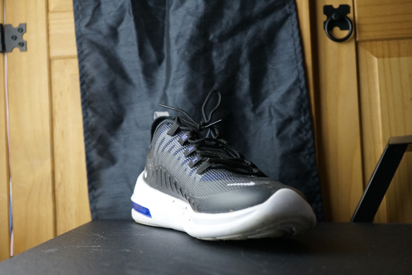
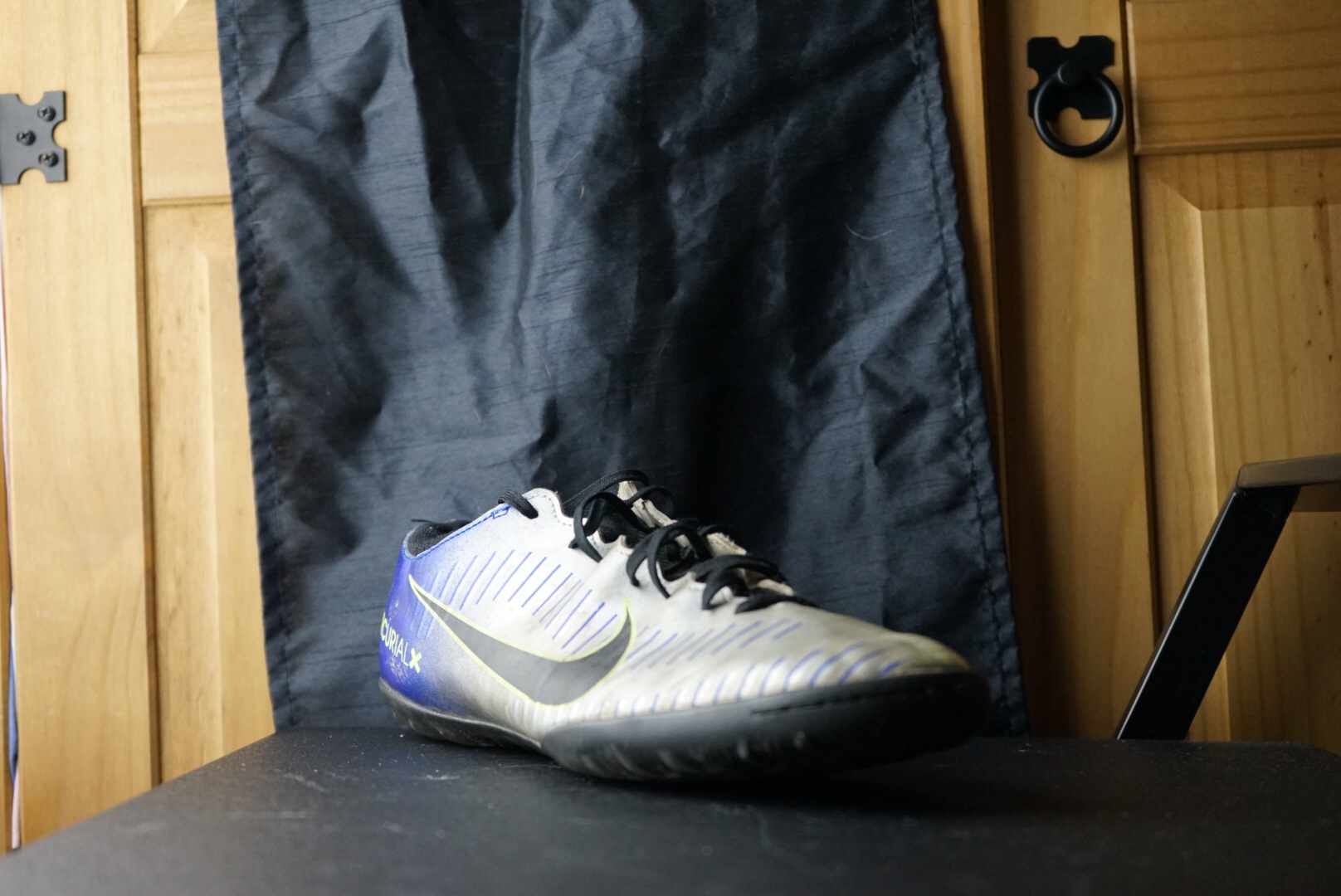
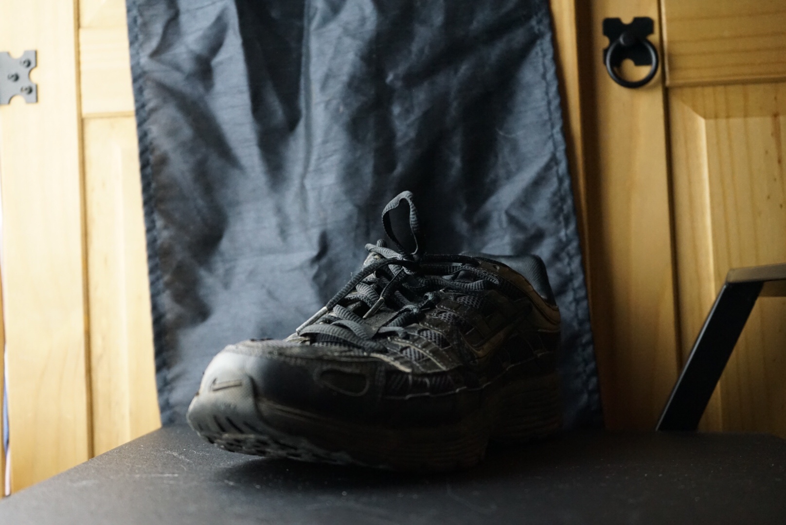
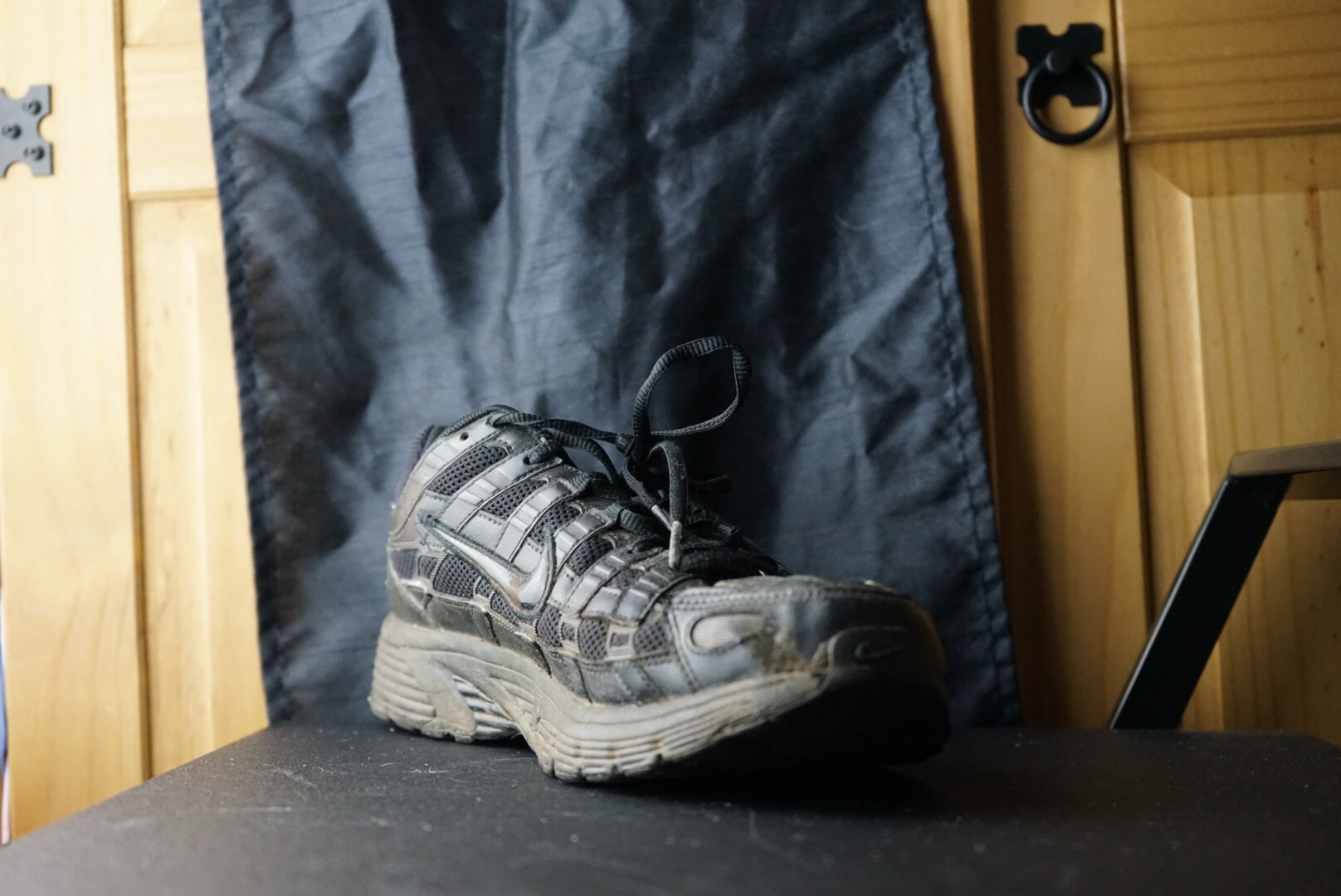
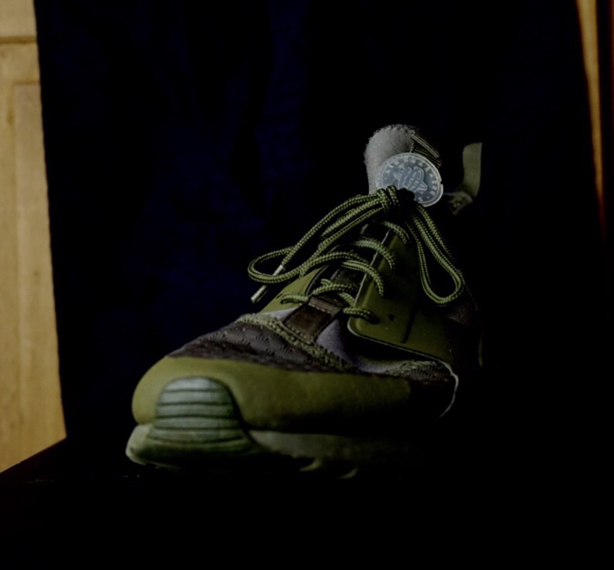
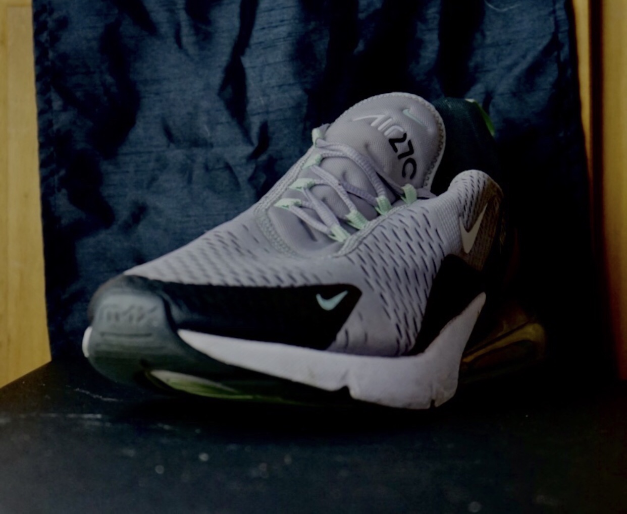
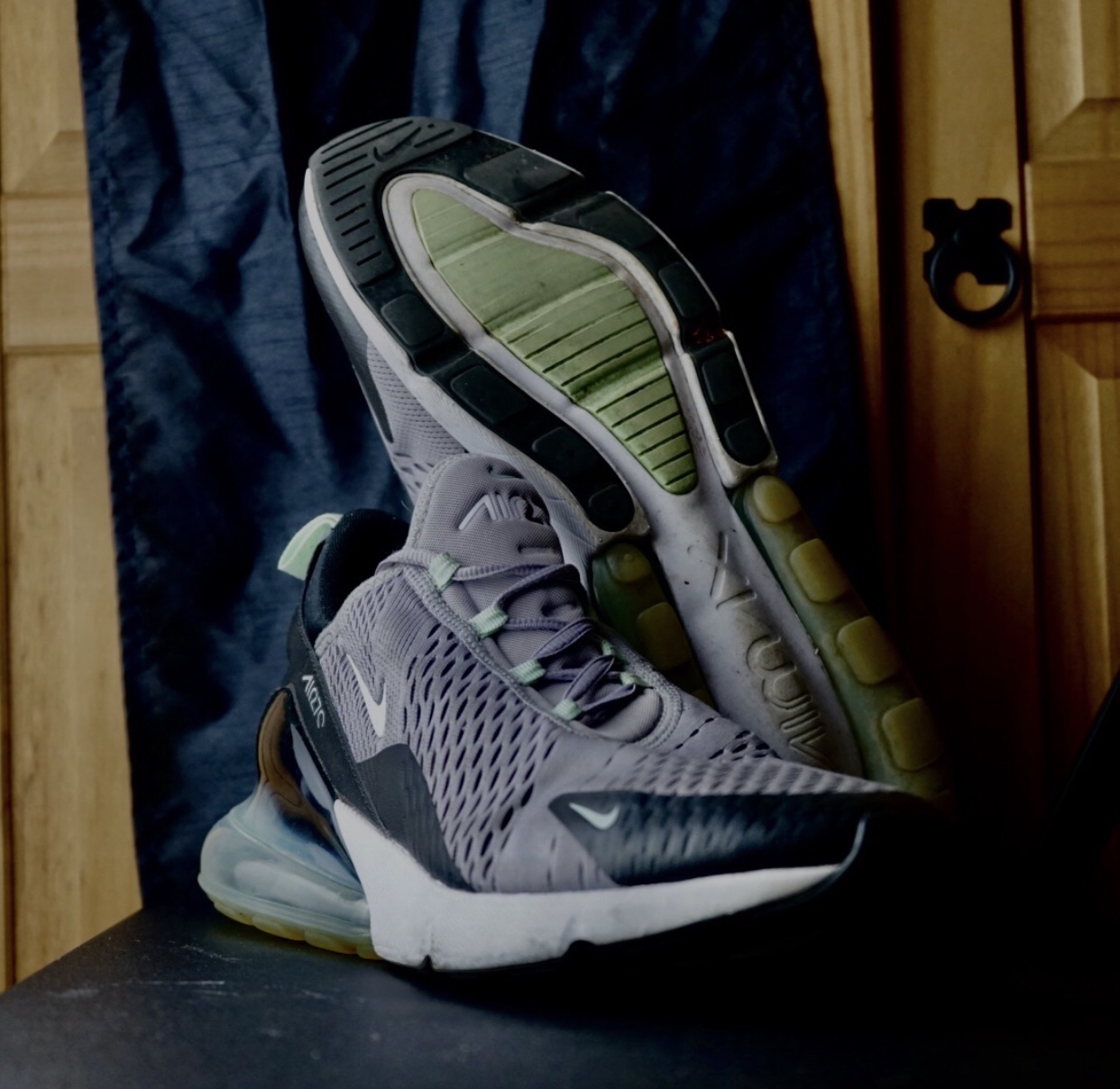
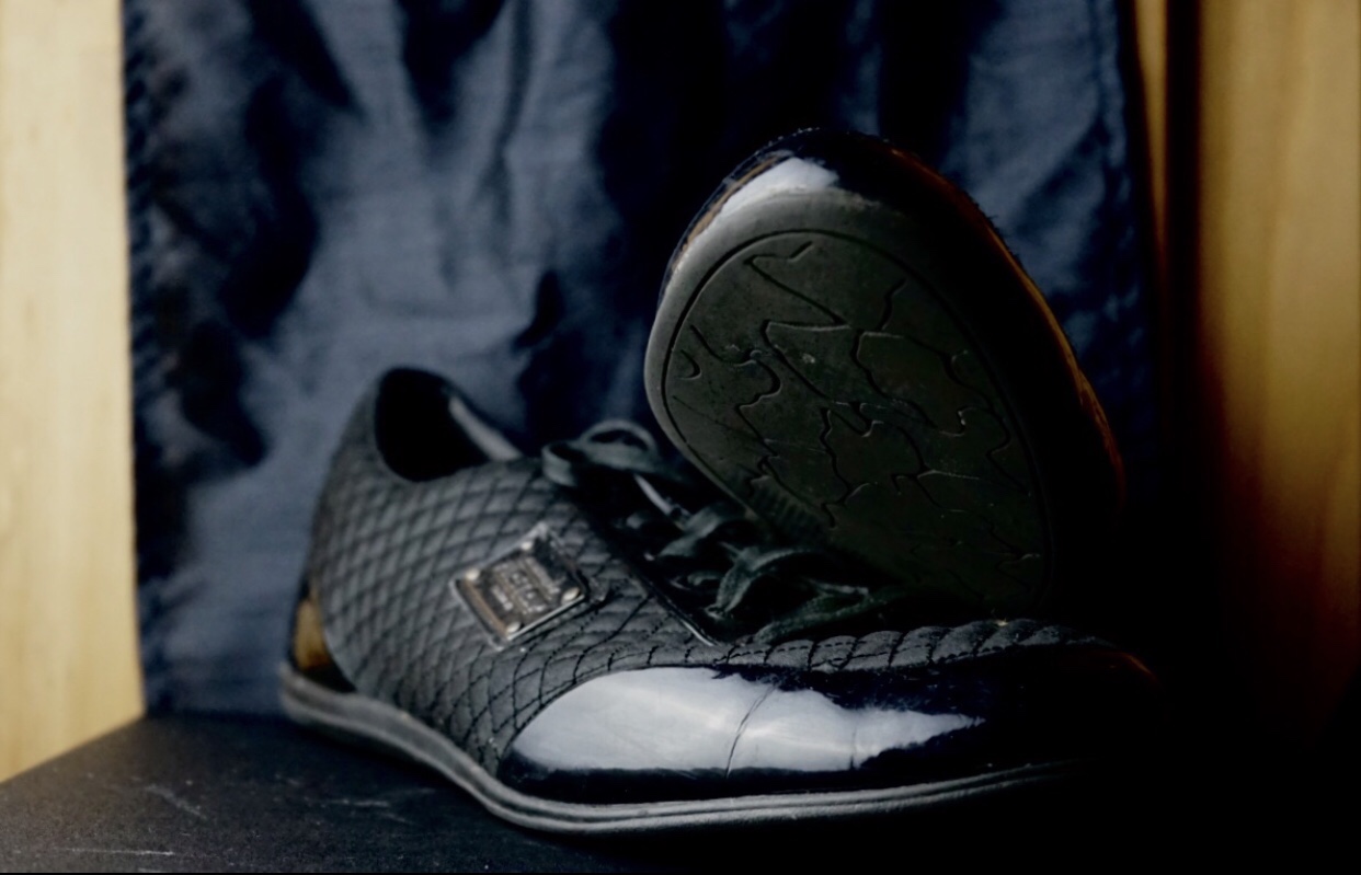
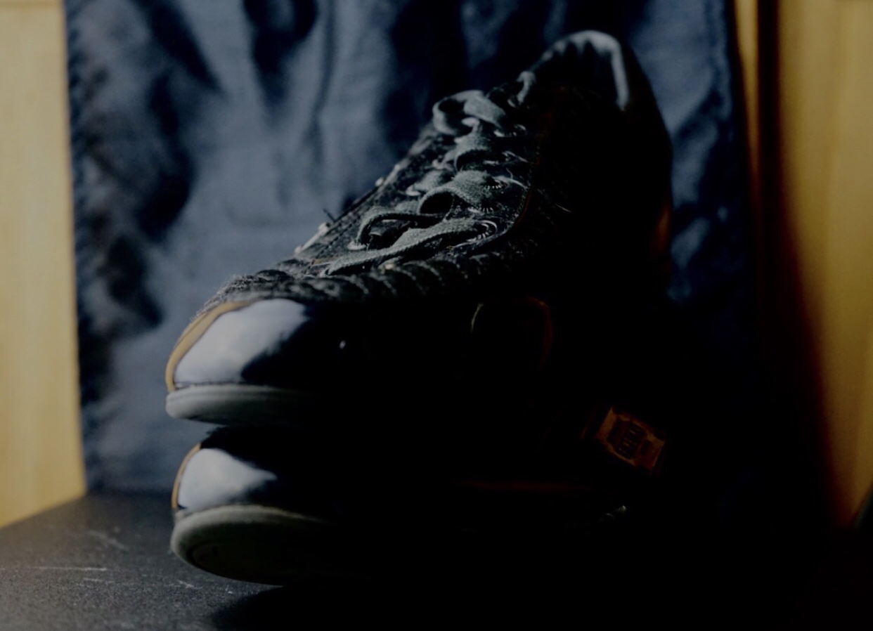
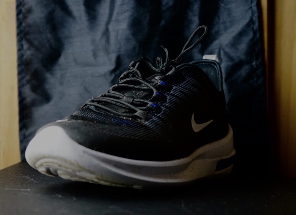
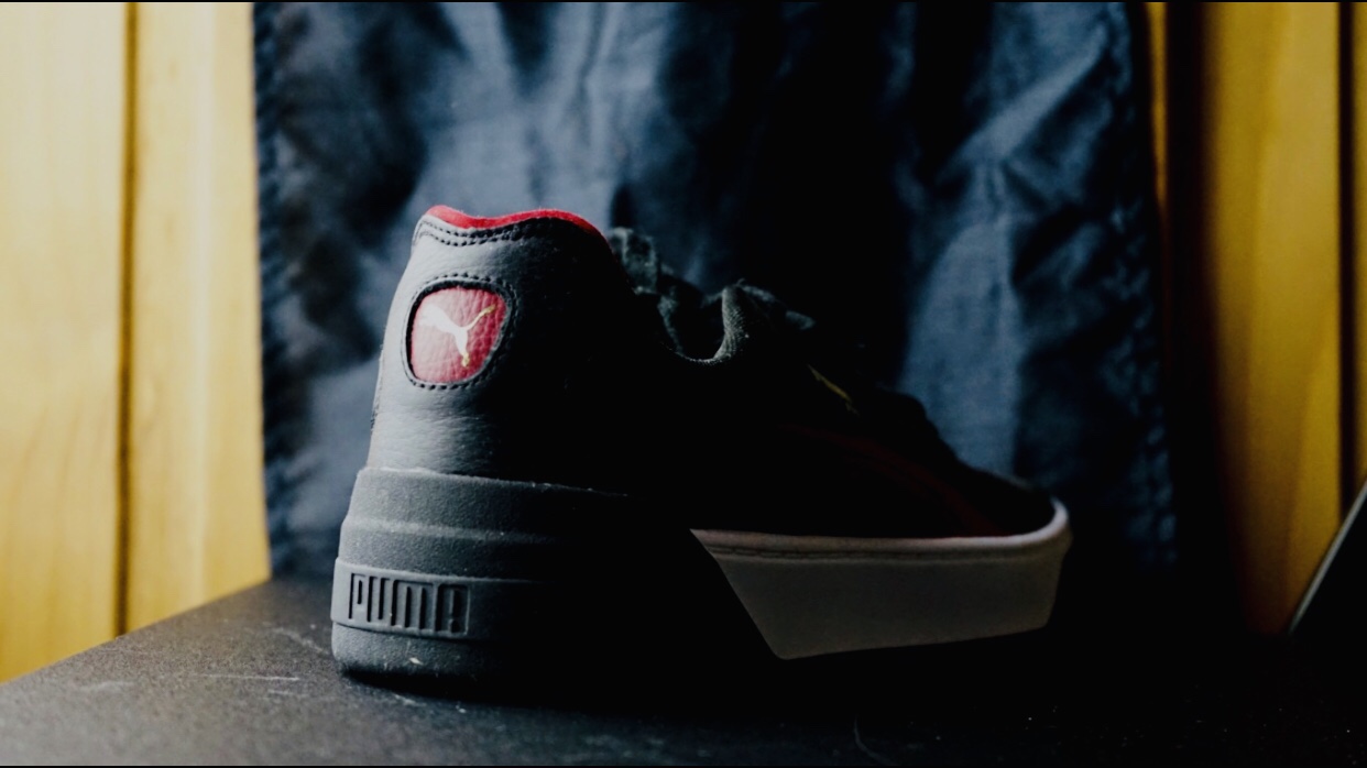
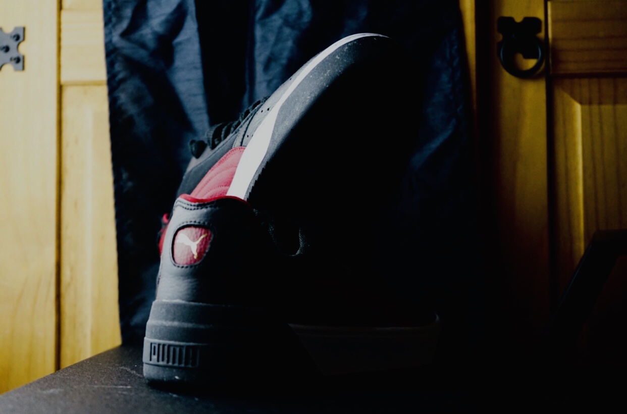
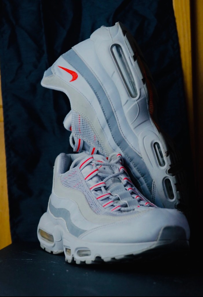
RE-TAKE FOOTWEAR PHOTOSHOOT IN LANDSCAPE LAYOUT.
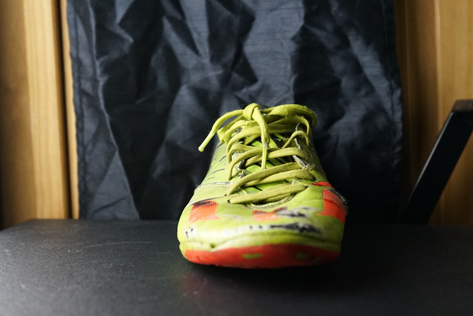
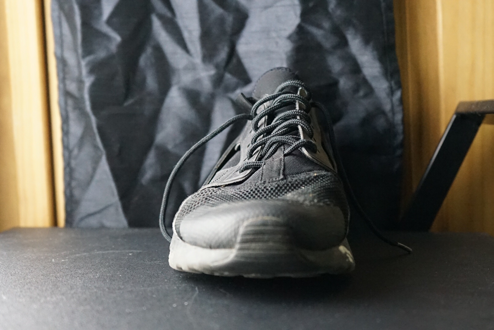
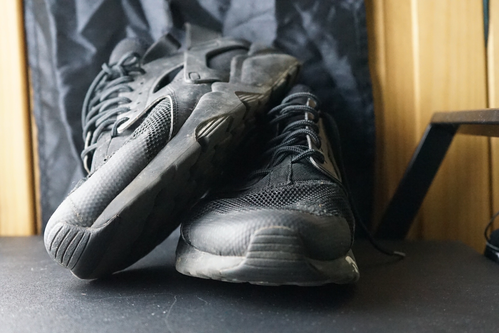
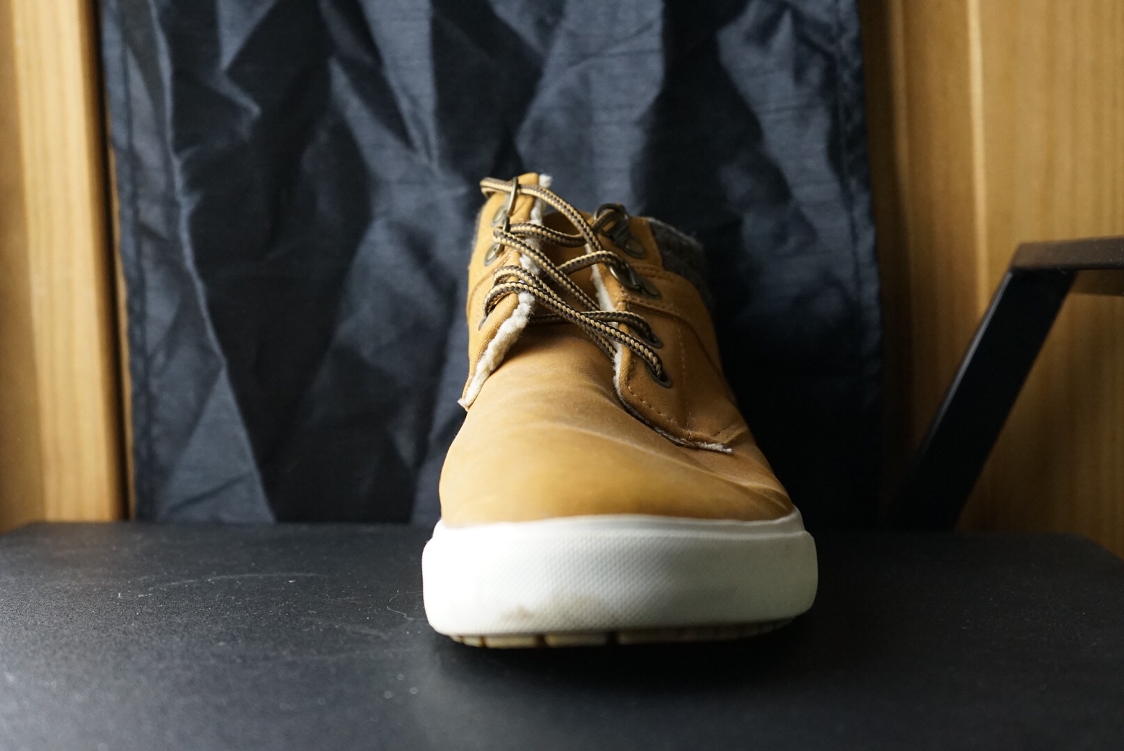
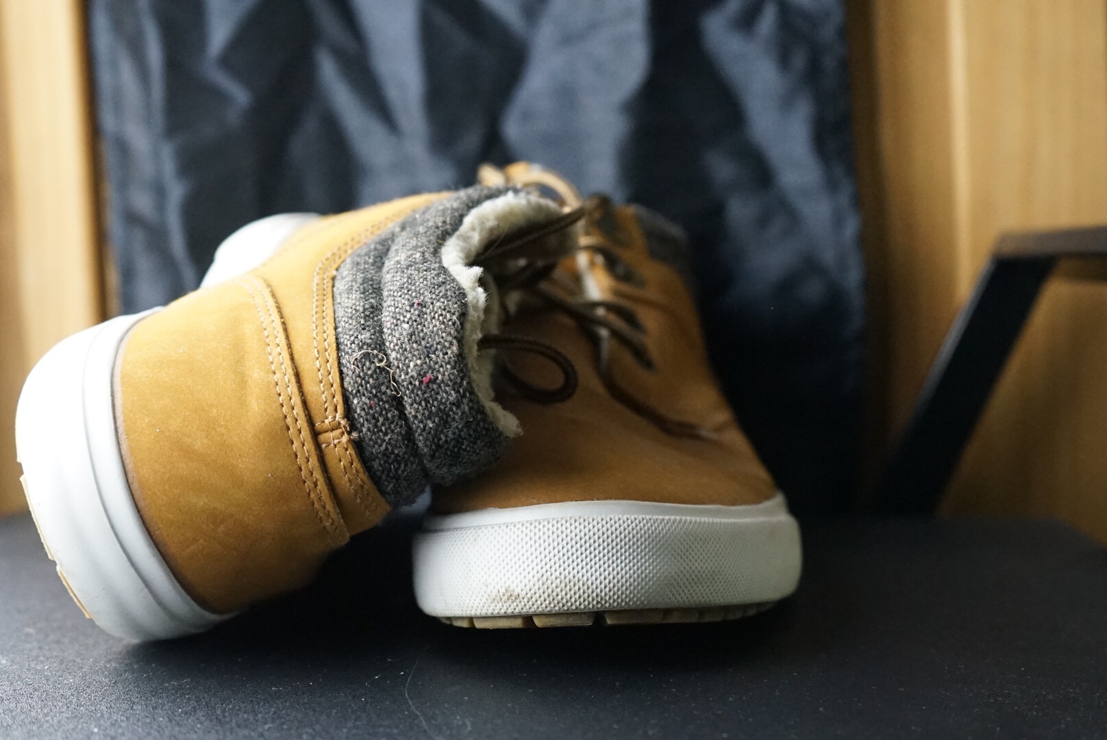
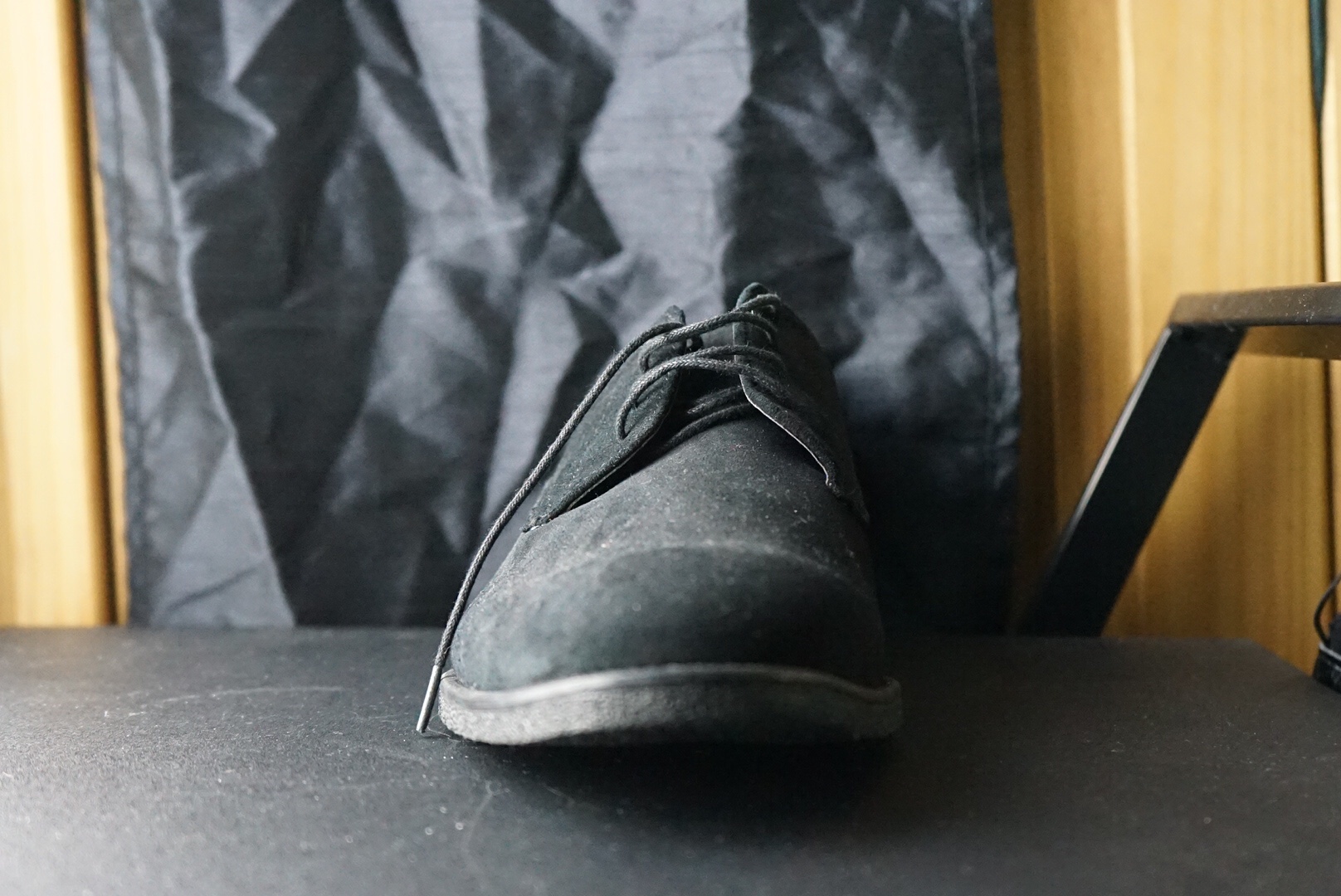
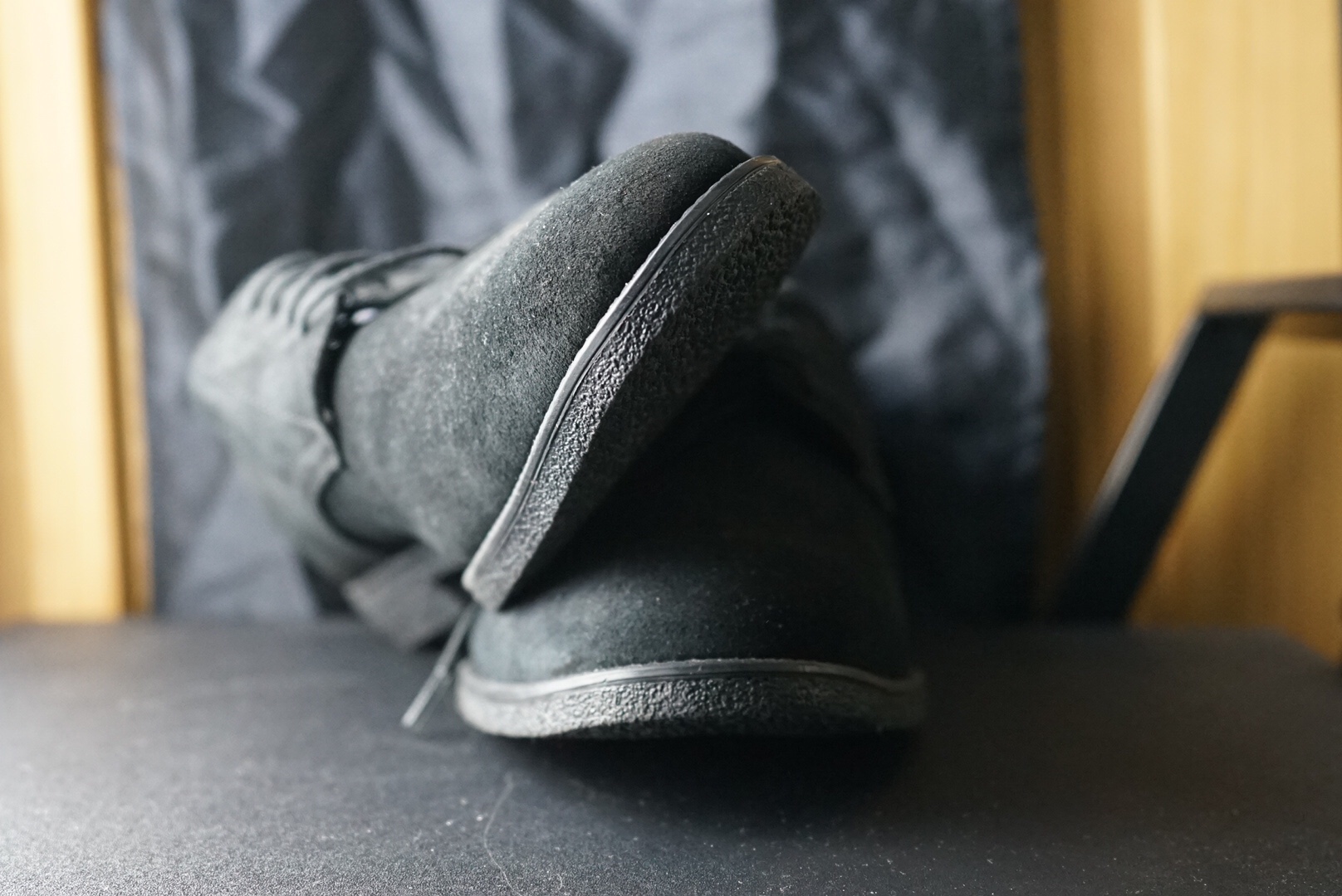
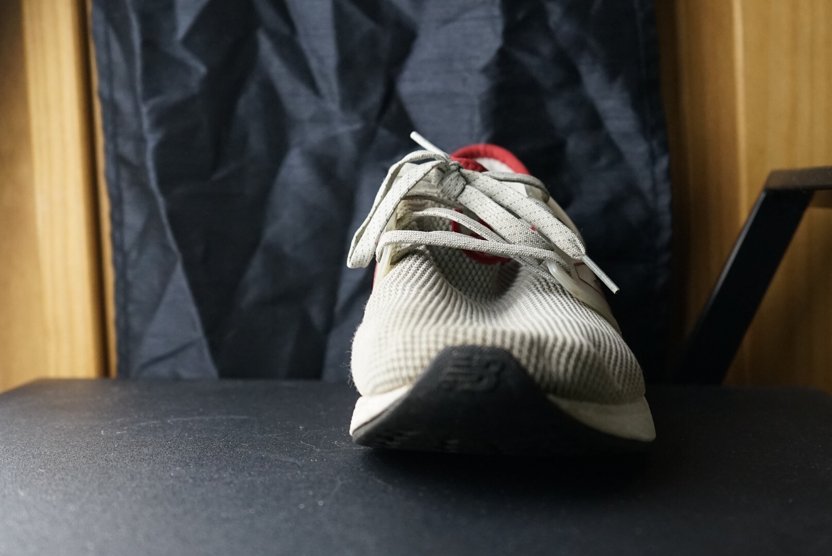
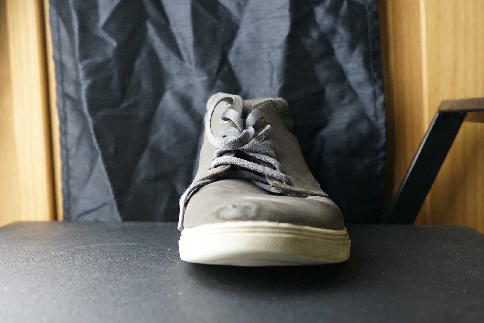
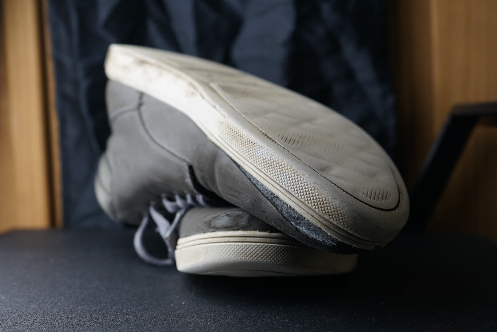
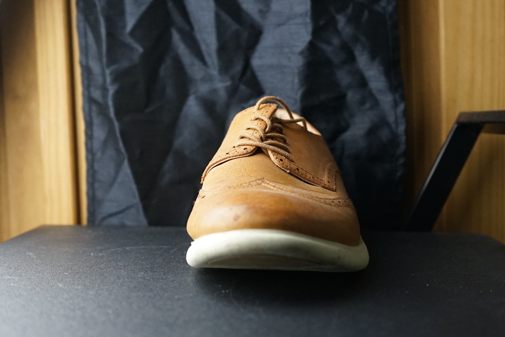
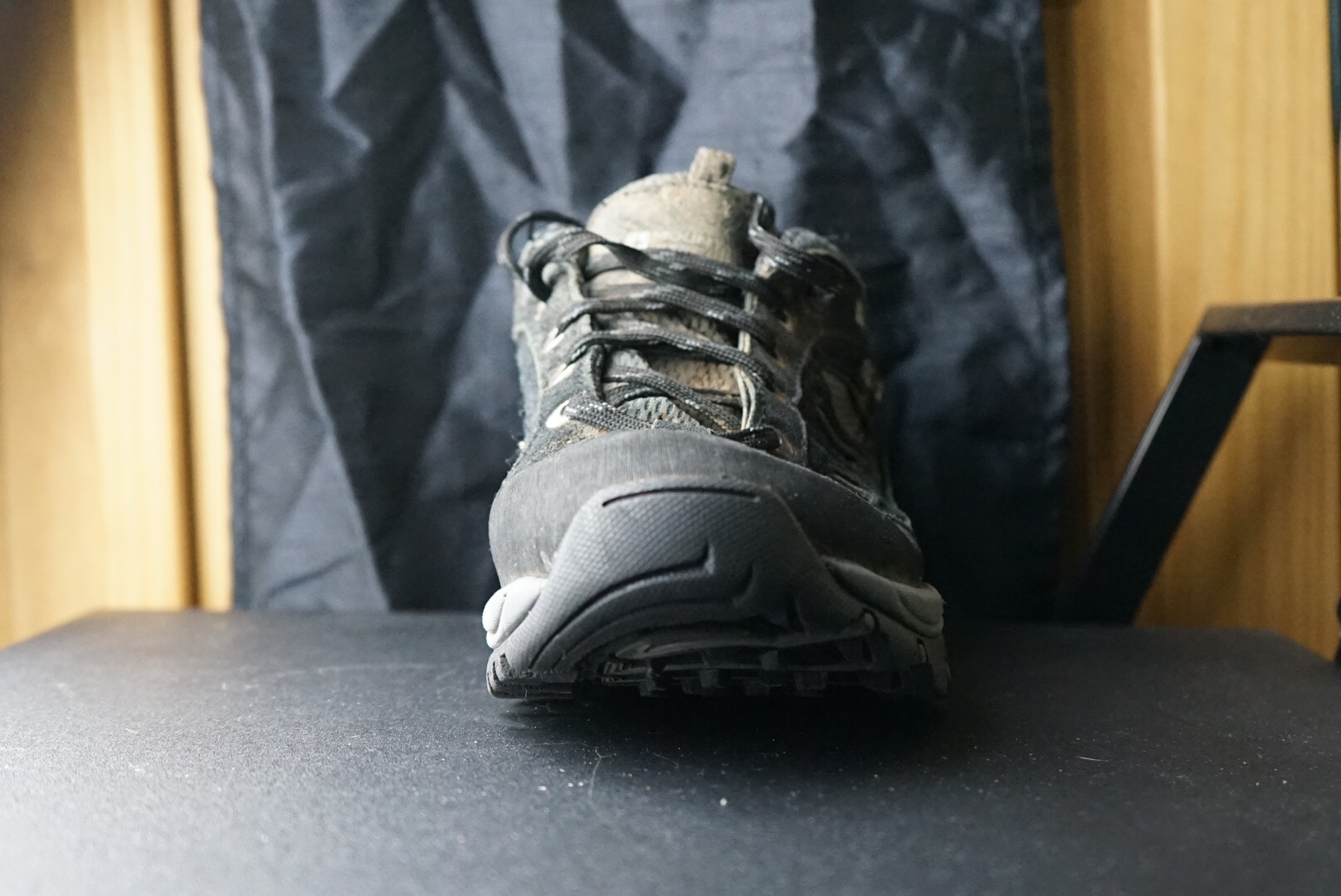
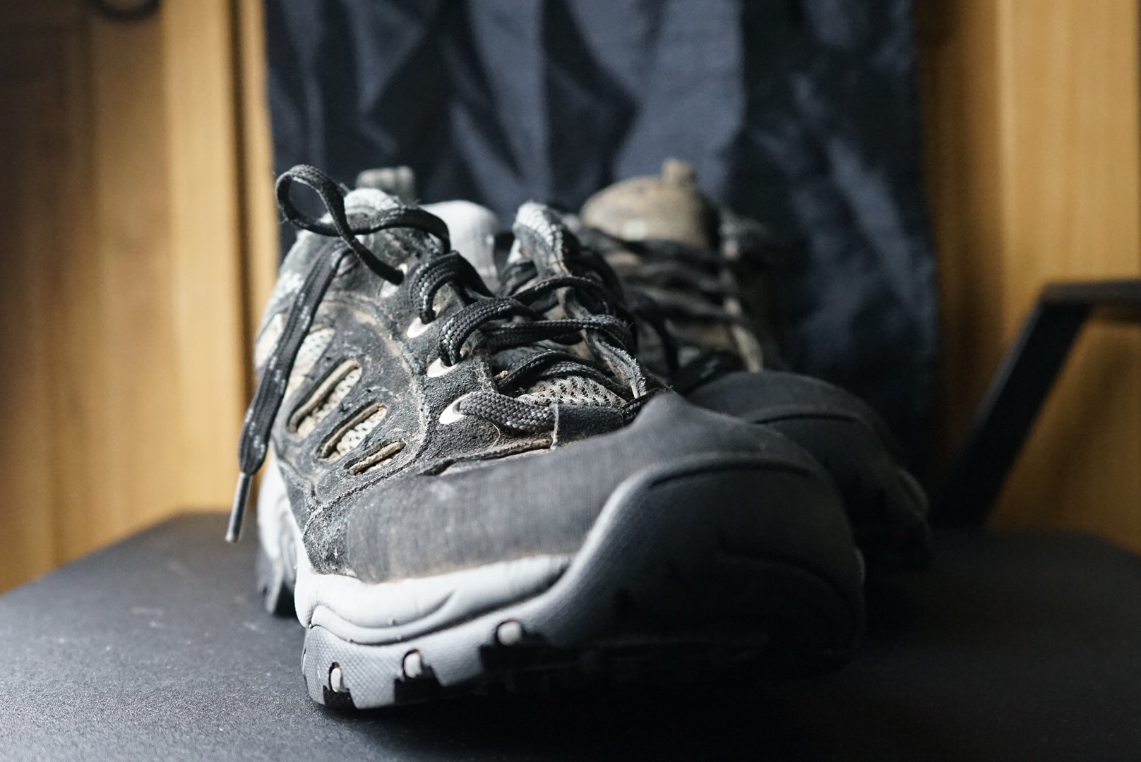
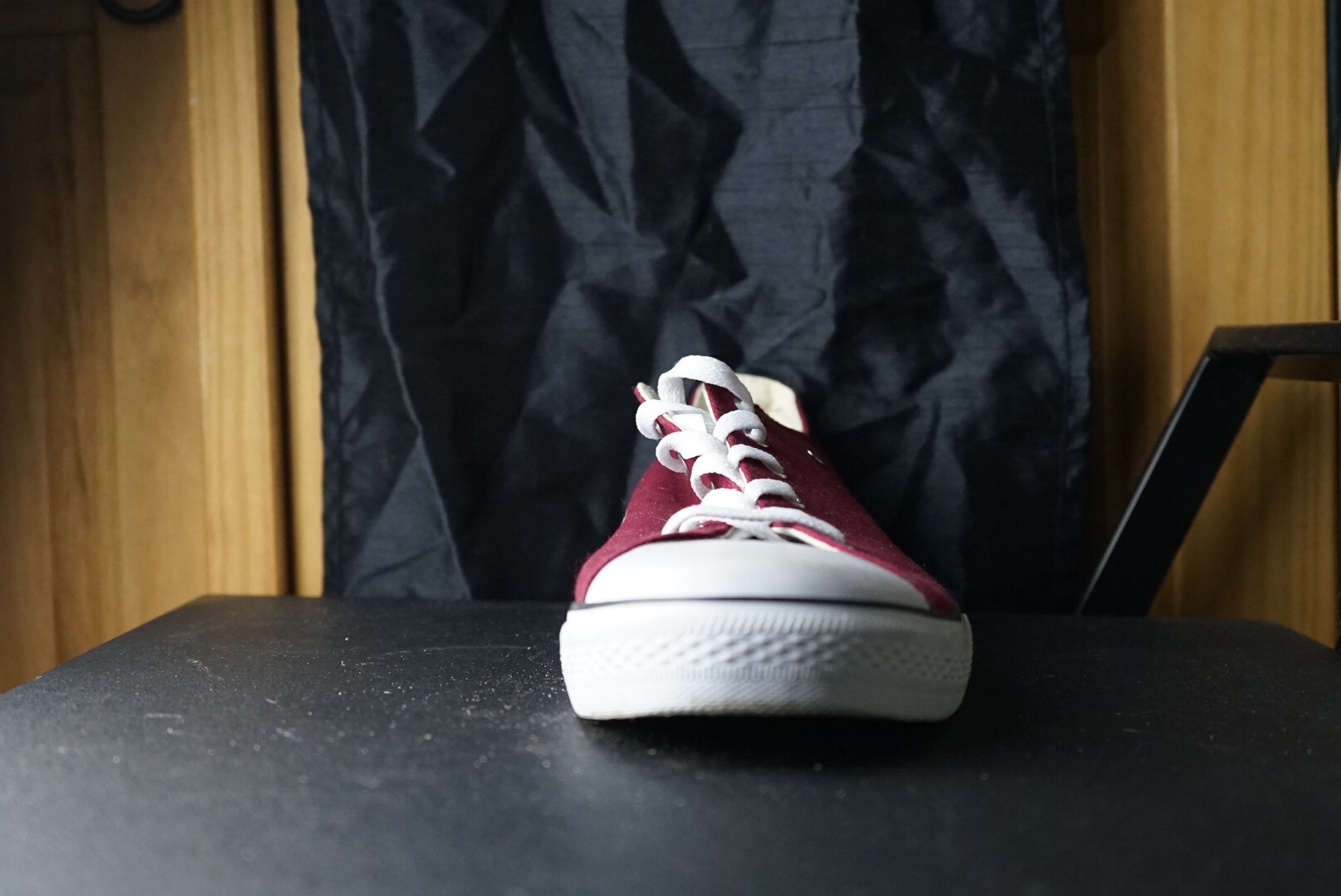
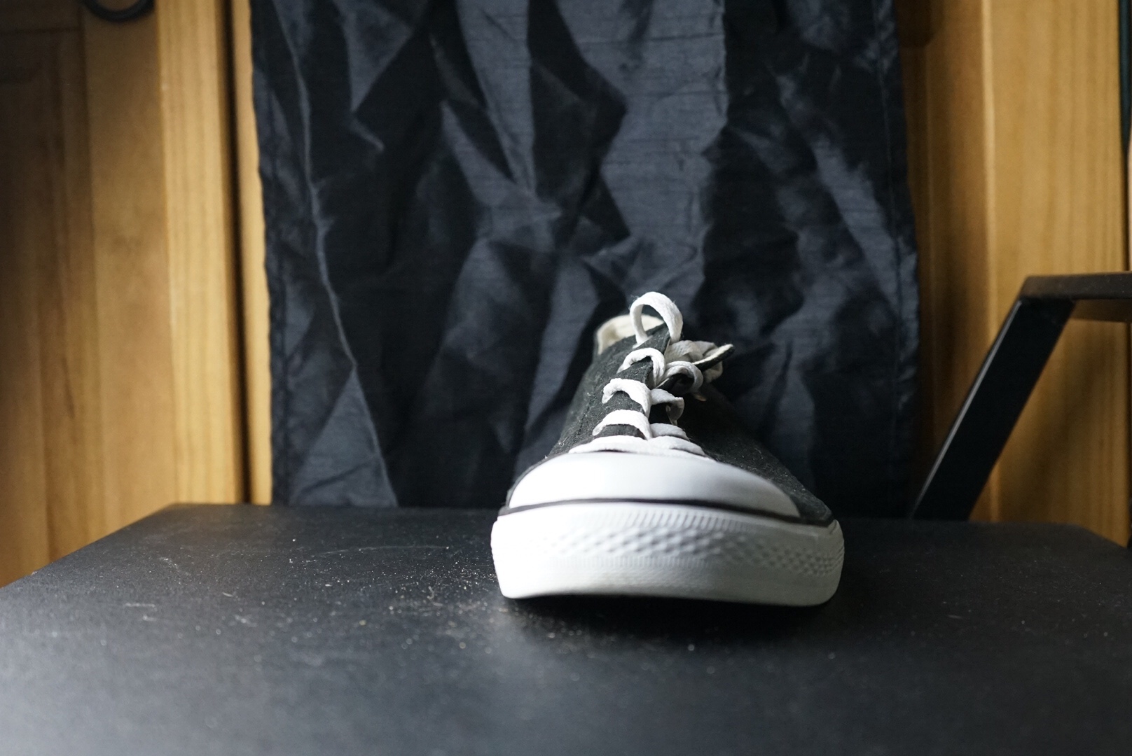
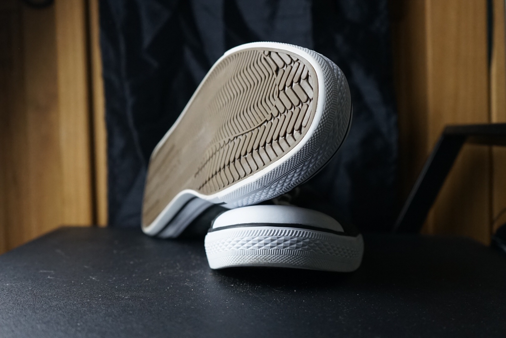
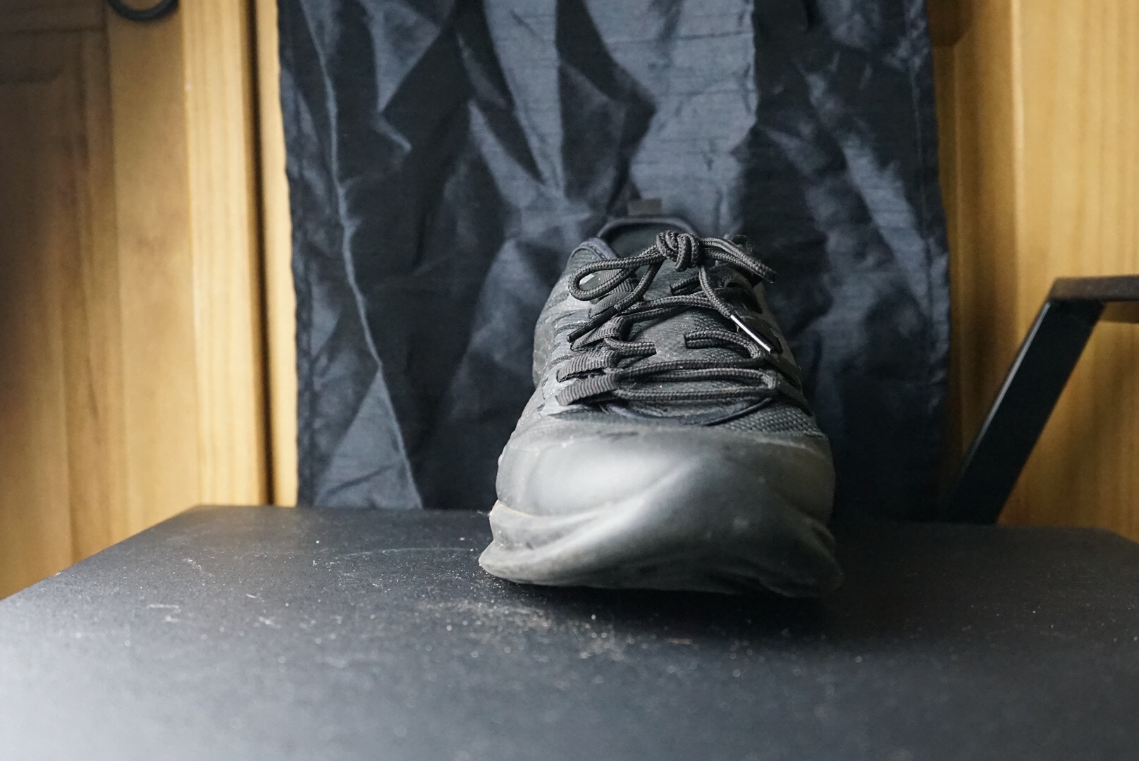
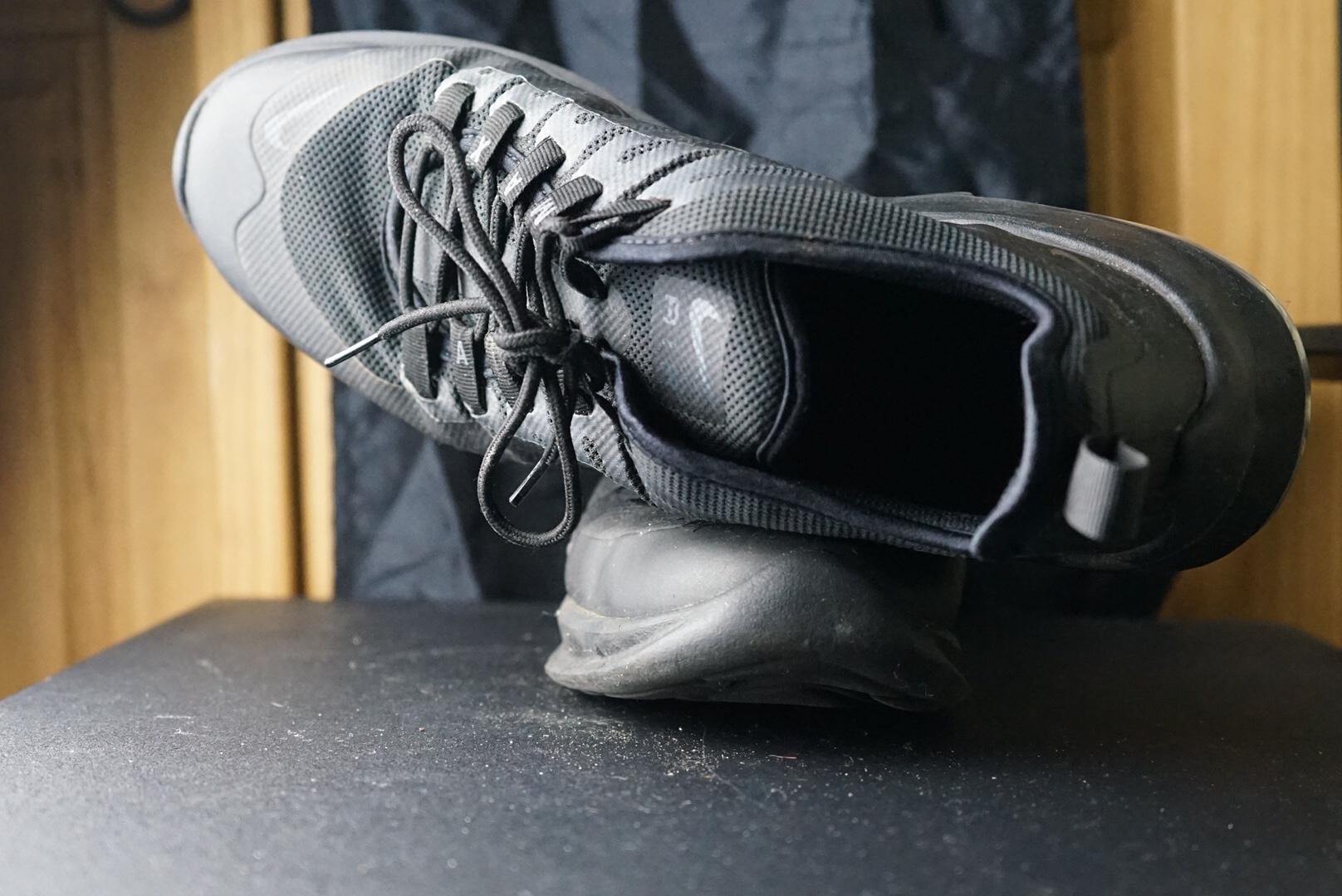
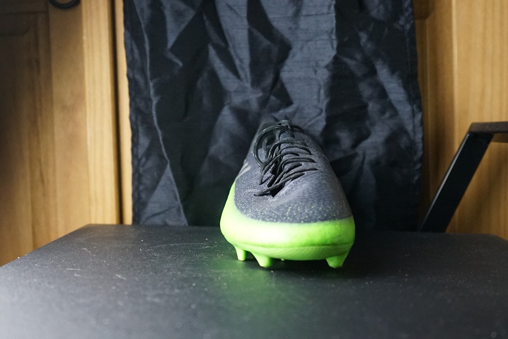
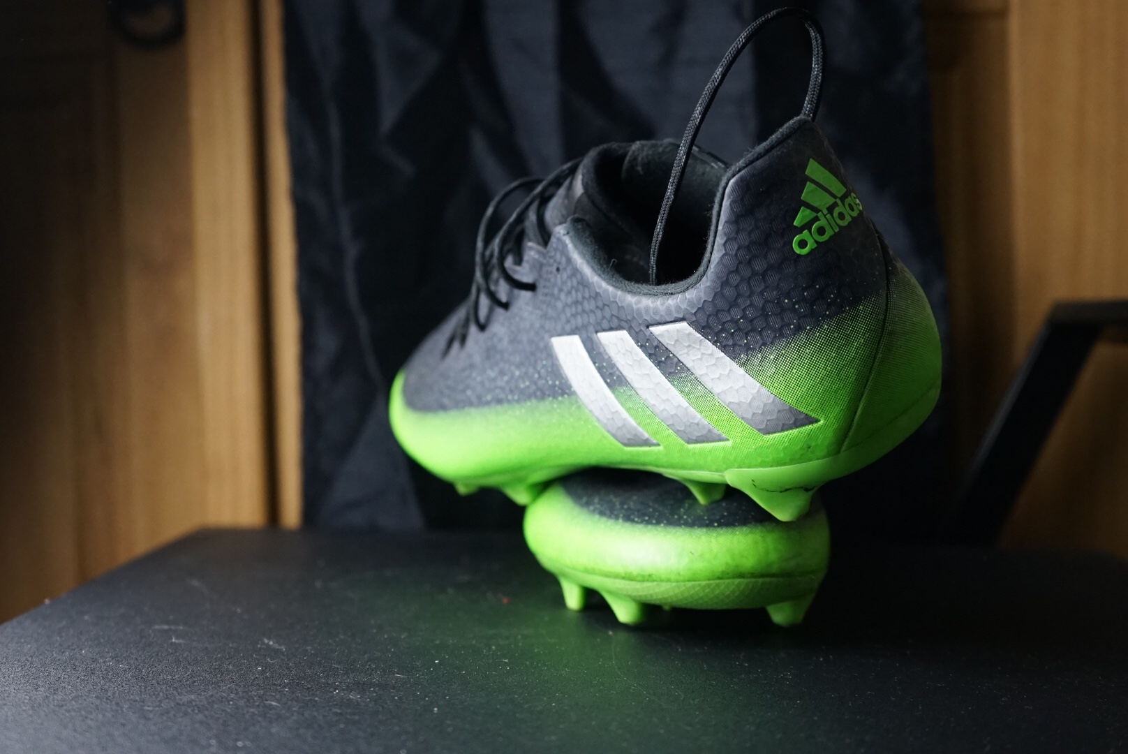
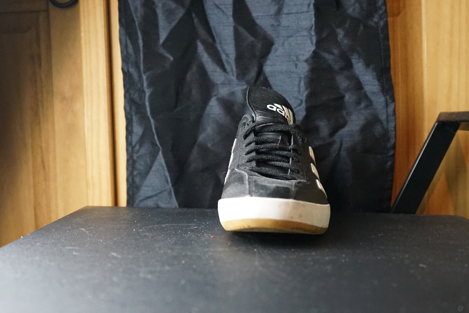
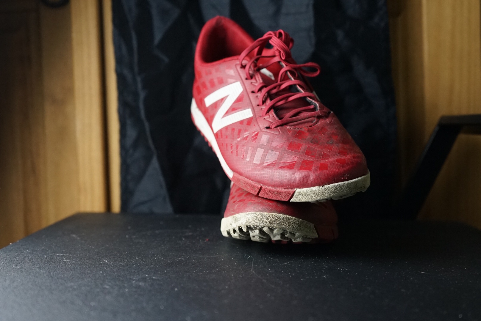
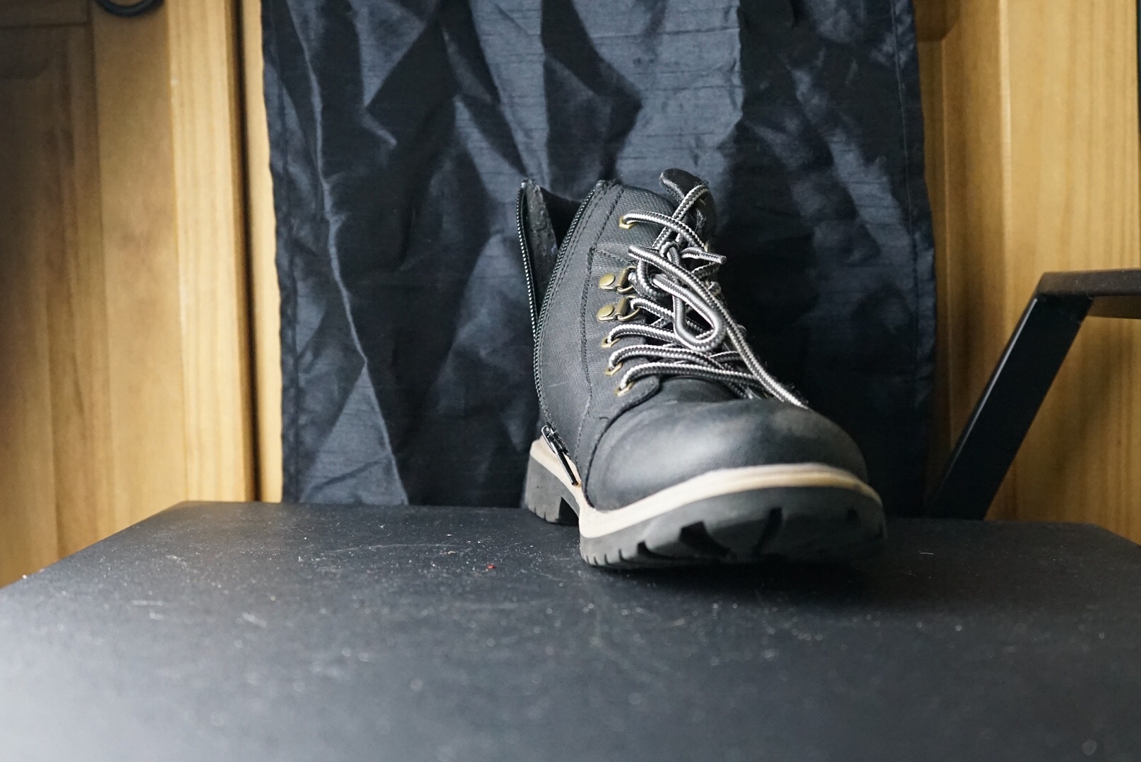
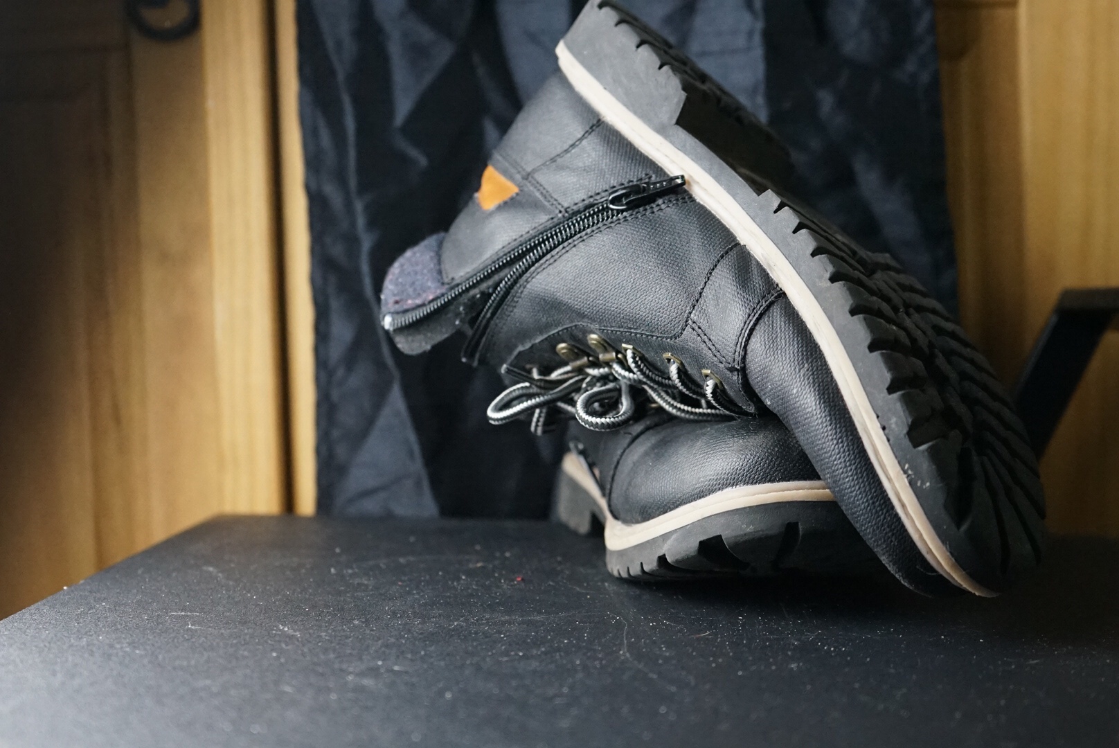
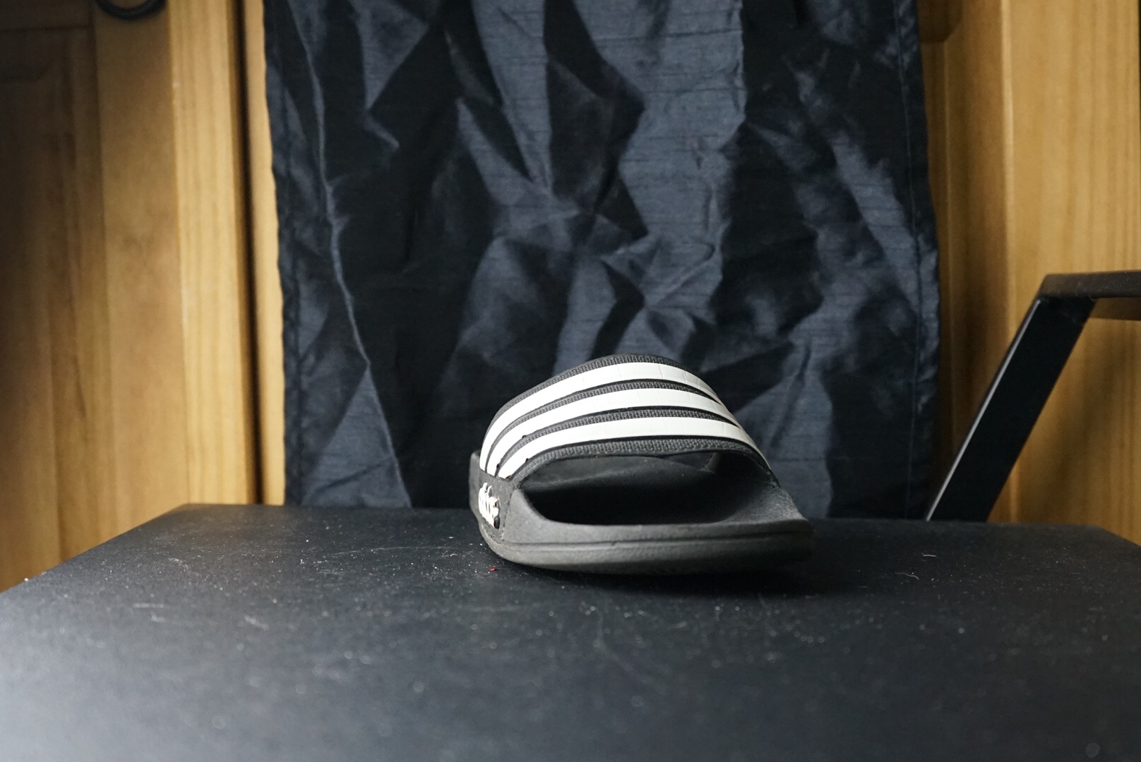
My aim of this shoot was to re-create the photo shoot of the footwear, but this time I also wanted to try to capture more light, tone in the picture to concentrate more on the objects to be more concentrated in the frame of the photo.

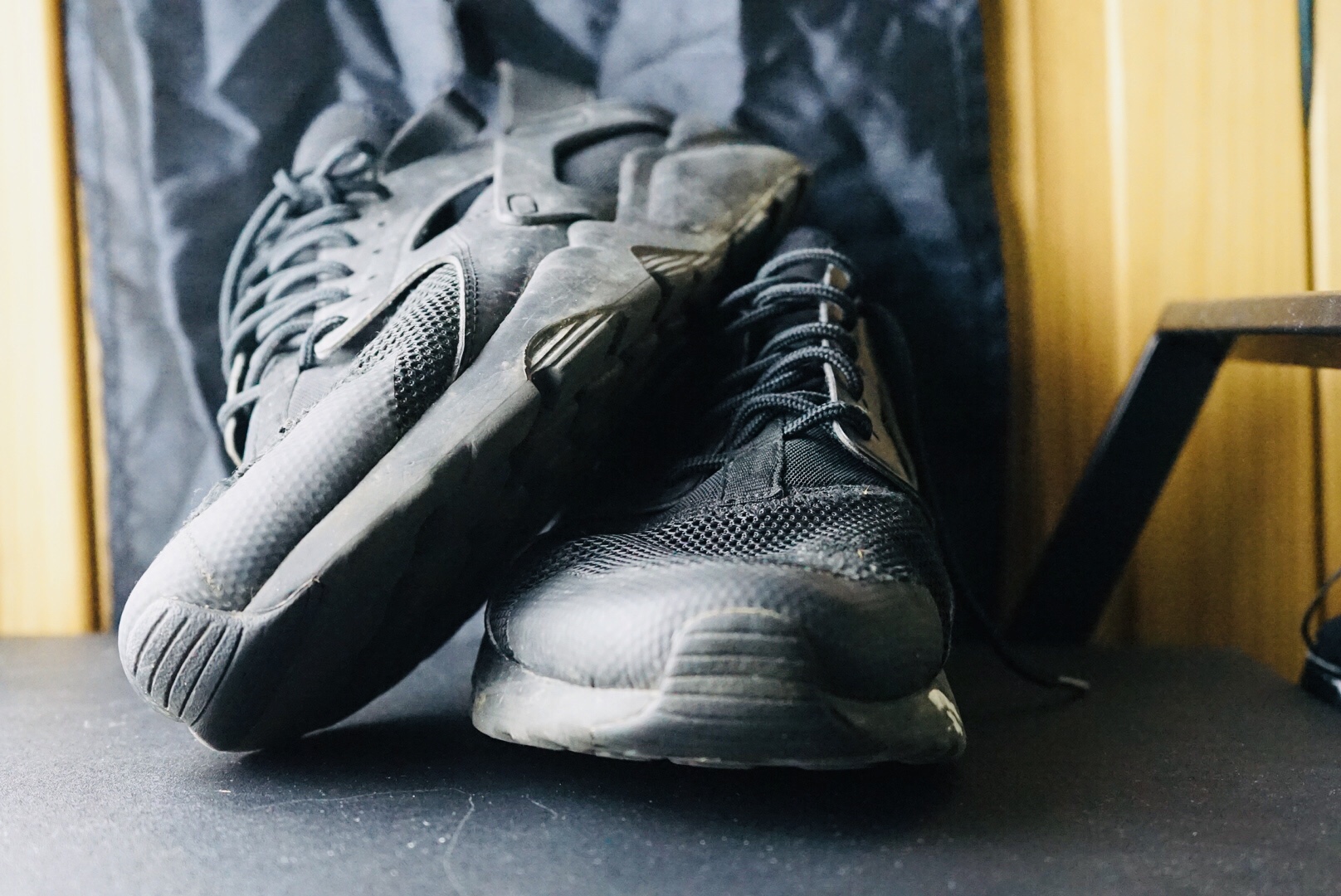


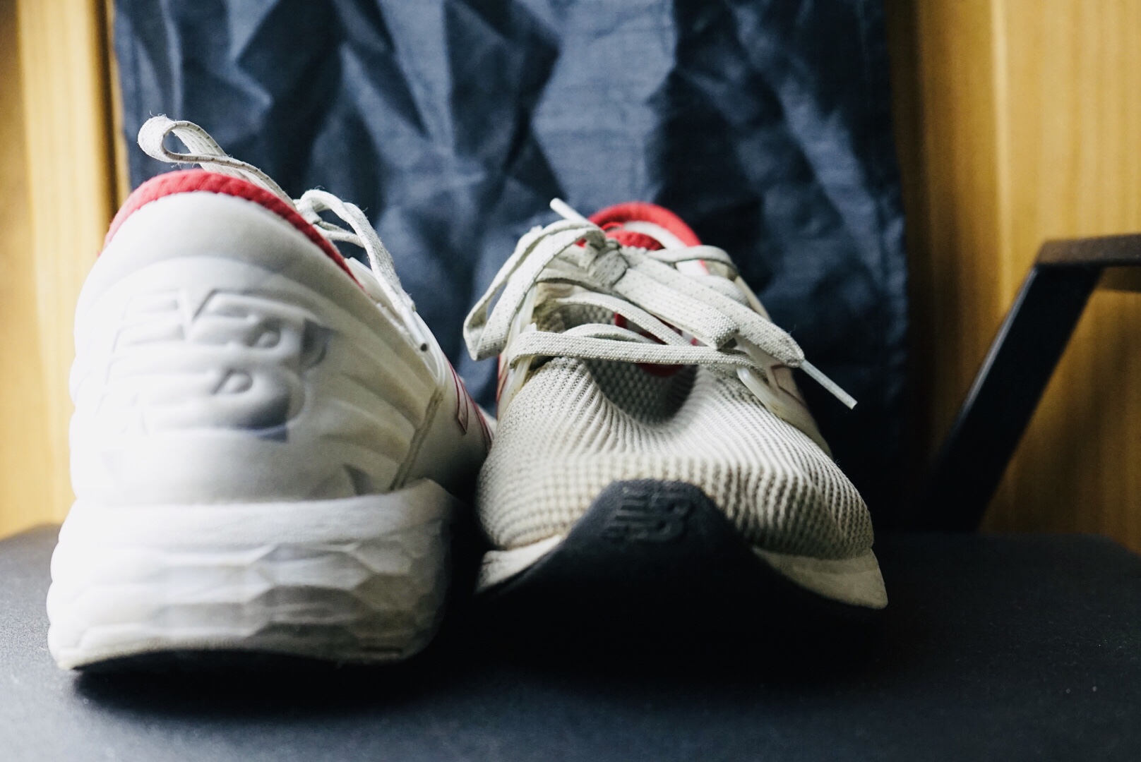

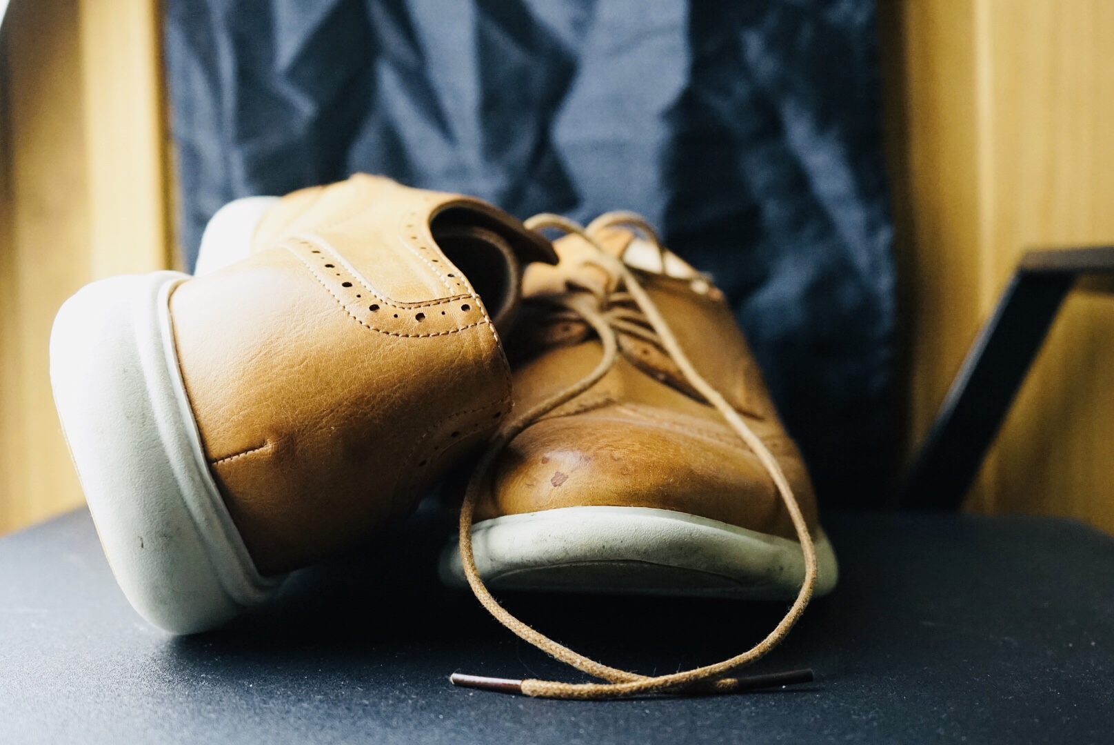
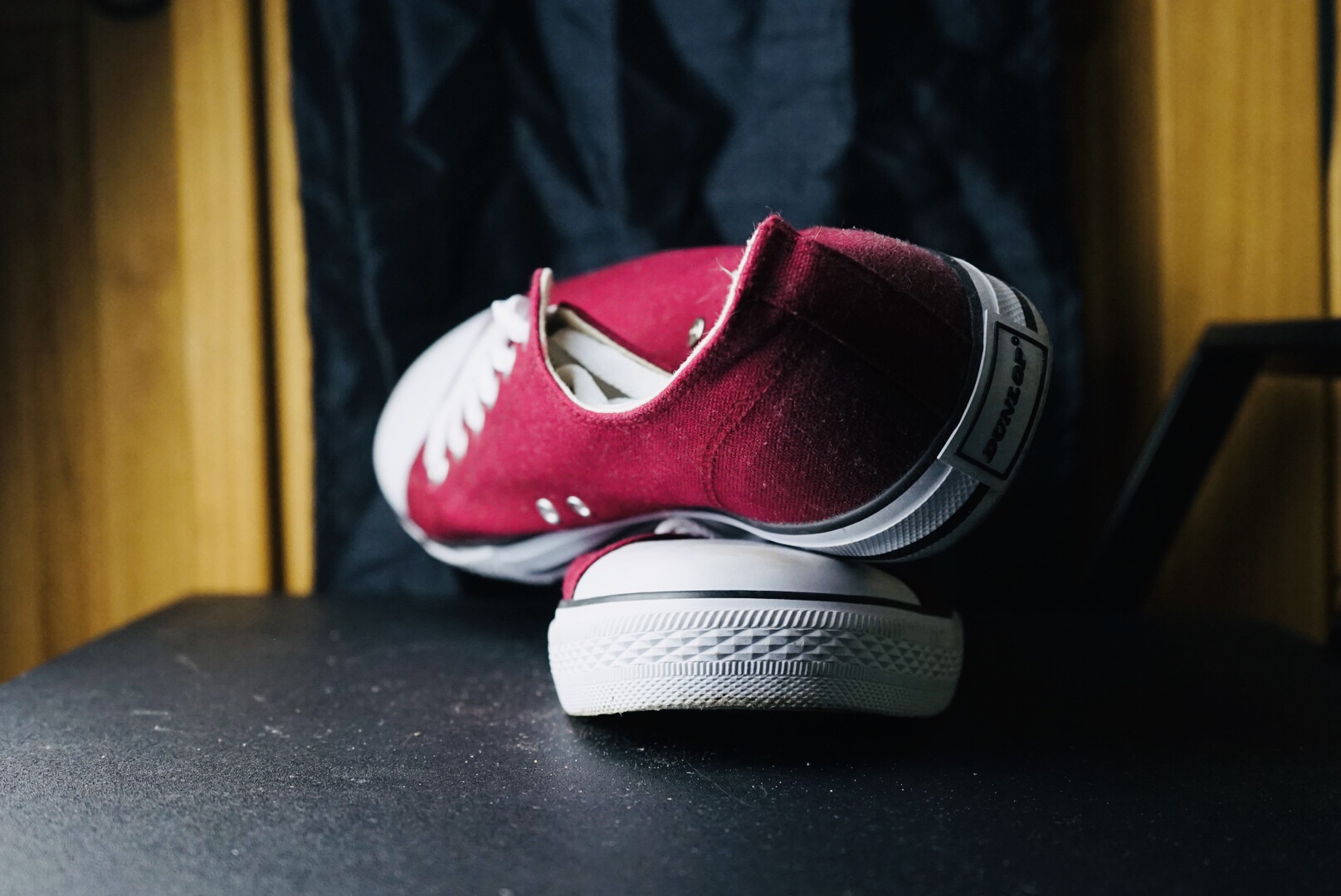

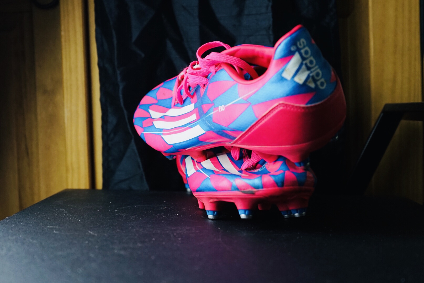

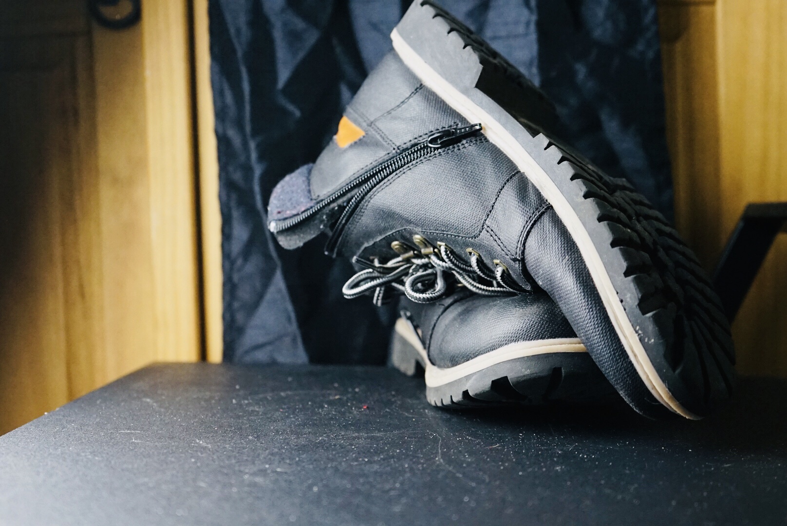
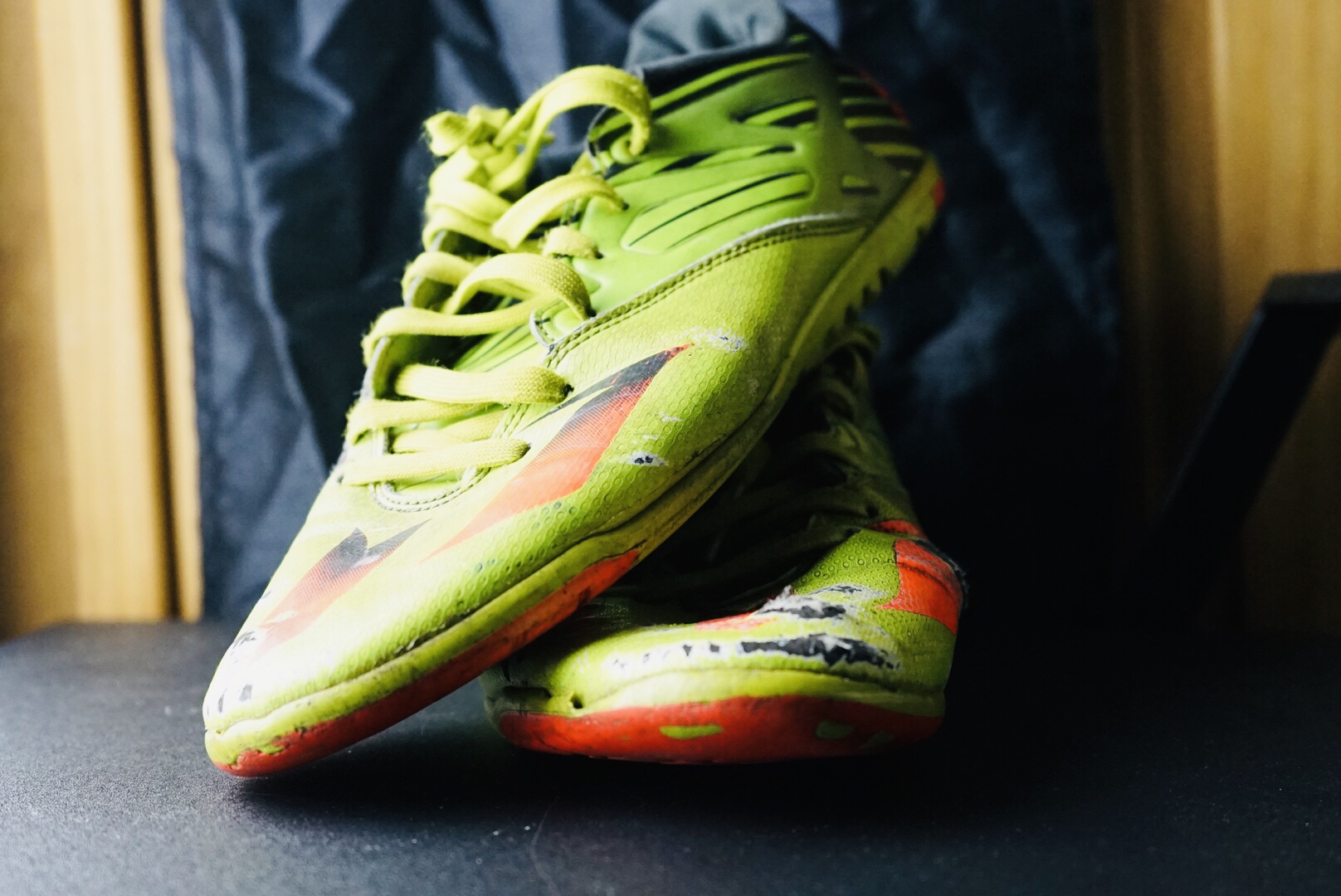
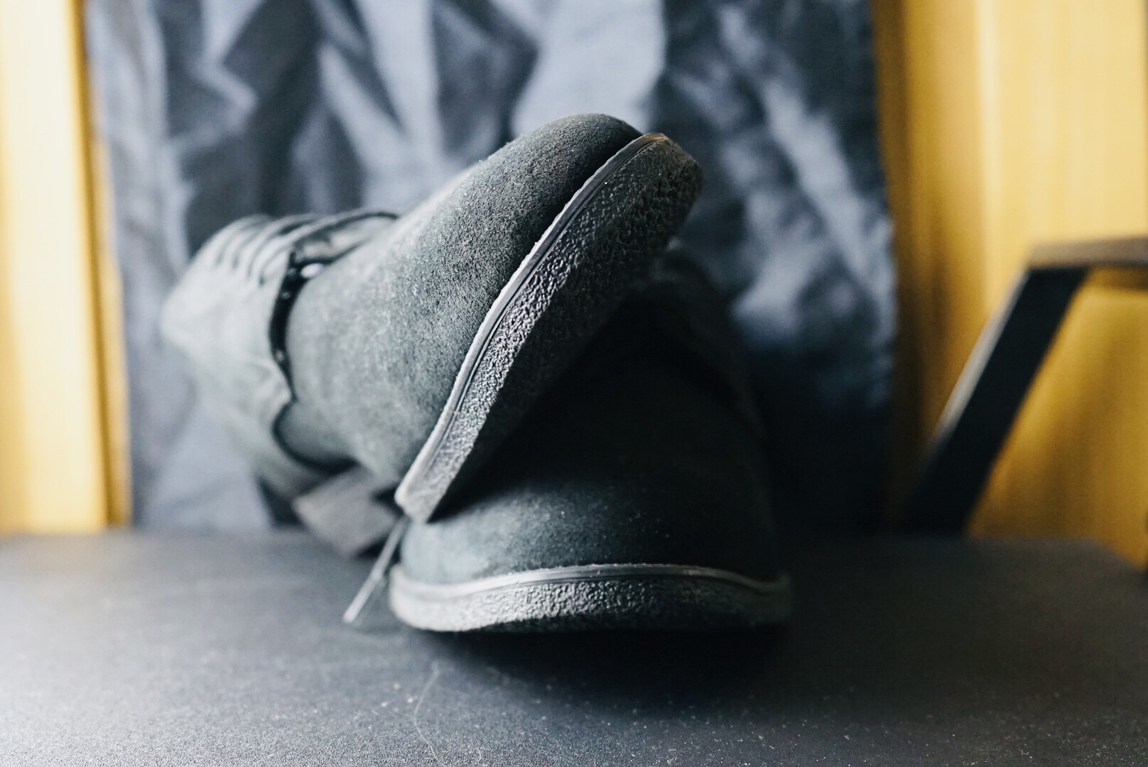


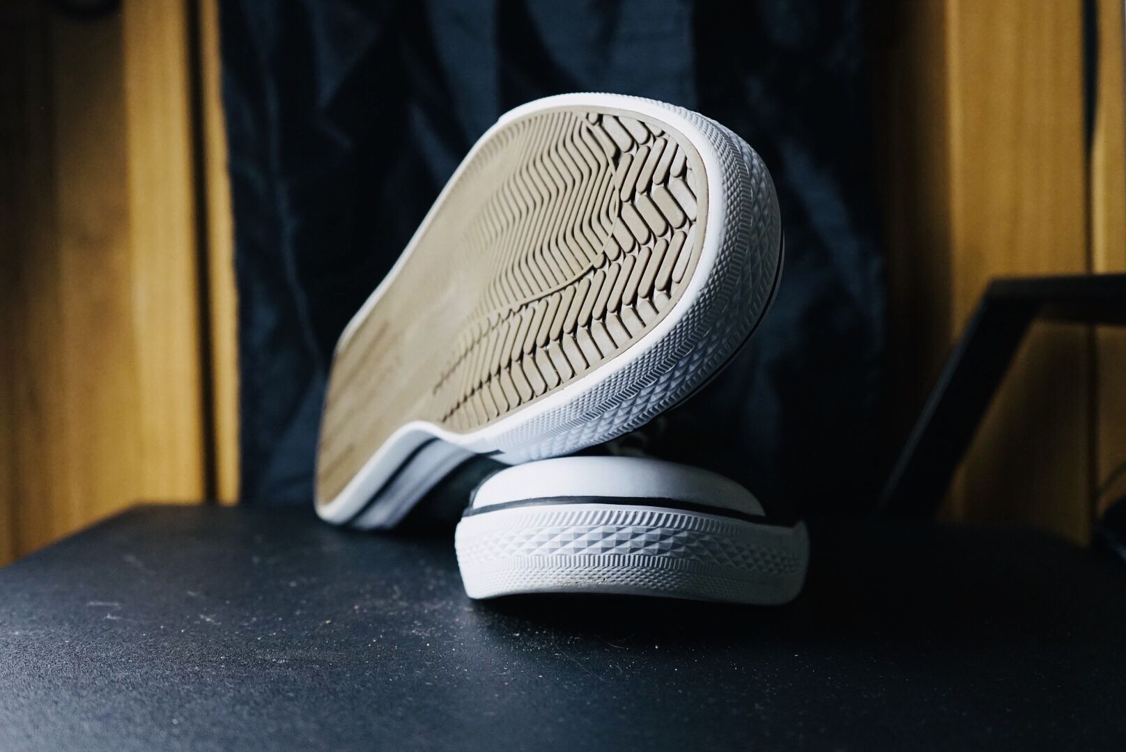


My intention was to retake the photoshoot of the footwear as I wanted to ensure that all the framing of the shoot was exactly the same, the second time I was able to catch what I was trying to do. The only thing that I hate about the photoshoot is that all the shoes, trainers and boots are all different sizes, making it difficult for mainTain to frame the photoshoot. The colours, tones and shadows I captured during the photoshoot are very interesting as the Green, Sandy and Black are all outstanding with a dark sandy colour in the background and black with the table cloth making the objects more centred.
Typology: JORDOLOGY
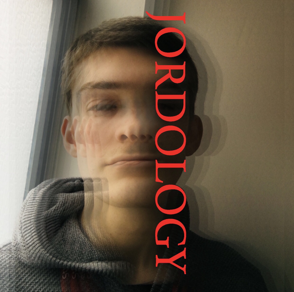
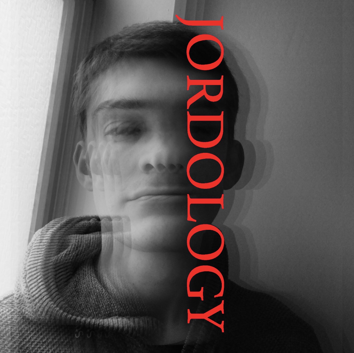


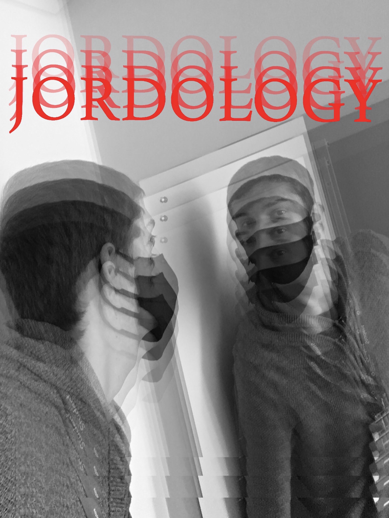
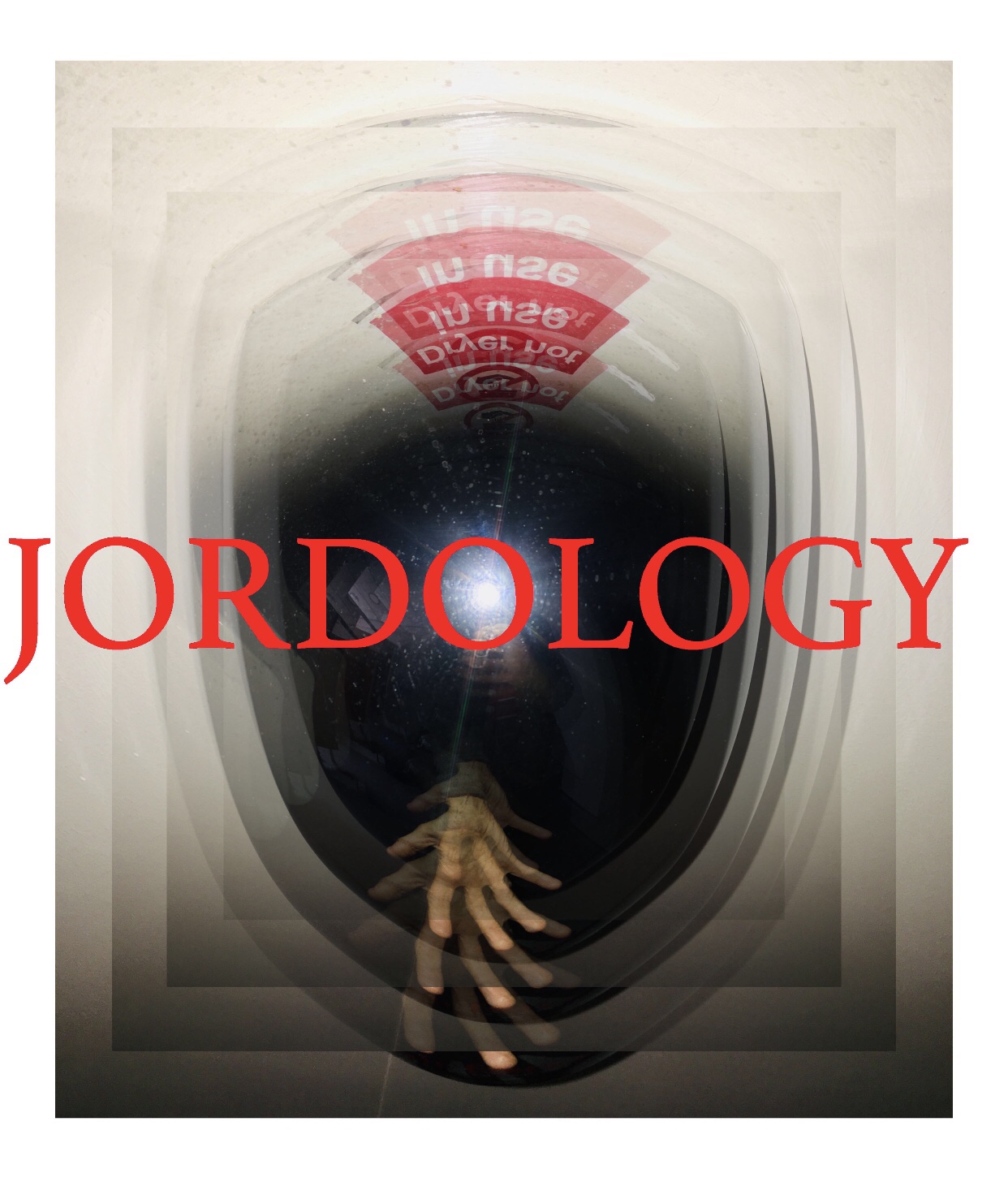
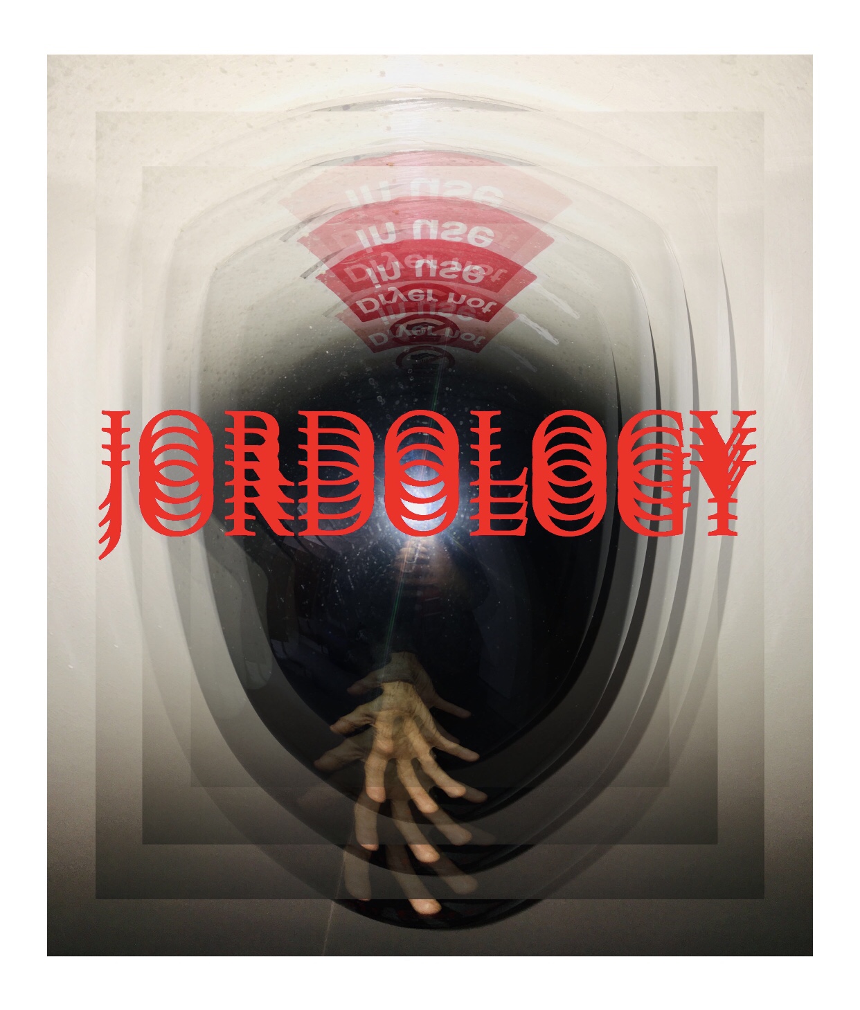
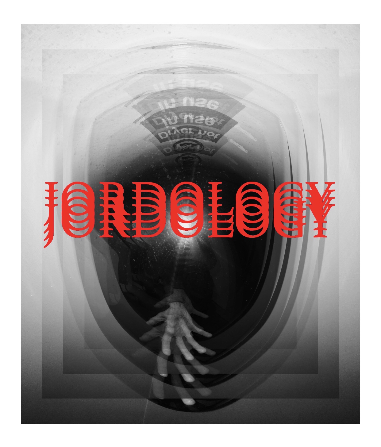
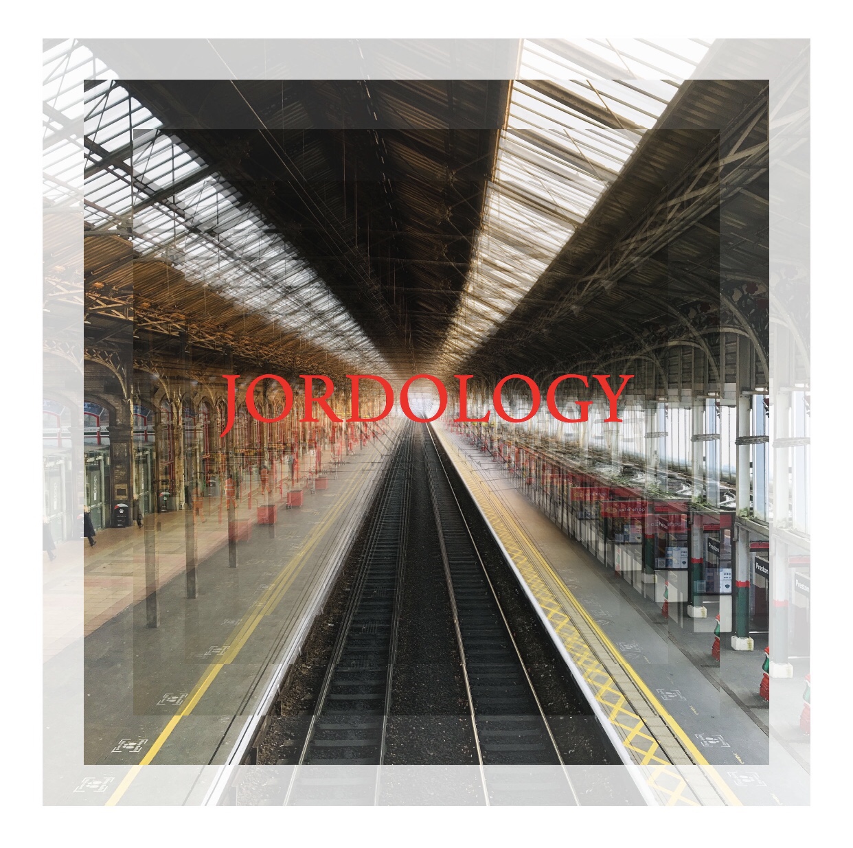


During the procedures, I started to use opacity for the layers to explore the uses of layers on Photoshop as I really find the fade effect really interesting and the JORDOLOGY text being placed into a fade effect in particular.
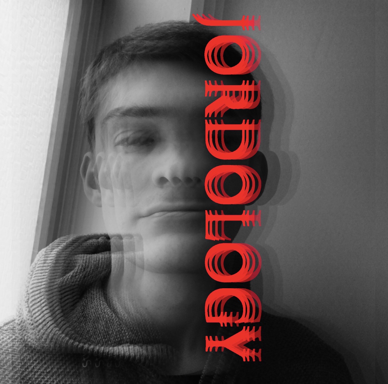


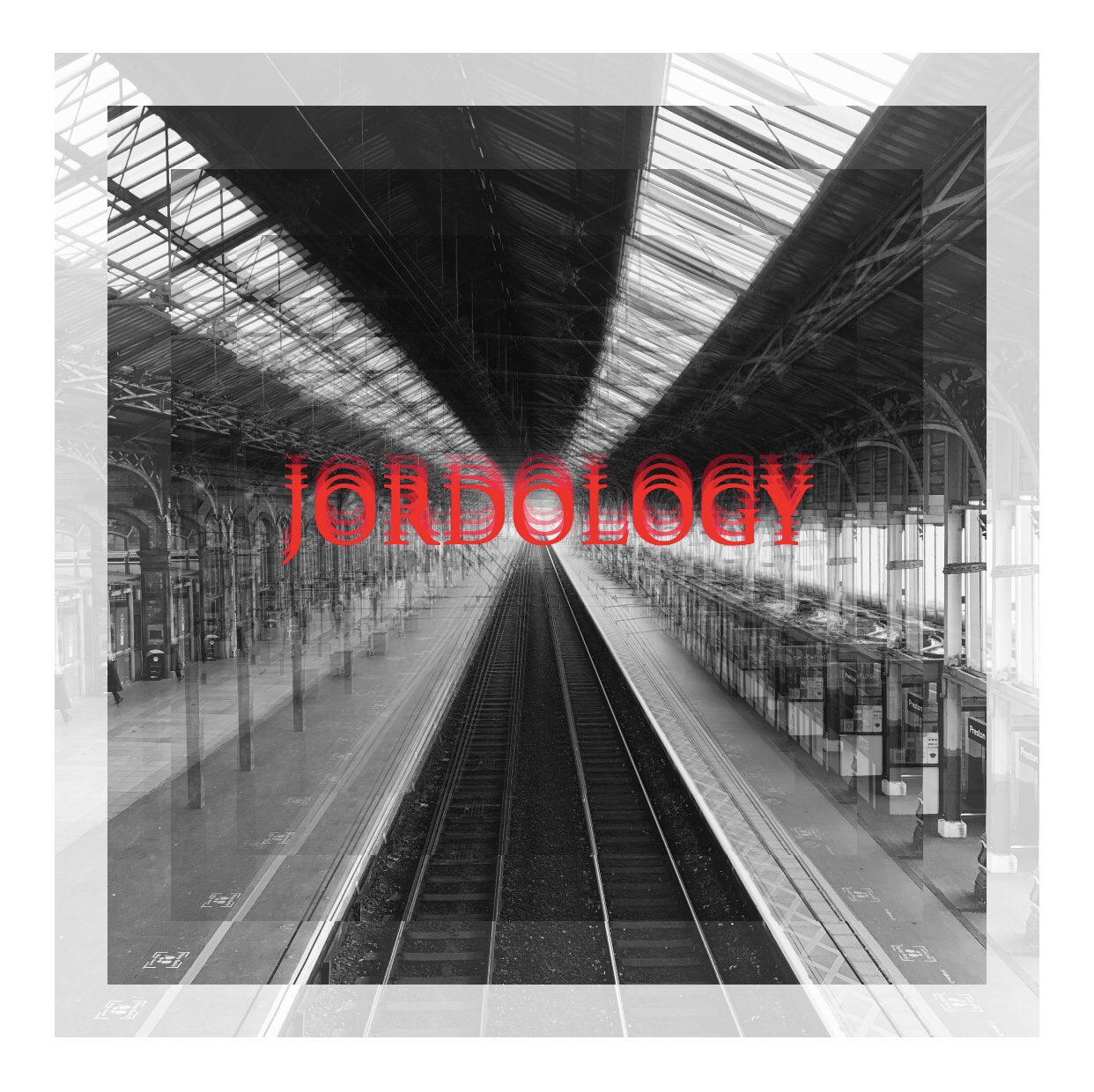
My goal of the editing process was to capture the use of layers, text and tools such as a brush tool, as I think these Photoshop tools are very effective for overlay use, particularly if you want to add more details to the image.
PH1000: Contact Sheets and Gif’s
Exploring the ways and uses of Contact sheets and Gifs.
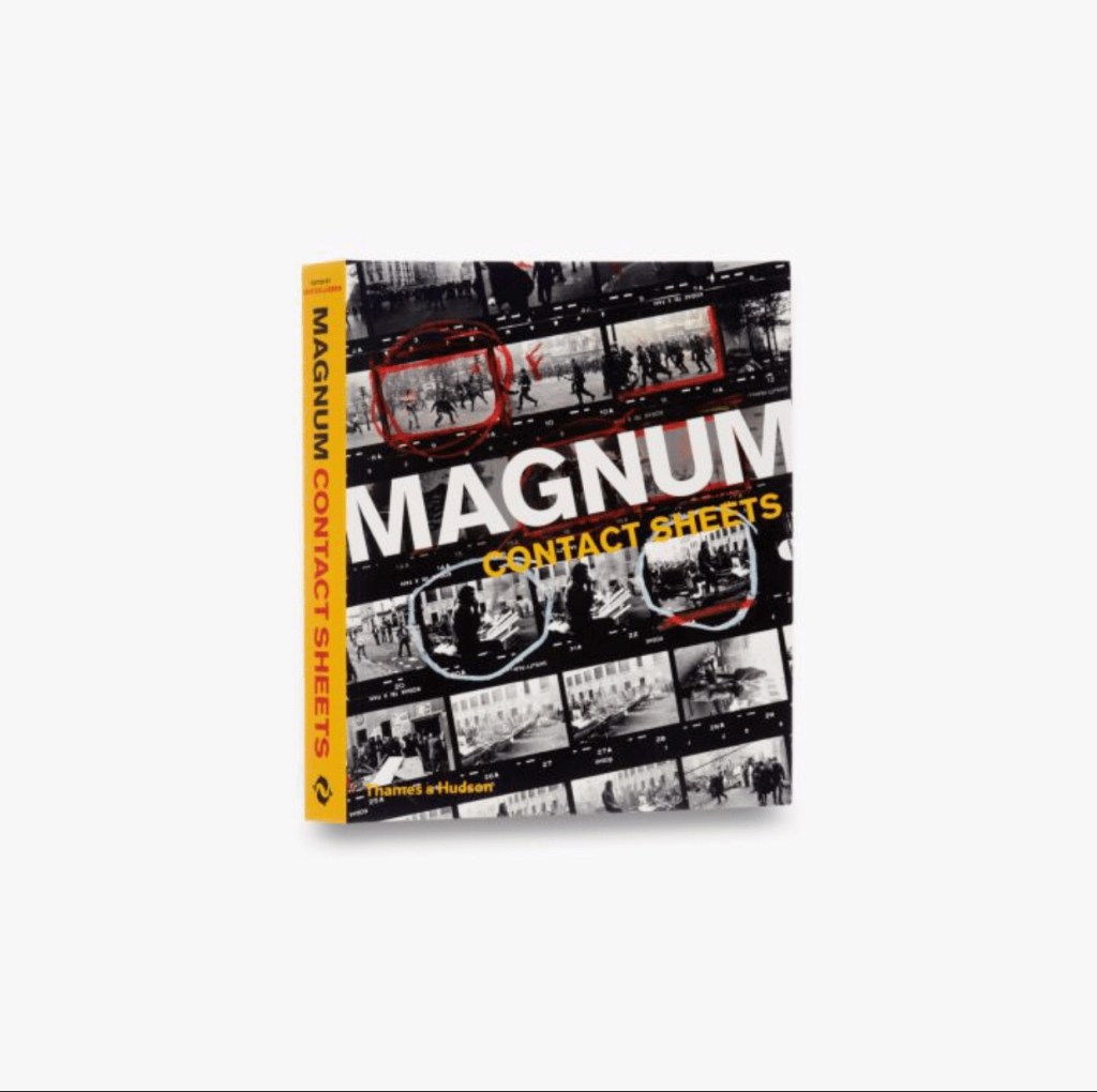
Few photography books can lay claim to being truly ground breaking. The first edition of Magnum Contact Sheets was one of them. This exceptional book, presented here in a new, accessible and democratically priced format for the first time, reveals how Magnum photographers capture and edit the very best shots. Addressing key questions of photographic practice – was the final image a set-up, or a serendipitous encounter; did the photographer work diligently to extract the potential from a situation, or was the fabled ‘decisive moment’ at play? – this book lays bare the creative methods, strategies and editing processes behind some of the world’s most iconic images
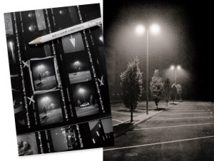
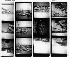
A touch printer (or proofer) is a type of easel that allows you to produce a sheet of thumbnail prints from a film roll that has been cut into strips, usually containing six 35mm film images per strip and three or four medium-format negative images per strip
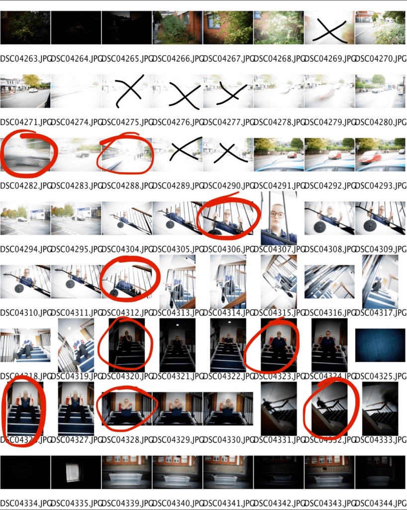
I decided to explore how to use rows, columns and contact sheet format. I was unable to pick the images I wanted to put into the contact sheet during the programme process, as the Photoshop programme automatically adds the entire folder and file.
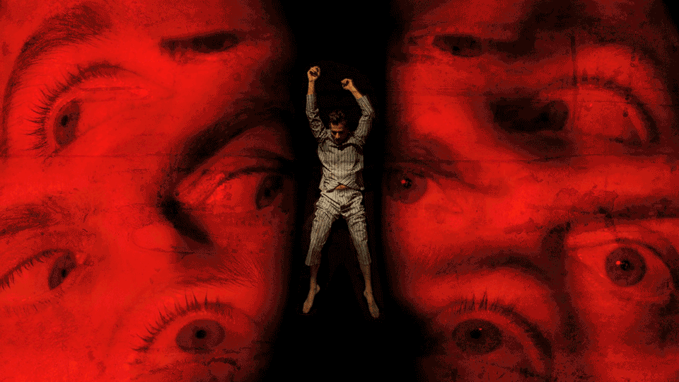
‘PH1000 – Animated GIF’
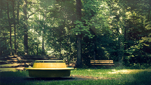
She is a cinemograph master. We’ve seen plenty of artful GIFs containing one small moving object. Julien, however, takes it to an entirely new hypnotic level with his frames of seamlessly looping motion from passing trains, this shot of a Ferris wheel above, to people walking down the street. The 24-year-old Strasbourg, France resident says he has been creating cinemographs since 2013. At the time Julien says he did not even know there was a specific name for the images he created, and it all started with a simple video he shot for a school project a year prior.
While studying architecture in the 80’s in my hometown, Lima, I found out that there was a lack of information in the media about all subjects related to the youth. This made me teamed up with two friends and proposed to the local newspaper to have a daily page where we would cover all concerns related to the matter. Many of the articles had to be documented with photographs which made me take a camera and start to do my first pictures
She is an artist who uses a combination of photography, film, sound and installation to continually explore the human relationship with the underwater environment as a political, philosophical and environmental space. She is Royal College of Art alumni and has developed works funded by organisations including The National Media Museum, Arts Council England, British Council, Singapore International Foundation, British Academy and the European Regional Development Fund. Her work has been shown extensively nationally and internationally in galleries and institutions including The Australian Centre of Photography, the ICA Singapore, The National Portrait Gallery, the Royal Academy, BALTIC Centre for Contemporary Art and Tate St Ives.

Self Portraits 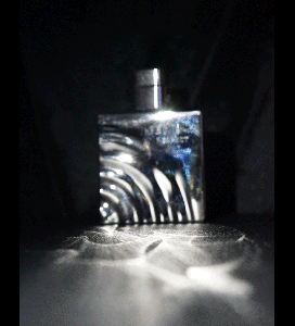
Standard Stinks
Here is my first attempt to make a GIF, so I just used the Photoshop programme to compile a gif and at first I was uncertain what photographs to use as I didn’t have the materials at the time. So I got a deal with one of the photography students and got permission to use the pictures of myself that Ella Thomson, UCLAN, photographed.
Here is my second attempt to build a GIF, so I used a set of aftershaves, what I find very interesting about this gif is the way I use a wide variety of different light, tones and shadows in the gif and the gif’s quick speed is also really efficient because you can see aftershaves up close and in the picture frame distance.
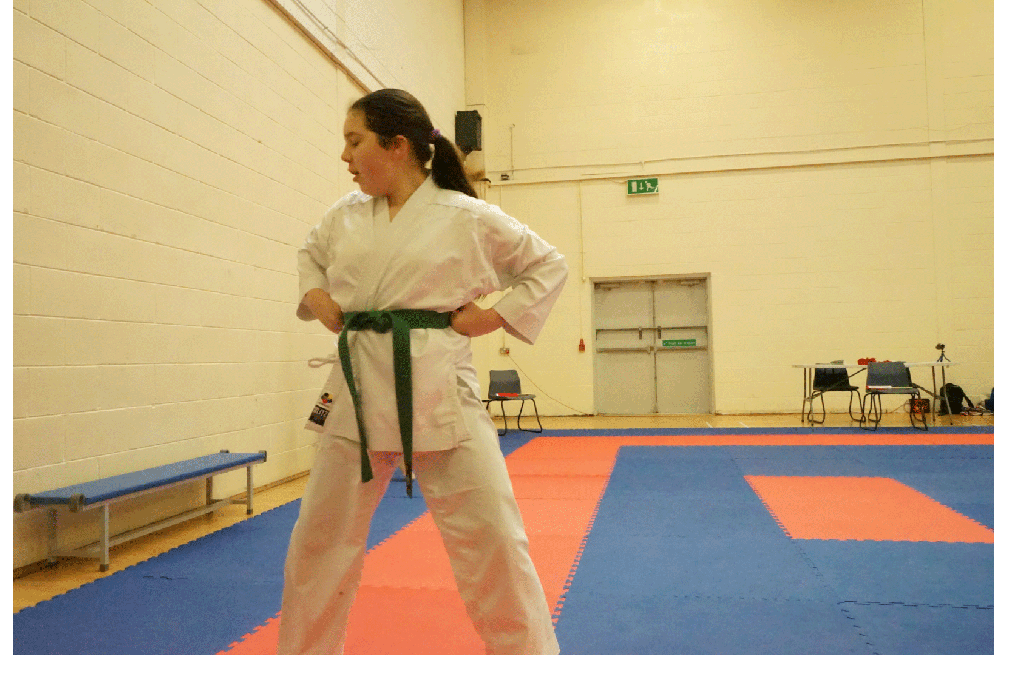
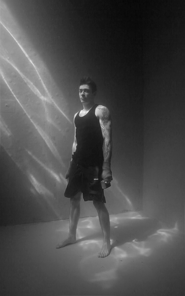
This is my third and final attempt to put a gif together this time I’m only using a few photographs because I want to see how fast the motions of the karate shots would look at a fast pace and what I really like about this gif is that all the colours, shadows and details are all the same, making the photos very unique and successful.
‘PH1000 – Animated GIF’
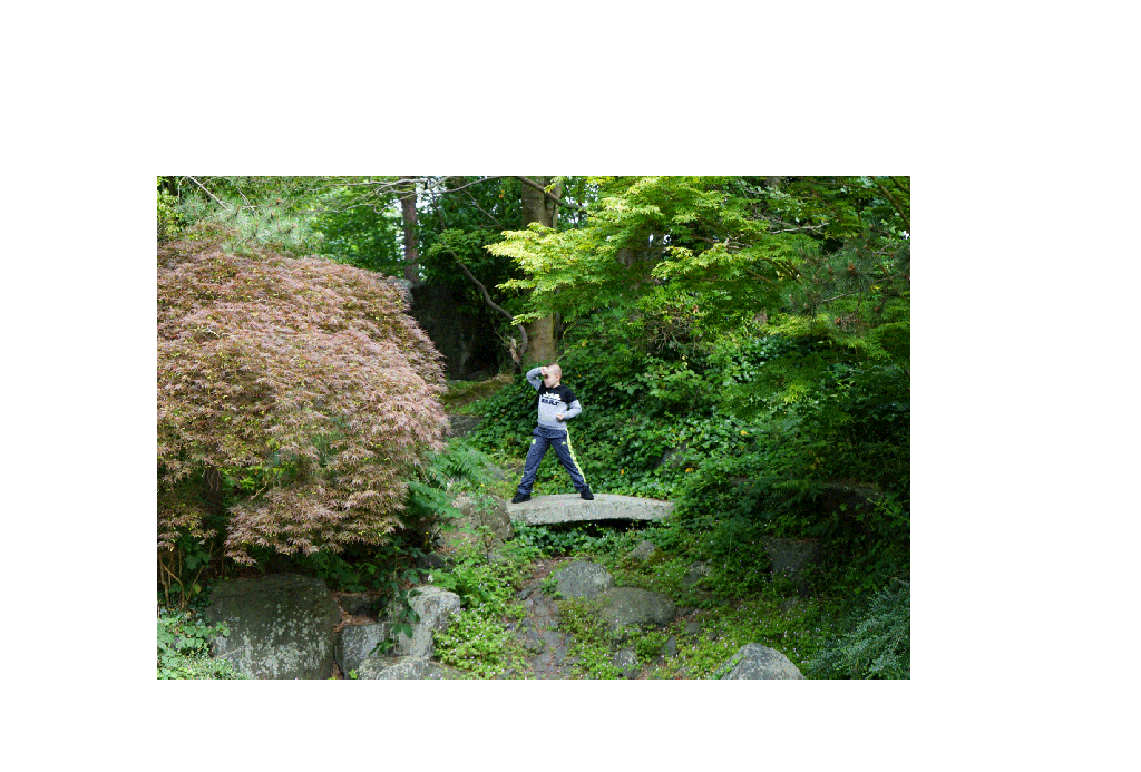
I’m really happy with the final outcome of the final GIF, because putting all of it together was very enjoyable. The boarder is very interesting around the GIF frame as the zoom in and out is replicated during the motion, as it often shifts while the GIF is in motion. As you normally wouldn’t see the wind movement, the movement between the trees, bushes, but you can see the movement of the background moving as well as the primary focus point with gif. The karate stances, the models are making, and the action of the models is very sharp as he is going to photograph a more efficient still picture at a slower speed for me.

Leave a comment